
Data Visualization with Tableau: 4 Best Case Studies to Know
Discovering the commercial benefits with data visualization..

Visualizing the information is more convenient than delving into the complex data table collections because the human brain easily digests the graphics, unlike the Excel spreadsheets due to their lack of information overload. That is why more and more people realize how to apply Tableau data visualization in the business context and discover the commercial benefits. In this article, you will find the examples of Tableau business cases with an ample outcome because of data visualization.
Impacting the businesses
Data visualization increases the revenue for enterprises. How, though? First of all, it allows to obtain the profound insights when answering the data-related questions: instead of trying to structure the messy information, one can easily observe trends in revenue, costs, customer count, conversion rates, and the other e-commerce metrics (MAU, DAU, CPC, CPA, LTV).
By visualizing the information, it’s easy to find inefficiencies, to determine seasonality and optimize the company’s strategy through development of profitable directions. Also, visualizing the data is the way of guaranteeing the objective source of truth for all levels of leadership and providing all of the departments with the up-to-date and truthful information. An example of efficient visual representation can be found down below:
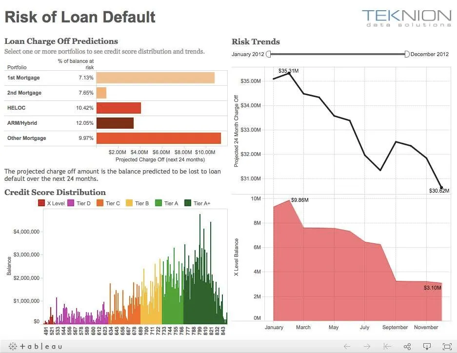
Source: Tableau Online
Tableau, a suitable solution
Tableau is a good choice for the users in need of cross-platform reports (on tablets, smartphones, or desktops). Tableau is easy to use and is suitable for sharing the data with all the members of the company. At the same time, it is convenient for processing the large sets of information, regardless of the amount of sources.
In fact, Tableau leverages an extensive set of data connectors, such as MySQL, Google Analytics, Google SpreadSheets, Excel, CSV files, and others. Thus, it provides the users with advanced analytical dashboard capabilities along with assisted formula editing, forecasting, clustering, and flexible deployment options (in-cloud, on-premises, and online).
Coca-Cola: shaping the essence of analytics
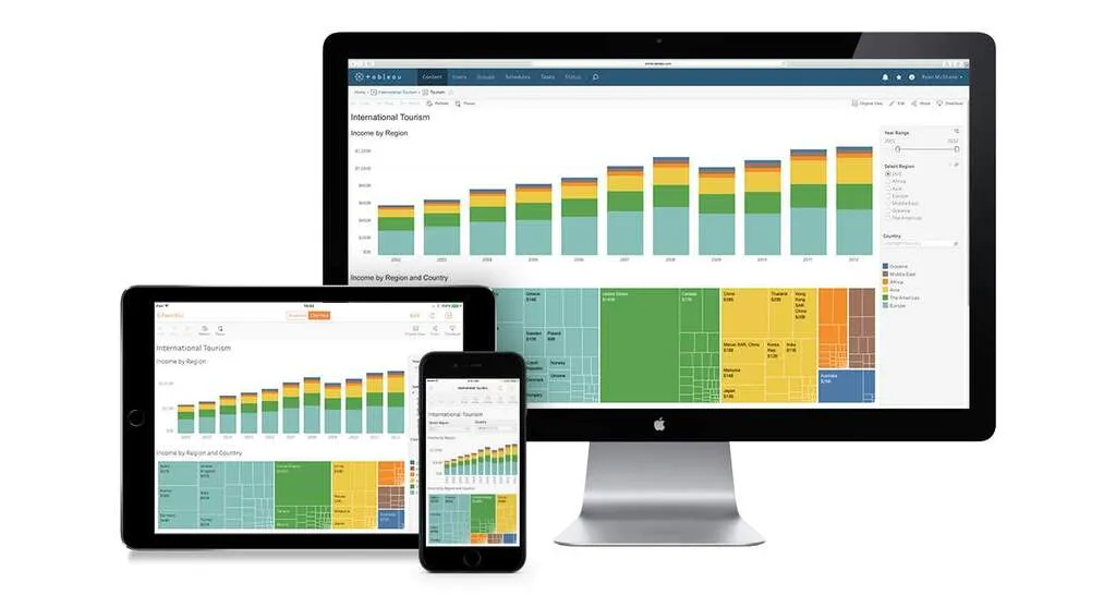
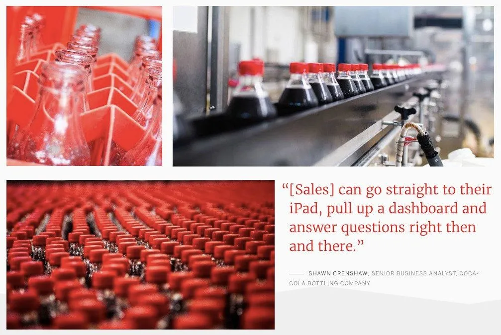
Coca-Cola , the largest beverage company in the world, looked how to replace its daily 45-minute manual data reporting process. Previously, the team spent a considerable amount of time trying to connect over 200 million lines of data from over 100 different systems into single storage to then build one usable dashboard. To boost the efficiency and carry out a real-time data, Coca-Cola adopted Tableau. Because Tableau consolidates the data from multiple sources, various teams at Coca-Cola can now actively comprehend the metrics, including the budget, delivery operations, and profitability in a matter of few clicks. Simultaneously, the sales department can now access the data from the remote locations by using the iPads, which increased overall timeliness. Finally, the executive reports automatically refresh each day at 5:45 am, unlike the previous times.
Coca-Cola Tableau case study
Lenovo: a 95% increase in efficiency across the company
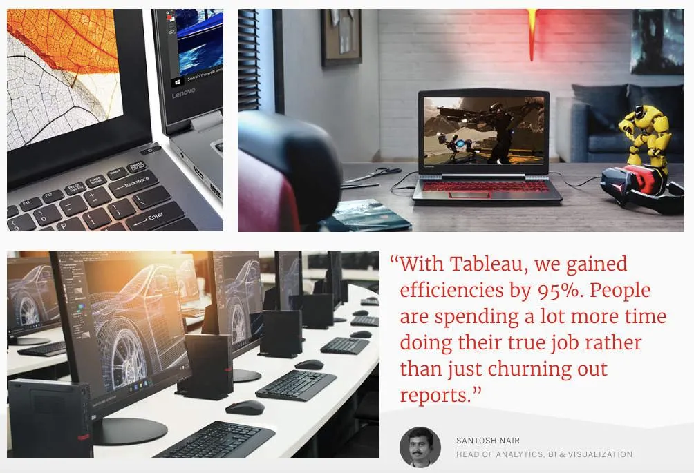
Lenovo, a global technology company, aimed to optimize its analytics experience across all the departments and worldwide offices. Previously, Lenovo operated with one single sales report that was delivered to 28 different countries. When different regions or company’s divisions wanted to adopt the report to extract the most valuable data, it required a commitment of eight to ten individuals and led to a massive number of on-hold tasks for the analytics team. In turn, Lenovo decided to use Tableau to orderly structure the data all across the company. As a result, Lenovo got a flexible dashboard with all the sales that can be adapted for the ad-hoc analyses, which also led to 95% efficiency improvement across 28 countries. With the help of Tableau dashboard ideas, Lenovo gathered the engagement metric, thus crafting a better experience and collecting more revenue.
Lenovo Tableau case study
LinkedIn: empowering 90% of the Sales Team
LinkedIn, a largest professional networking website, wanted to synchronize all the data across its internal databases ( Google Analytics , Salesforce.com , third-party tools). Previously, one analyst at LinkedIn would handle daily sales request from over 500 salespersons, which created a reporting queue of up to 6 months. To fix the issue, LinkedIn decided to use Tableau to centralize the spread out data and develop a series of customer access dashboards. As a result, thousands of individuals nowadays can access the Tableau Server on a weekly basis, which constitutes 90% of the LinkedIn sales force. With the interactive real time dashboards in Tableau, one can easily predict churn and track the current performance, which eventually created more revenue through the proactive cycle of sales.
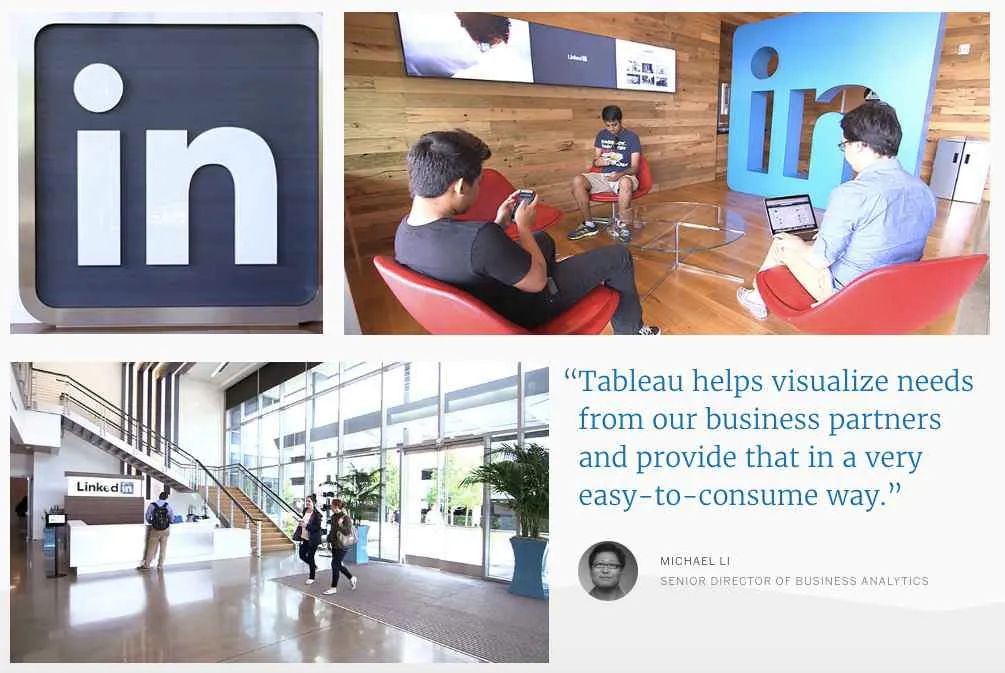
LinkedIn Tableau case study
Bookimed: Building real-time analytical dashboards
Bookimed, a Ukrainian service for searching the best medical solutions worldwide, wanted to make an x2 increase in revenue by year. To do so, the companies that use Tableau would have to make reasonable decisions based on data. We understood that previously managers had issues with evaluating hypothesis and tasks prioritization because of the manual filtering through the information. Usual data analysis required next steps:
- Making a task for IT-department to load raw data in CSV file.
- Filtering this data by hand and exploring it to Excel.
- Manually linking data from Excel, CSV files to data from Google Analytics and Google AdWords.
In order to get quick and error-free insights from data and tracking the real-time state of the business, Bookimed decided to use Tableau and Tableau Online services. The main goal was to create the customizable for every department real-time dashboard system. To fulfill these tasks, we did undergo three steps:
- Connected Google Analytics, Google Adwords and MySQL to Tableau.
- Set-up Dashboards for every department at Bookimed.
- Additionally, data root labs incorporated Amazon Redshift + Amazon Kinesis for advanced data gathering and more sophisticated data analysis.
Here are some of the first graphics of the company (numbers are random and for visualization purpose only):
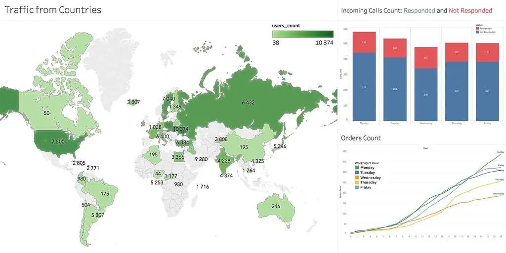
Graphics and Visualizations (Tableau). Source: Bookimed.com
Now, Bookimed.com has the system that delivers all the relevant data and information to every member of the company in real-time mode. Simultaneously, Bookimed got all of the following:
- Reduced the business analysis time from 1 week to 2 hours and ensured the data-driven decision making among employees.
- Build based on data reasonable growth plan for increasing the revenue by 10% monthly .
- Acquired the data visualization infrastructure that can be easily modified, scaled, and changed according to the business needs.
Other Industries where Tableau is used
Healthcare analytics.
- BJC , a company that provides healthcare to residents of Missouri and Illinois, reduced supply chain expenses from 23.5% to 19% .
- Seattle Children’s, a pediatric hospital, saved more than 40000 clinical hours each year and $100000 with demand flow.
Education Analytics
- Des Moines Public School District received an ability to quickly detect high-school students with the likelihood to drop-out .
- The University of Notre Dame got able to perform data analysis using Tableau 10x times faster .
Government Analytics
- The city of Tallahassee measured workload sewers’ efficiency and made utility decisions that improved productivity by 30% .
- Surrey County Council reduced analysis time from days to hours to track intervention at youth clubs.
Marketing Analytics
- Allrecipes, a largest digital food brand, increased the mobile site visits from 8 percent to more than three-fourth of total .
- PepsiCo cut analysts time by 90% .
Tableau Insurance Analytics
- EY, a professional risk management organization, saved clients millions of dollars and prevented fraud .
- MA Assist, the UK-based property services firm, cut insurance claim duration by 15% and improved business efficiency by 20% .
High Technology Tableau Analytics Examples
- GoDaddy, an international web hosting firm, scaled 13TB of data governance and and optimized product experience for over 17 million customers.
- Ancestry.com , a largest online resource for searching family history, visualized billions of rows of data for strategic decision-making .
Have an idea? Let's discuss!

Website navigation
In this section
- Imperial Home
- Data Science Institute
- Data Observatory
Visualisation Case Studies
All the visualisation case studies below were developed by researchers at the DSI or DSI Academic and Affiliate Fellows.
Visit how to book the DO to see some of the visualisations first hand!
- AI4Science: Data Learning Across Scales
- Bioinformatic Analysis of Severe Asthma
- High resolution images of Mars
- Interactive Maps & London Cycling Routes
- People Flow
- Predicting Road Traffic Collision Impact Using Social Media Data
- REDASA: Real-Time Literature Analysis Reinvented
- Sharing Economy
- Telematics from Smartphone Data
- Towards a large-scale Twitter Observatory for political events
- Using social media users as sensors in healthcare applications
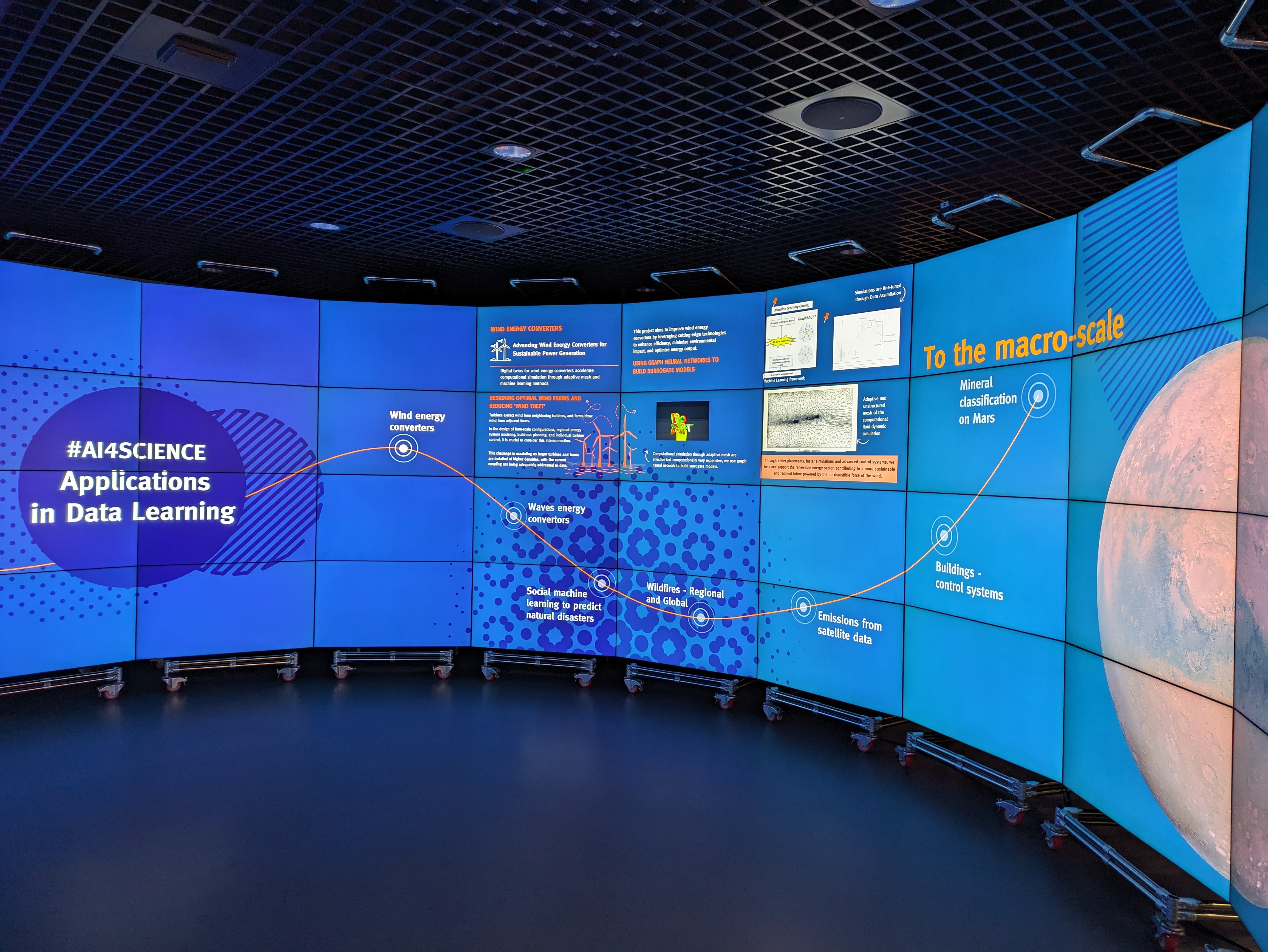
This demo features work from the Data Learning Group – an interdisciplinary group at Imperial that uses digital twins and data assimilation to model real-world observations, with machine learning used to increase the reliability of predictions made by forecasting models.
Their research spans a wide range of applications which transcend scales, from the micro, such as droplet formation, to the macro, such as natural disaster prediction or mineral classification on Mars.
Find out more about the Data Learning Group.
Every transaction conducted in the Bitcoin network is recorded permanently and irrevocably in a public database known as the Blockchain. By visualizing this network of highly associated data in a large scale environment we are able to accelerate algorithmic discovery of anomalous transactional patterns, with obvious applications into areas such as fraud detection.
Real time obseravtory on the different patterns of transactions that occur on the bitcoin network.
It also features some past blocks which contains relevant, unusual activity
If you want to read further about Bitcoin through a Master's student's visit, please click here .
Please read the publication Visualizing Dynamic Bitcoin Transaction Patterns written by our researchers, here.

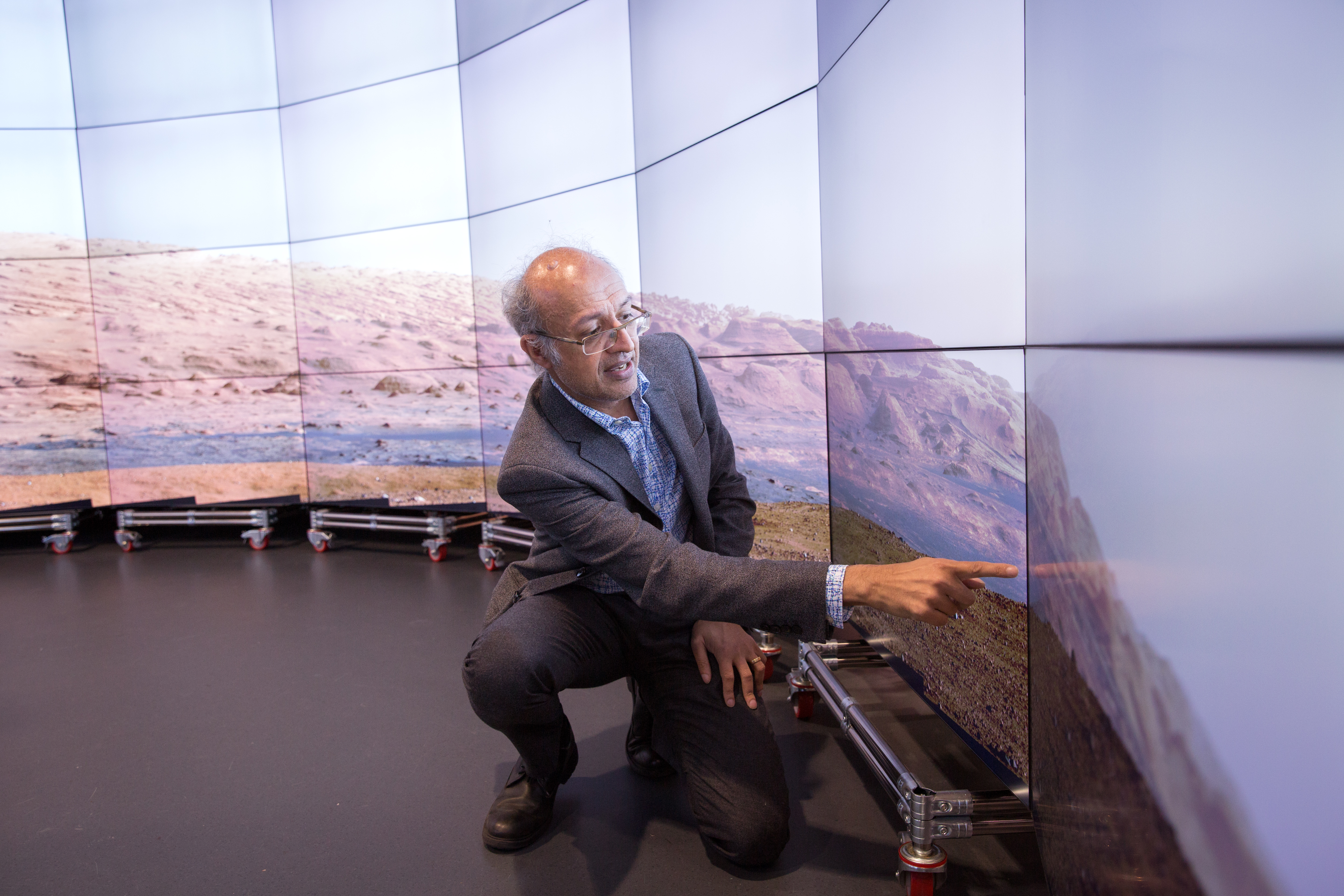
DSI Fellow Professor Sanjeev Gupta often uses the Data Observatory to examine the geology of the surface of Mars.
Through collaborating with NASA, we are able to show you high resolution images from the Curiosity and Perseverance Rover Missions.
This demo works well for all visitors, from school students through to academic researchers.
The Data Observatory environment is particularly interesting for examining and interacting with satellite maps, with the possibility of adding geolocated information on top.
In one example. we can showcase a previous project that worked with TFL to investigate cycling routes in London. The below image is a snapshot of this visualisation, displaying traffic information such as the number of bikes at any given location as well as morning and evening commutes.
This brings maps to life in the DO, getting to see which routes are faster and getting to see the areas we know from a different perspective.

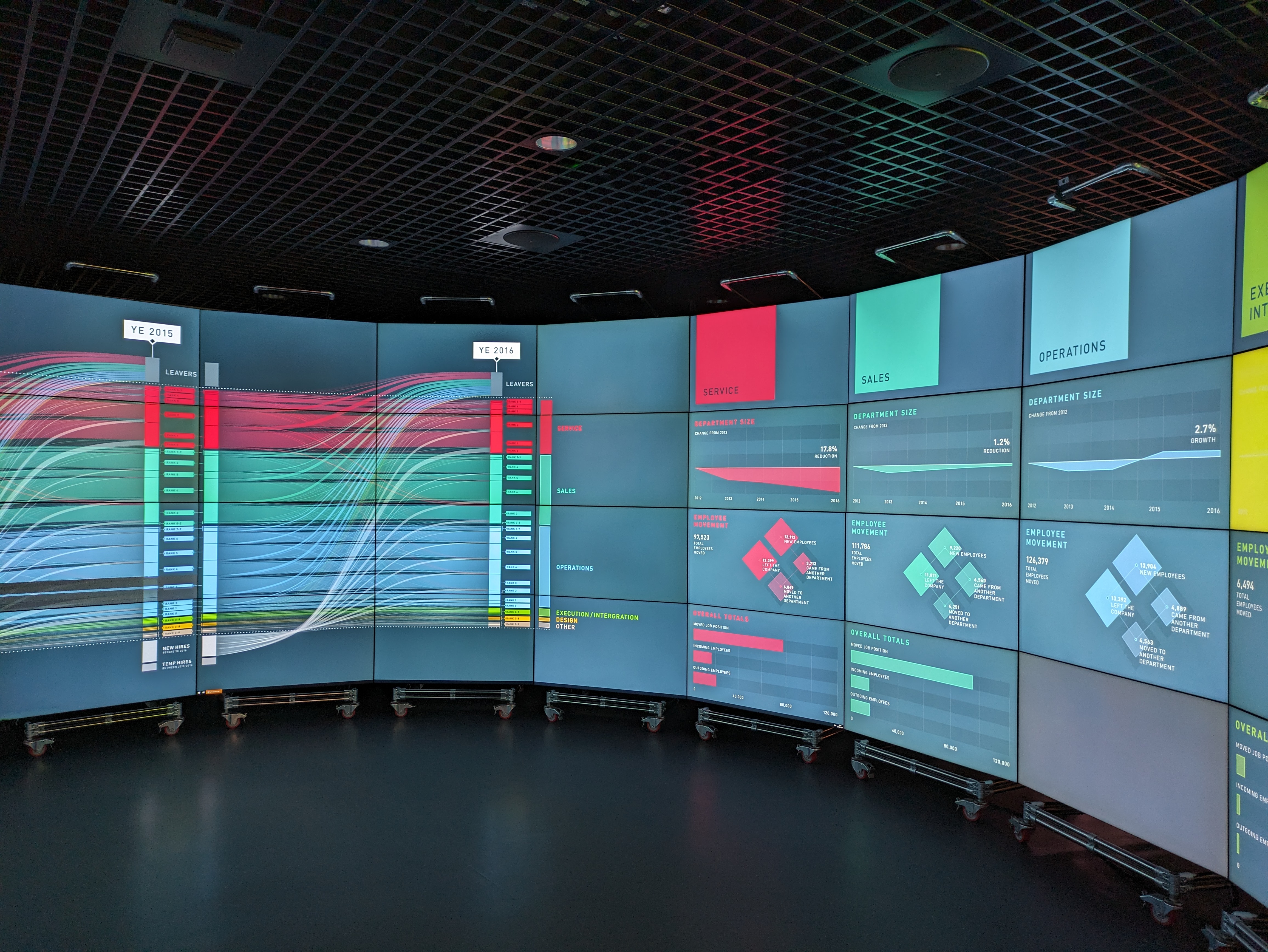
Visualisation that shows how employees in a bank moved between different departments within the company through several years. Data comprises biweekly HR record.
Leverage the untapped potential of social media for road safety with our innovative research project, which utilises Twitter data to predict and visualise the impact of road traffic collisions.
By employing advanced machine learning techniques the system effectively classifies and groups tweets related to specific incidents, offering near-human accuracy in detecting road traffic events.
This approach not only enhances real-time monitoring but also provides an interactive visual platform for stakeholders to engage with and understand the patterns and impacts of road incidents more deeply.
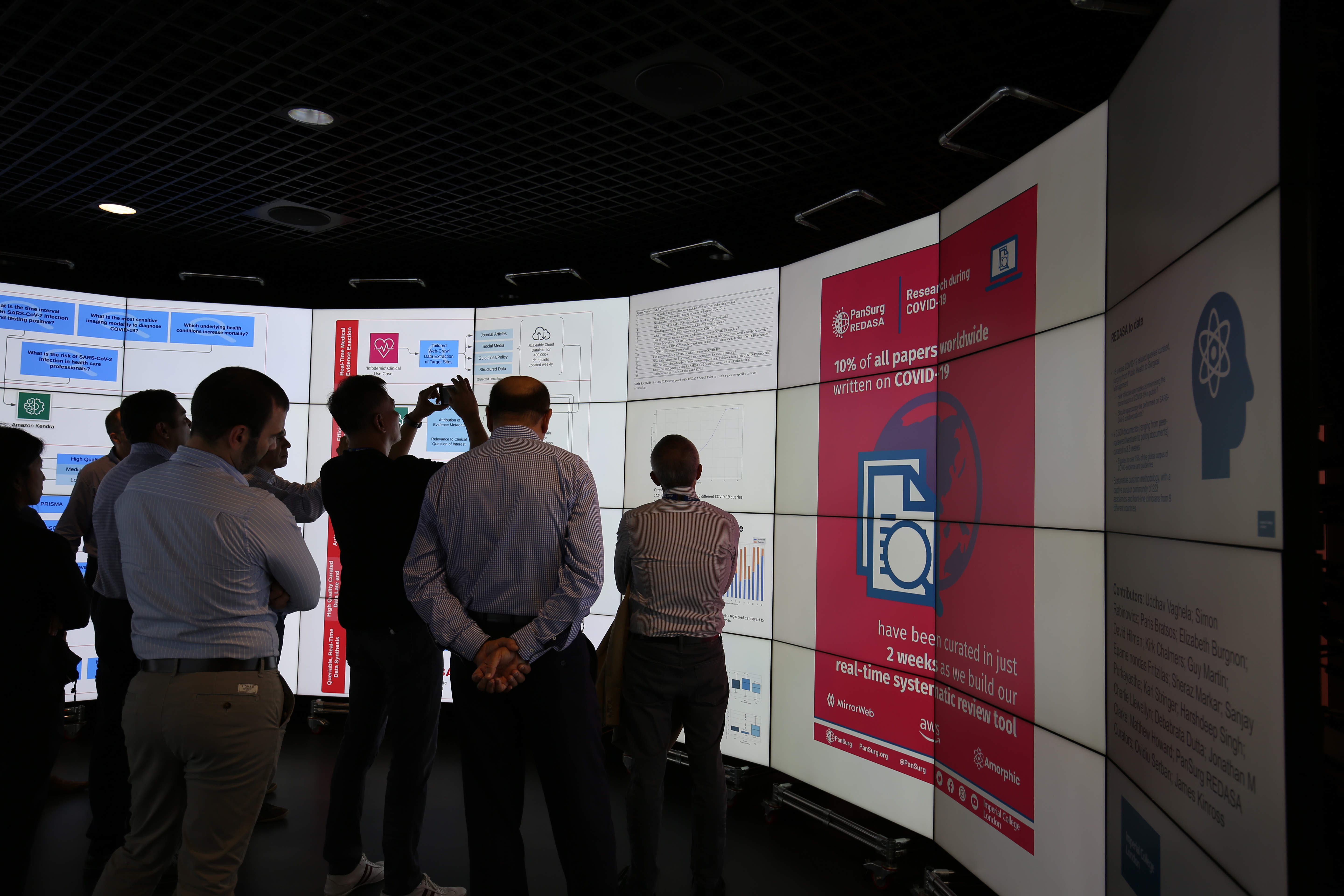
Introducing REDASA, a groundbreaking real-time curation platform tailored to streamline the synthesis and analysis of COVID-19 scientific literature.
Developed by the PanSurg Collaborative at Imperial College London, this platform leverages a sophisticated web crawler and human-in-the-loop methodology to provide up-to-date, high-quality medical insights.
With over 104,000 documents curated rapidly into a comprehensive dataset, REDASA is setting the standard for future automated systematic reviews, offering a robust solution to combat the infodemic faced by clinicians and policymakers.
Longitudinal study of how Sharing Economy (Uber, Airbnb, etc..) has risen in the last few years in the UK.n It includes a detailed study on the demographics of the participants, together with a timeline of events leading to it.
.jpg)
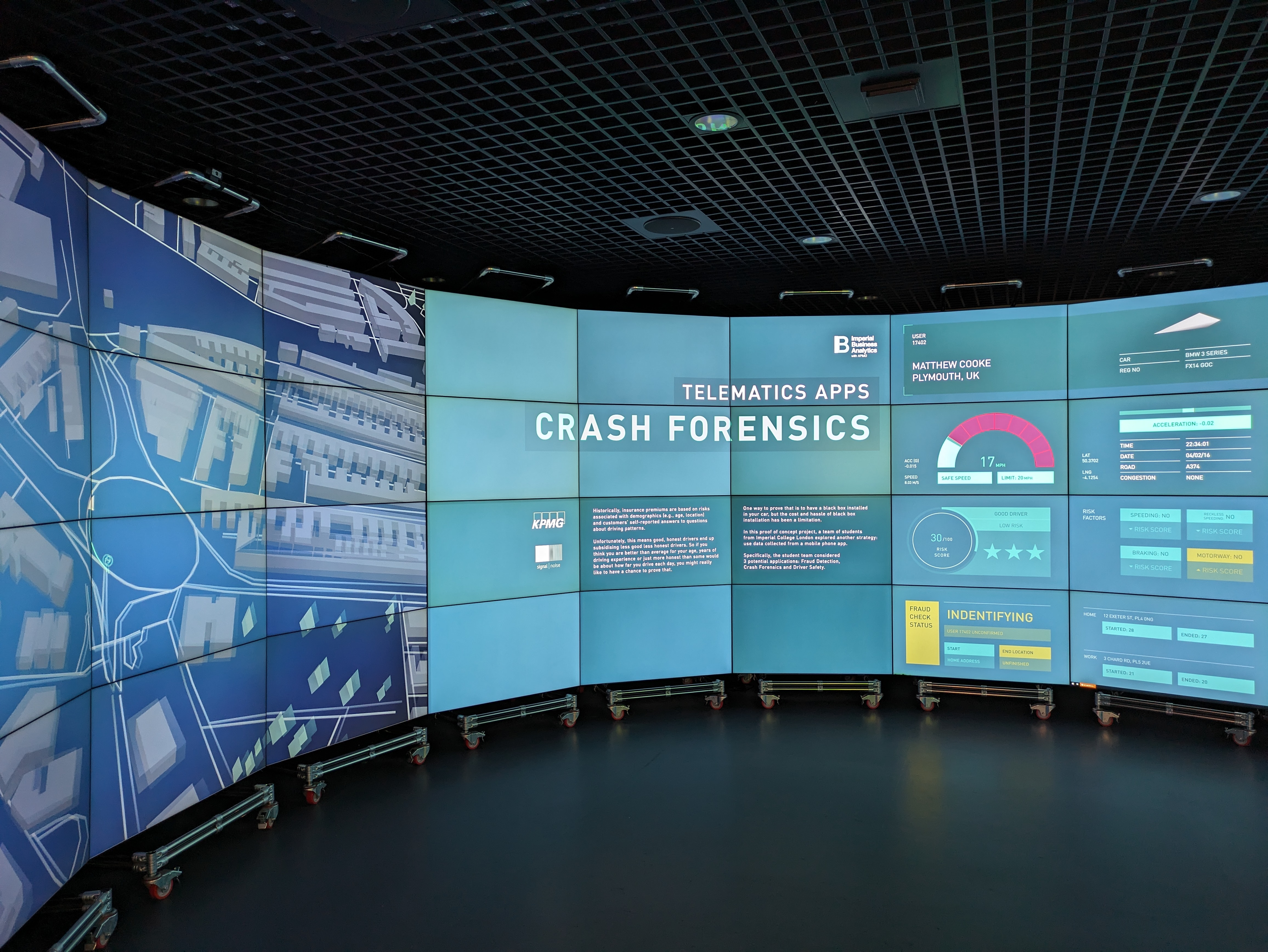
GPS data in our mobile phones are a great source of information for insurance companies. The aim of the 'Telematics from Smartphone Data' project is to enable car manufacturers, insurers and service providers to deliver an enriched driving experience that creates loyalty and unlocks the value in vehicle. With the help of the DSI, t he visualisation presented in the DO shows three user cases of how those data can be used for f raud detection, c rash forensic, r isk assesment and more.
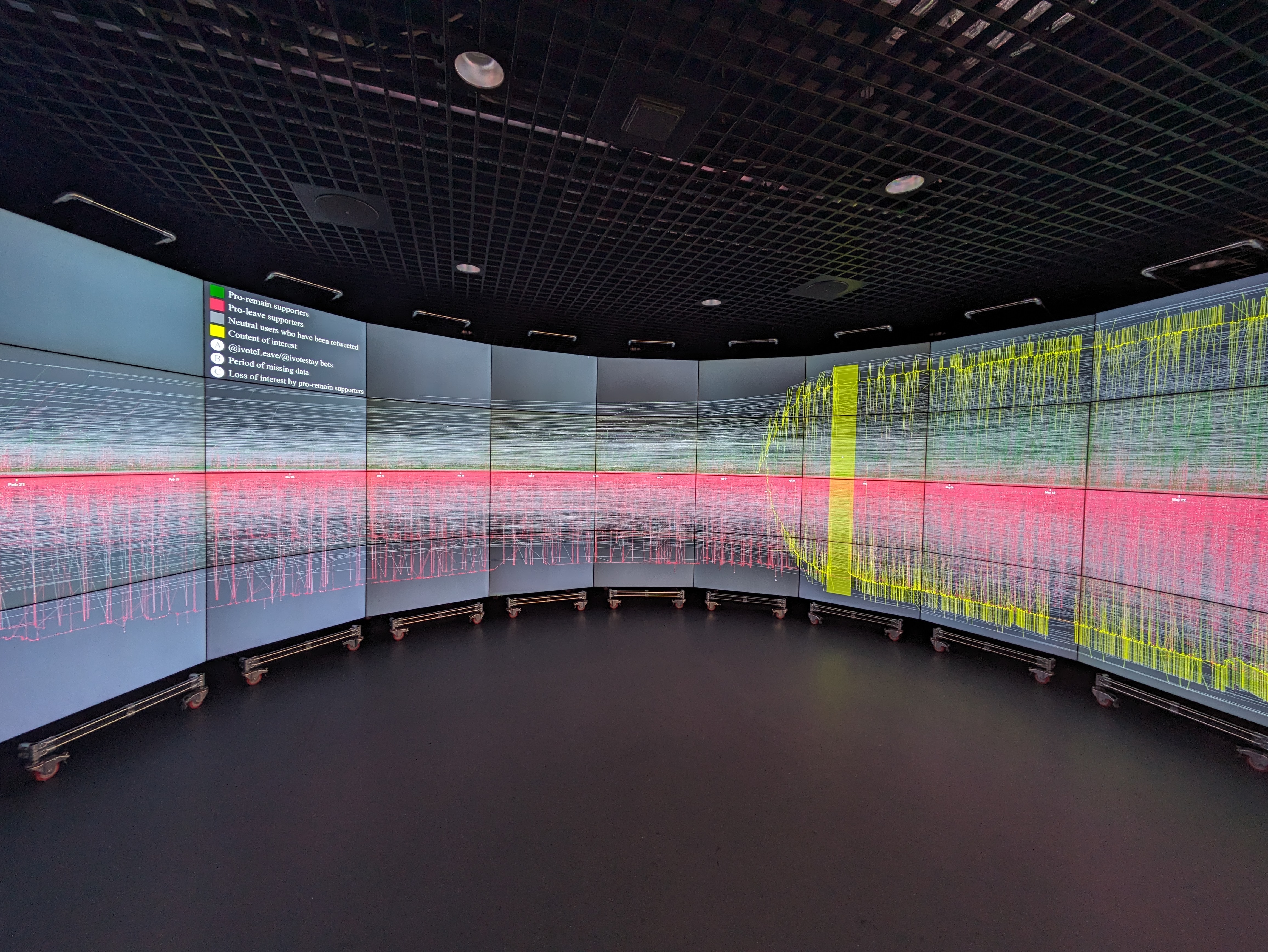
Discover the future of political analysis with our Large-Scale Twitter Observatory, a revolutionary tool designed to manage and visualize massive datasets from social media for actionable insights.
This cutting-edge solution empowers researchers to efficiently retrieve, analyze, and display Twitter data, facilitating a deeper understanding of political events.
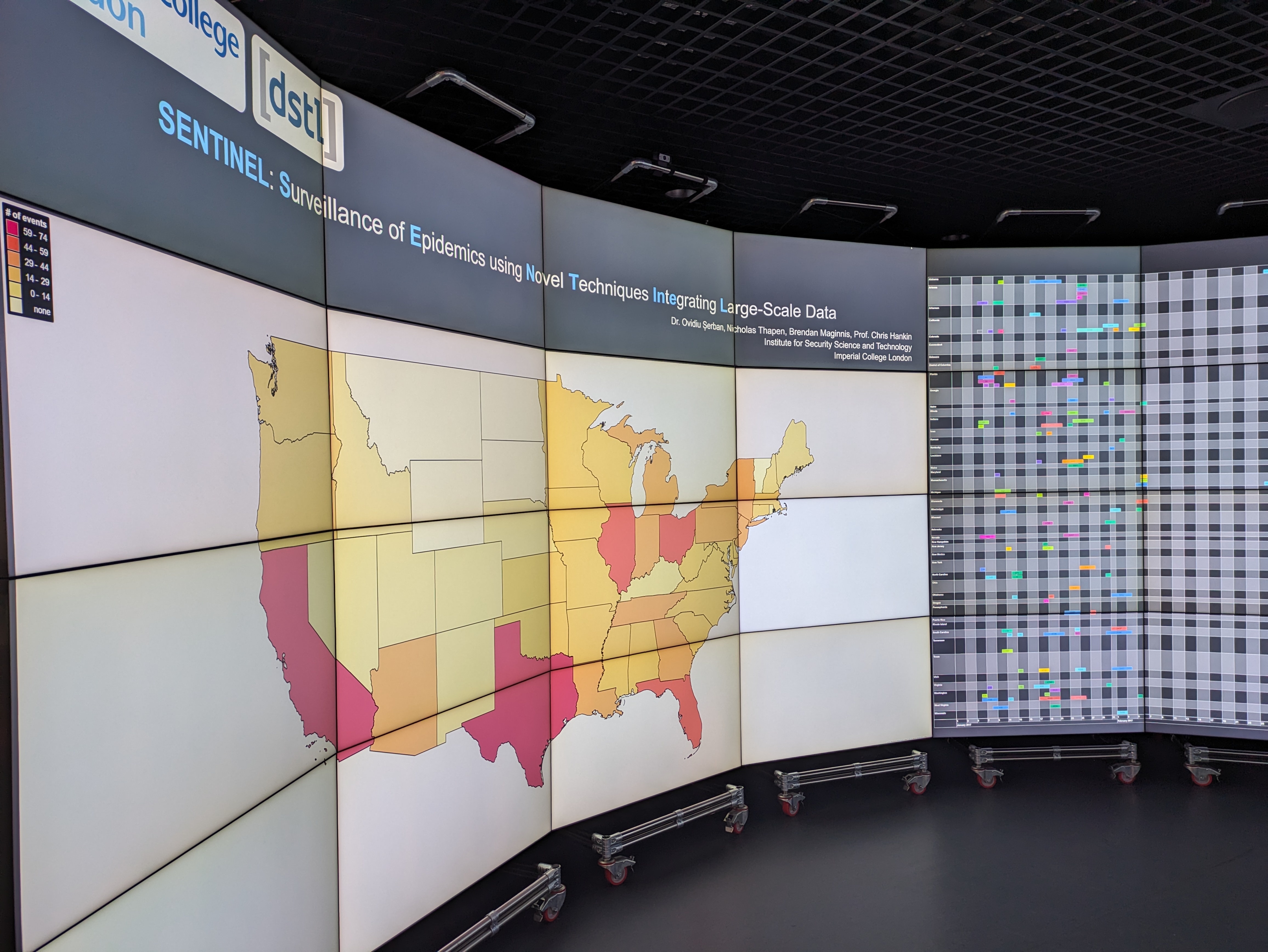
SENTINAL: Surveillance of Epidemics using Novel Techniques Integrating Large-Scale Data
Discover the future of public health monitoring with our state-of-the-art software system, designed to harness the power of social media for real-time disease surveillance.
Utilizing the latest advancements in machine learning and data processing, the system excels at identifying potential disease outbreaks by analyzing health-related tweets with remarkable accuracy.
This innovative approach not only provides faster outbreak detection compared to traditional methods but also incorporates nowcasting features that enhance disease predictions using a combination of social media and clinical data.
With proven effectiveness in detecting and monitoring influenza-like symptoms, our technology is an essential tool for public health officials seeking to improve response strategies and situational awareness.
You can watch a video from Imperial's Executive Education Programme where Dr Ovidiu Serban from the Data Science Institute talks through the SENTINAL project here.
Student projects
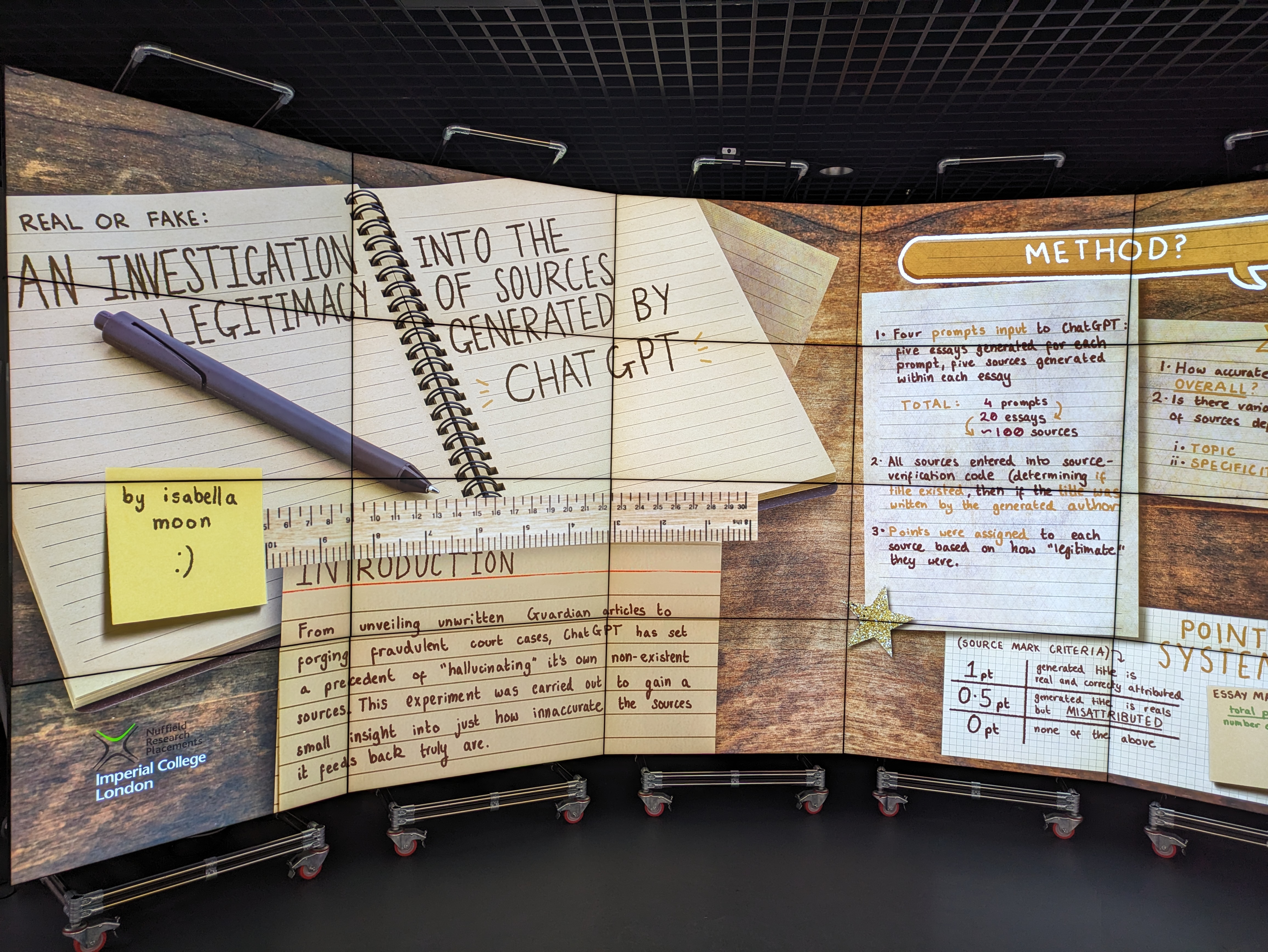
- 'Marking ChatGPT's Homework': An investigation into the legitimacy of sources generated by ChatGPT
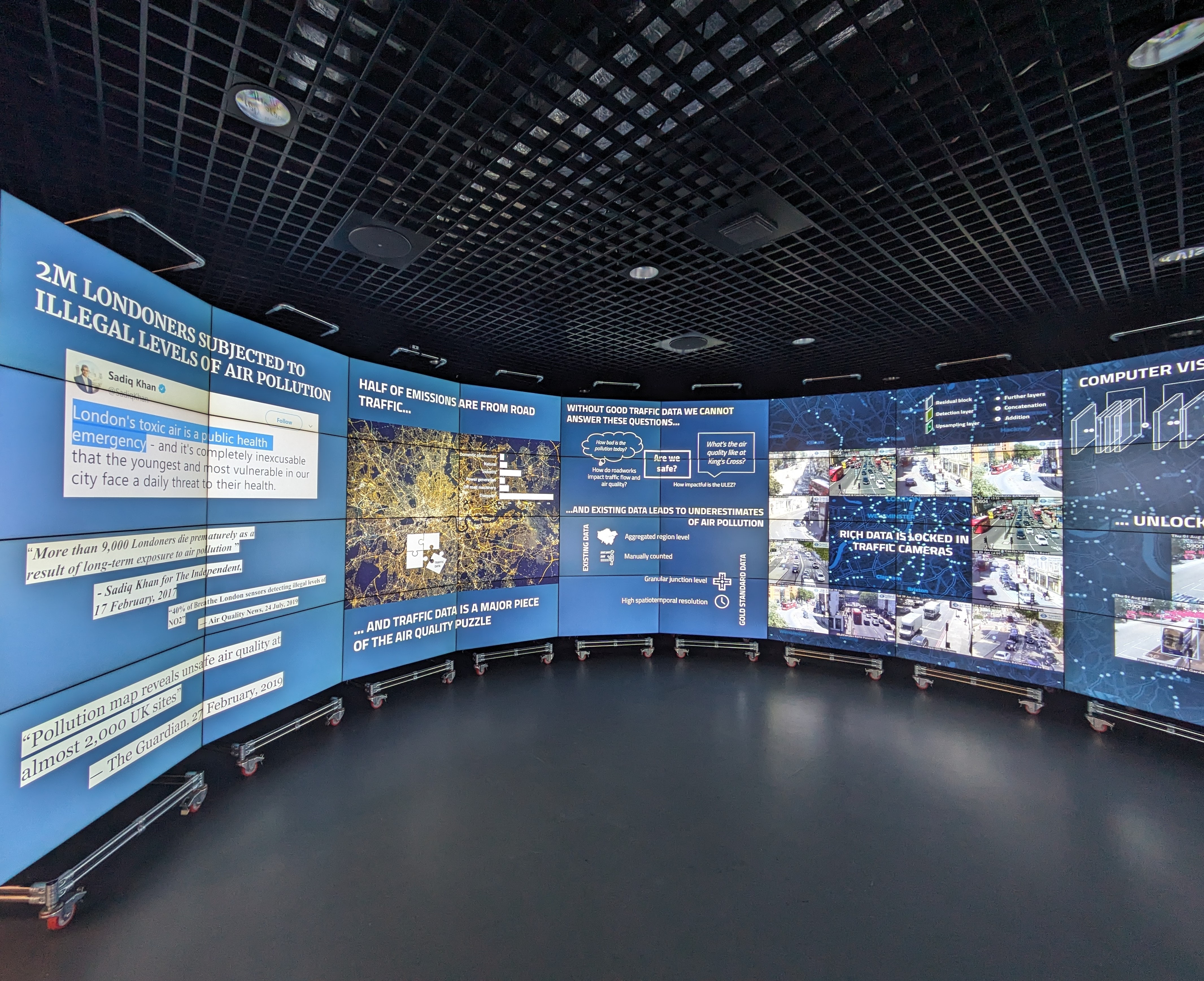
- Quantifying traffic dynamics to monitor air pollution in London
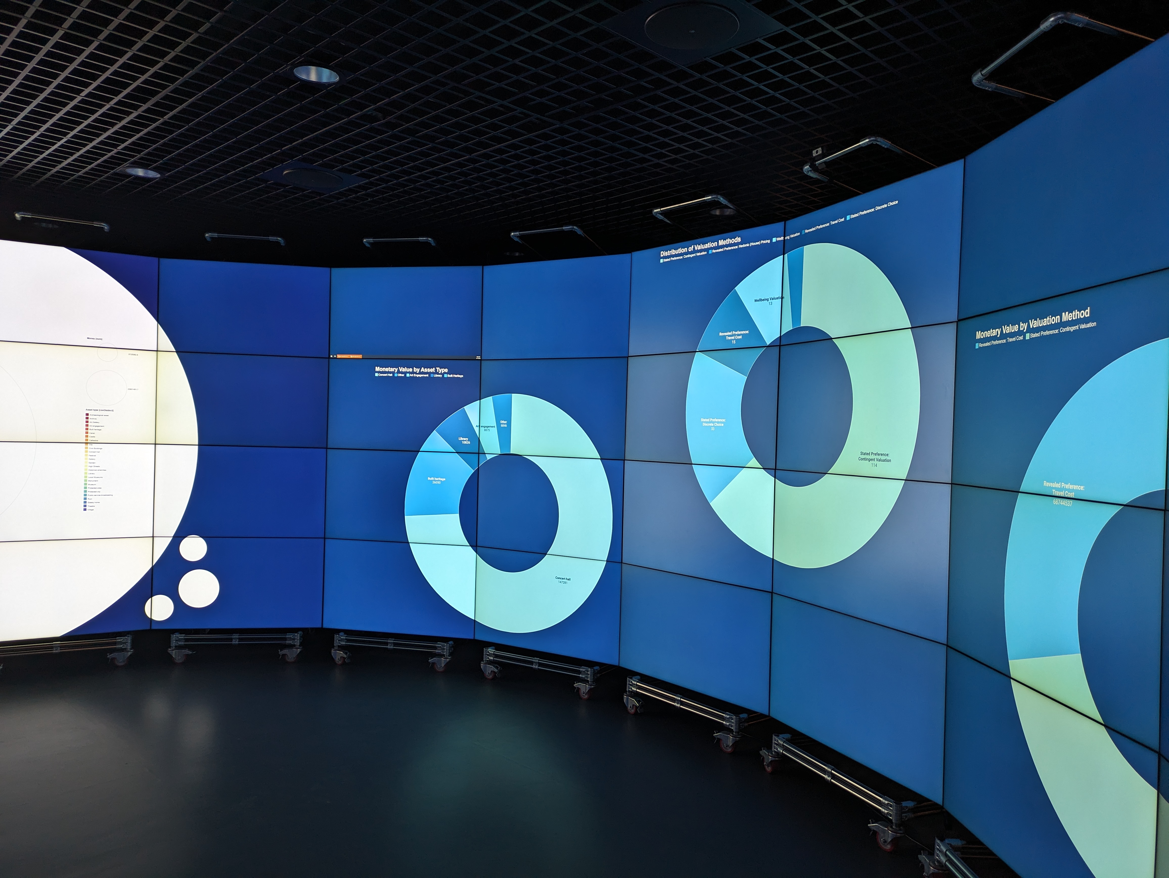
- Valuing our Cultural Heritage
ChatGPT has set a precedent of ‘hallucinating’ its own non-existent sources.
This demonstration was developed as part of a student placement to investigate how inaccurate ChatGPT-generated sources actually are.
This demo works well for a range of visitors, from school students to academics, policymakers or practitioners wanting to know more about the opportunities and challenges of generative AI.
More than 2 million Londoners are subjected to illegal levels of air pollution every day (2019). One way that researchers are helping to address this problem is by improving air quality models to make better estimates of what air quality is within London. These models require good traffic data because traffic represents a key contributor to air pollution in London.
In a project by the DSSG London Air Quality team at the Gandhi Centre for Inclusive Innovation at Imperial Business School, students used TFL data and computer vision to track vehicles in traffic cameras. This project aims to provide more accurate information about traffic congestion through the city, so that air pollution levels can be better estimated.
The team behind this project created an algorithm that counts the number and type of moving vehicles travelling in London by analysing images from jam camera videos. The data collected by the algorithm provides a more accurate record of the number of moving vehicles and the number of times each vehicle stops and starts. This creates a more accurate picture of the level of moving traffic and associated air pollution levels across the city.
This demo was created as part of a novel interdisciplinary student project with undergraduate students from the History of Science, Technology & Industry course taught by DSI Fellow Dr Weatherburn.
During the project the students used the evidence bank from a study by the UK Department for Digital, Culture, Media & Sport (DCMS) entitled Rapid Evidence Assessment: Culture and Heritage Valuation Studies which has now grown into this larger UK Research and Innovation (UKRI) study .
Students worked in five interdisciplinary groups in short periods across two months, following Dr Weatherburn’s research project hackathon approach . They then presented the work in the data observatory on 22nd February 2024.
The experience highlighted how successfully CLCC and DSI staff can collaborate as well as demonstrating that, even within a limited timeframe, Imperial undergraduates can produce considerable results with no specialist training.

Explore the power & impact of great data visualization & storytelling.
Data visualization case studies.
See the potential that creative design and storytelling can bring to data. These data visualization case studies span Australia, the United States, Europe, the Middle East, and Asia .

Mercedes-Benz Case Study
The Datalabs Agency took a collaborative approach injecting a lot of the Mercedes-Benz (or Daimler) brand and updating it to fit data visualization best practices. The icons, fonts, and color palette all got extensive and worthwhile attention.
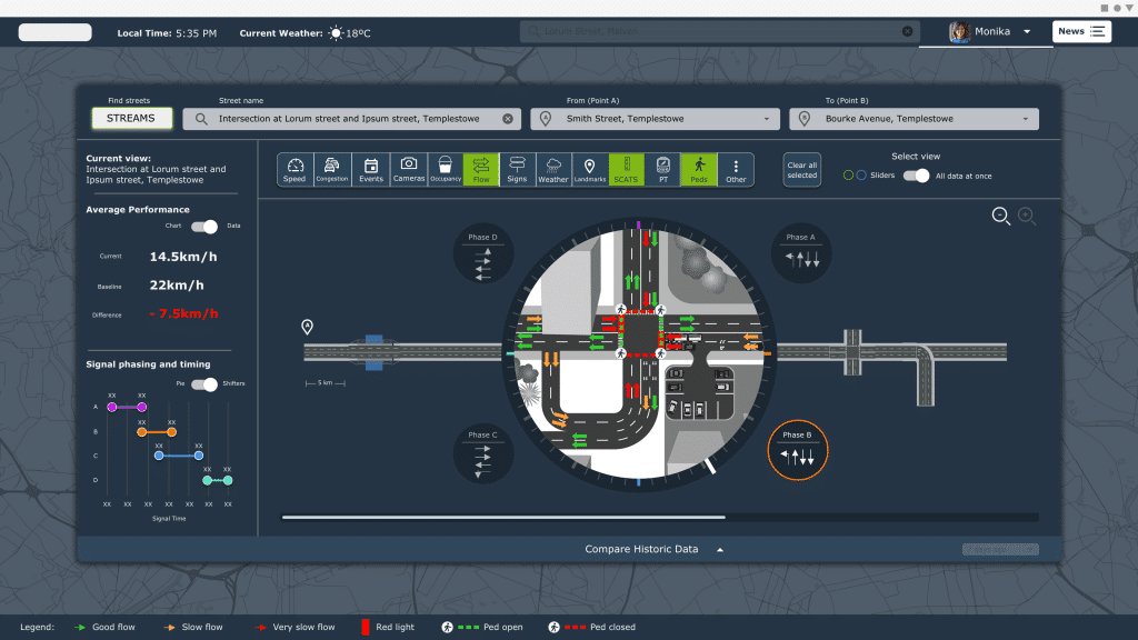
Traffic Management, IoT, and XAI Software Design
The Department of Transportation asked the Datalabs Agency to design a traffic management platform for its data. The result: a suite of interface designs showing the complexity of the road system and a way forward to optimize it at a systems level. See the future of transportation design…
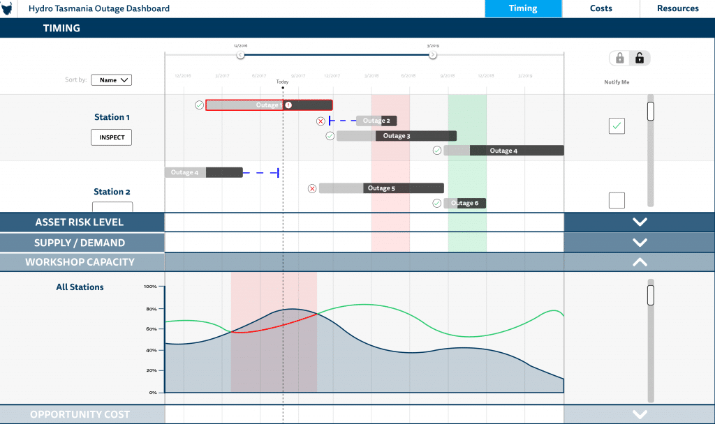
Hydro Tasmania Energy Portal
The Datalabs Agency was commissioned by the energy company, Hydro Tasmania, to prototype an asset and resource management tool, utilizing the best practices in UI and data visualization design
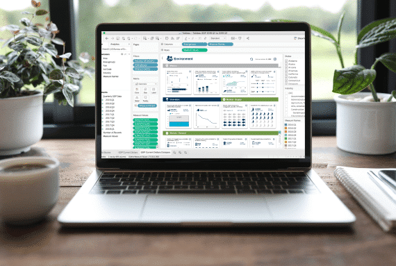
Walton Family Foundation Case Study
The team at Walton Family Foundation reached out to Datalabs seeking assistance with a series of Tableau dashboards, dashboards to present a series of metrics and KPIs on the environmental program for the foundation’s leadership team.
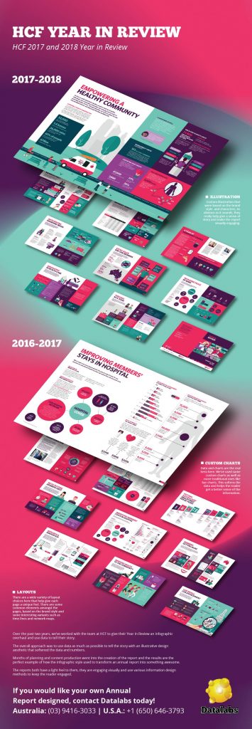

HCF Annual Report Case Study
A health care fund, HCF, asked the Datalabs Agency to design its Year in Review report and animated data videos, a suite of designs that included a video summary of two important reports.
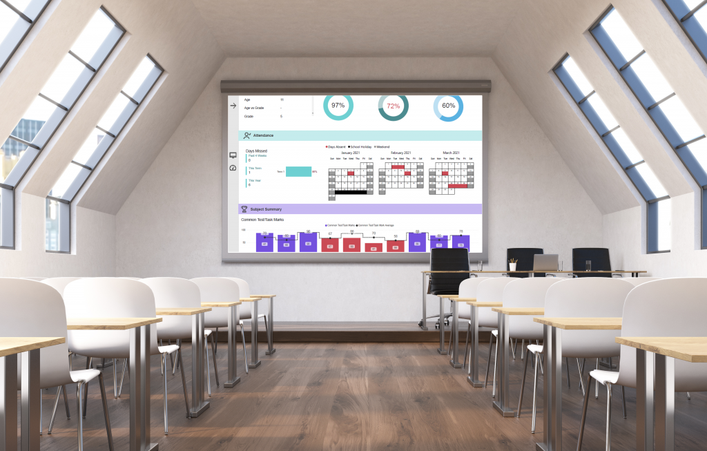
Dell Foundation Case Study
The fine folks at Michael and Susan Dell Foundation reached out to Datalabs with a unique Power BI design and development challenge. That was to re-design the education reporting system and migrate it from custom software to Power BI.
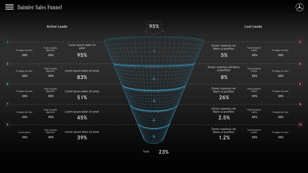
Mercedes-Benz Dashboards
A long-term client of the Datalabs Agency, Mercedes-Benz in Germany and Singapore trusted us to design and develop their Power BI dashboards, style guides, and BI framework.

UPS Online Workshop
UPS asked the Datalabs Agency to train its staff in the fundamentals of data visualization. Our agency facilitated a series of training workshops using their data and design guidelines to lift their thinking and skills to the next level.

Rabobank Data Visualization Workshop
The Dutch bank, Rabobank, hired us to train its staff in Hong Kong. We tailored our Introduction to Data Visualization & Storytelling Workshop to include agriculture data, Power BI design, and collaborative exercises.
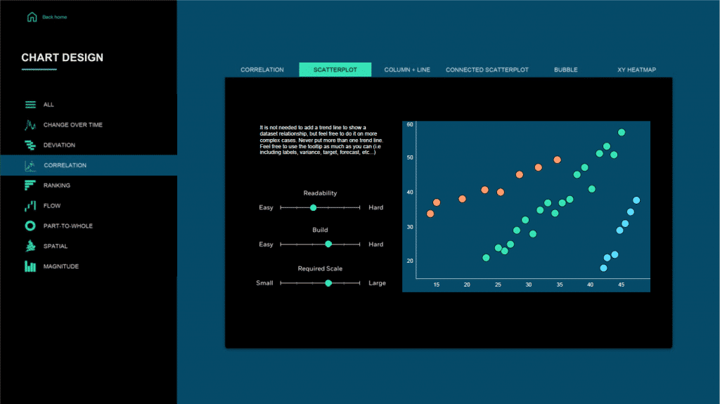
Tabcorp Tableau Style Guide Project
Tabcorp approached Datalabs to see if we could help them define a style for their business intelligence platform, Tableau. Here’s a peek inside…
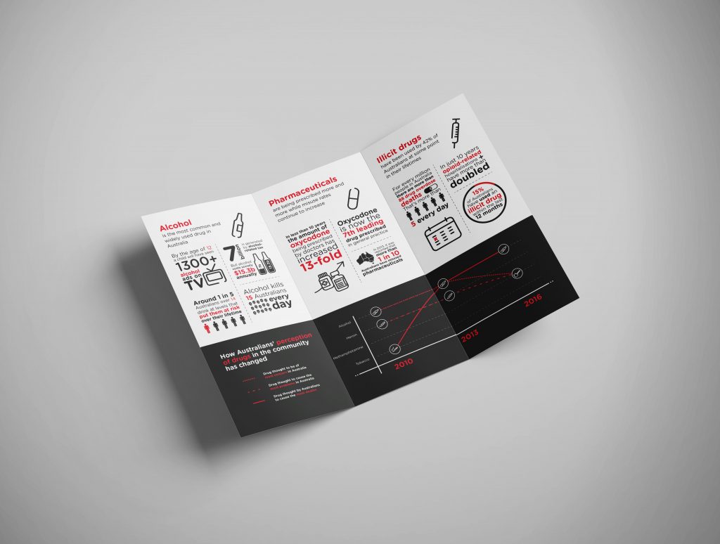
ADF Infographics & Animations Case Study
A beautiful suite of infographic reports and animated data videos designed with data-driven graphics, icons, and illustration for our client the Australian Drug Foundation.
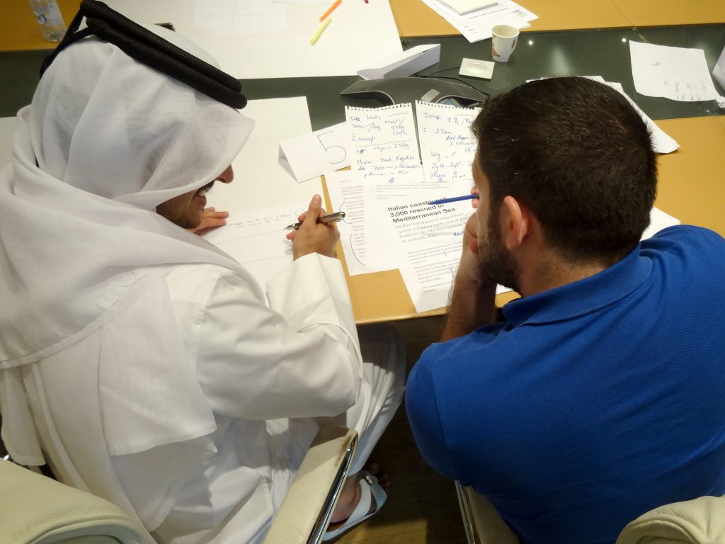
Al Jazeera Infographics Workshop Case Study
Two days with Al Jazeera journalists, producers & designers in Doha, Qatar talking about infographics, data, and their process in creating data-driven motion designs for their broadcasts.
SEEK Employment Data Microsite Case Study
A case study of SEEK Australia’s Laws of Attraction Interactive Microsite, showcasing employment data from Australia, Hong Kong, Singapore…
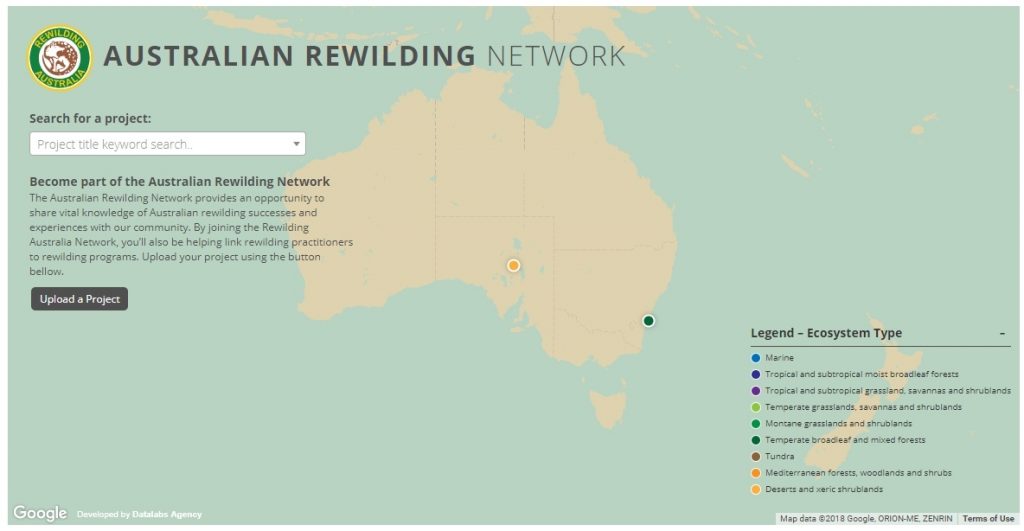
Case Study: Rewilding Australia Project Map
With an interactive map now live on their website, Rewilding Australia has increased the amount of interactive media on its site tenfold. Check out the cartographic experience.
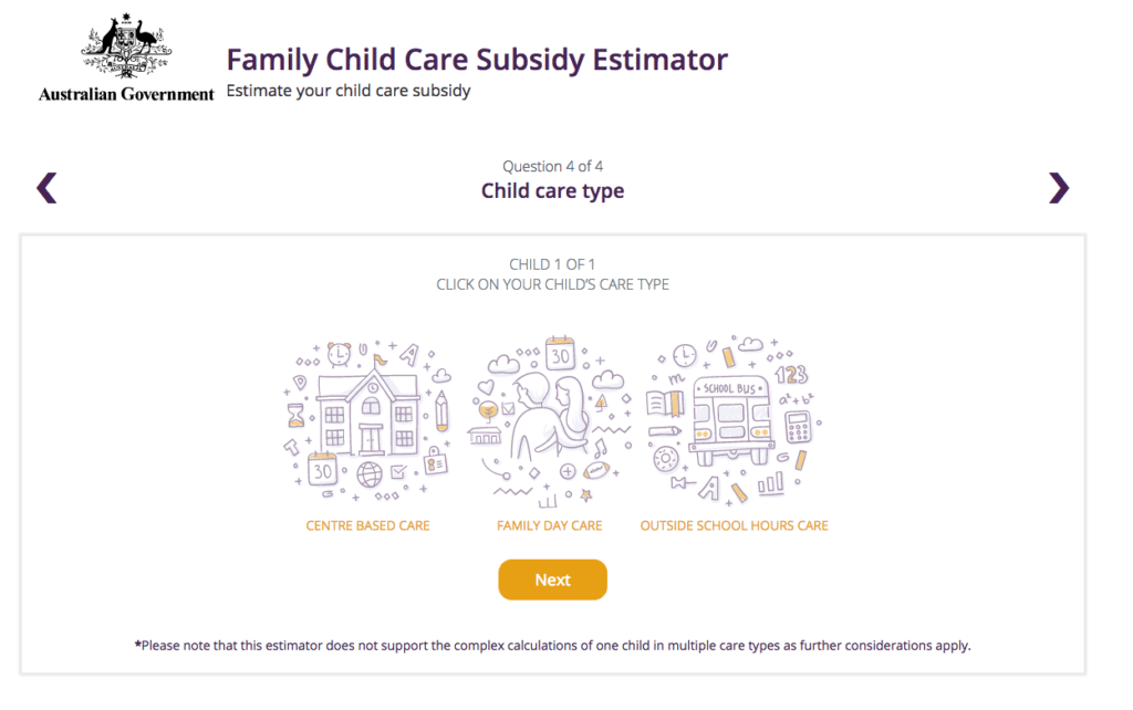
Department of Education and Training Child Care Subsidy Estimator
The Datalabs Agency was engaged to help Australia’s Department of Education provide a clean and simple user interface in which parents and carers of children could estimate the amount of money they may be entitled to receive.
Case-study: Intranet Dashboard Design for Nestlé
Nestlé’s aim was to develop an easy-to-use, visually engaging experience that would help to make Nestlé employees’ jobs easier, and therefore, more enjoyable. The Datalabs Agency designed and developed a fun Intranet portal in response.
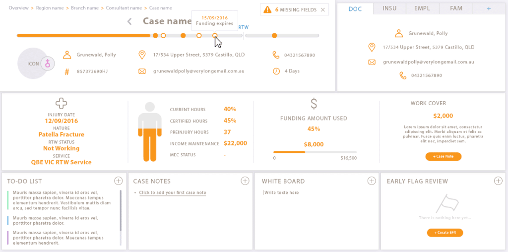
Interface Design Case Study
Our client engaged Datalabs to design a best-in-class dashboard and user interface for their frontline staff’s main workstation. Check out the infographic look in this data visualization case study.
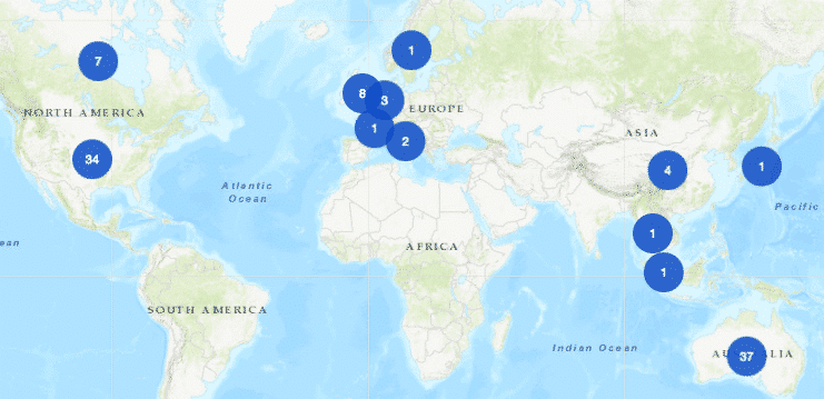
University of Melbourne Map Project – A Case Study
The Datalabs Agency was commissioned to turn the list of the University of Melbourne’s partners and connections around the world into an interactive map that would sit on the home page of their site.
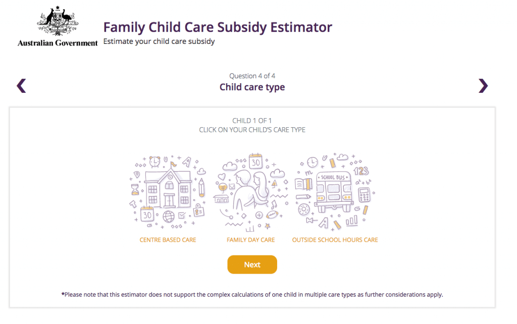
Department of Education & Training Case Study: Interactive Calculator
The Department of Education and Training needed a clean and simple user interface to assist in the communications strategy for the Australian Government’s New Child Care Package. This interactive tool was a hit with parent’s in need of some numbers.
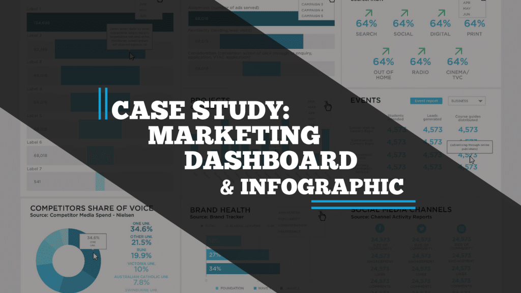
Case-study: Victoria University Dashboards & Infographic Reports
A case study on a Tableau dashboard, infographic and data design project for the marketing team at Victoria University.
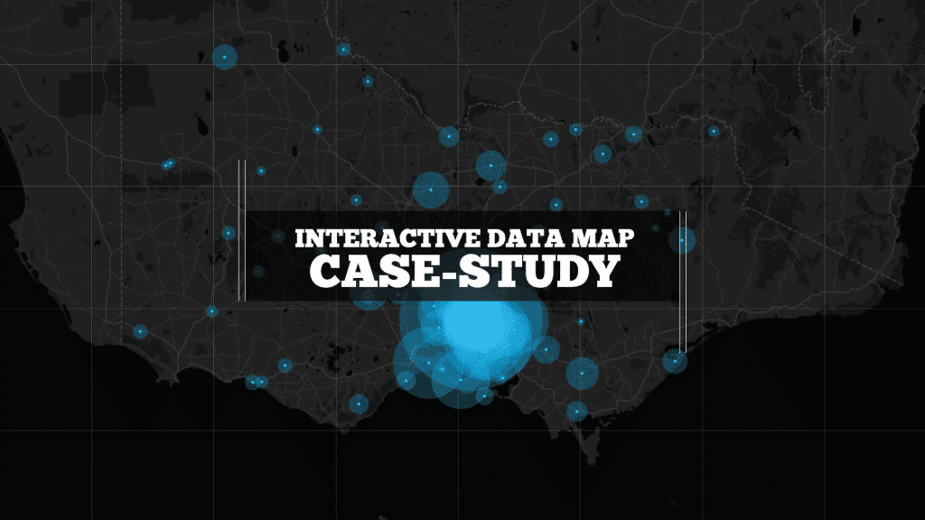
Case Study: Interactive Data Map
We built this interactive map as a use-case for interactive/explorable maps. It’s UI and easy-of-use is a case study of how data visualization can make better sense of geographical data. Certainly better than a table in a spreadsheet!
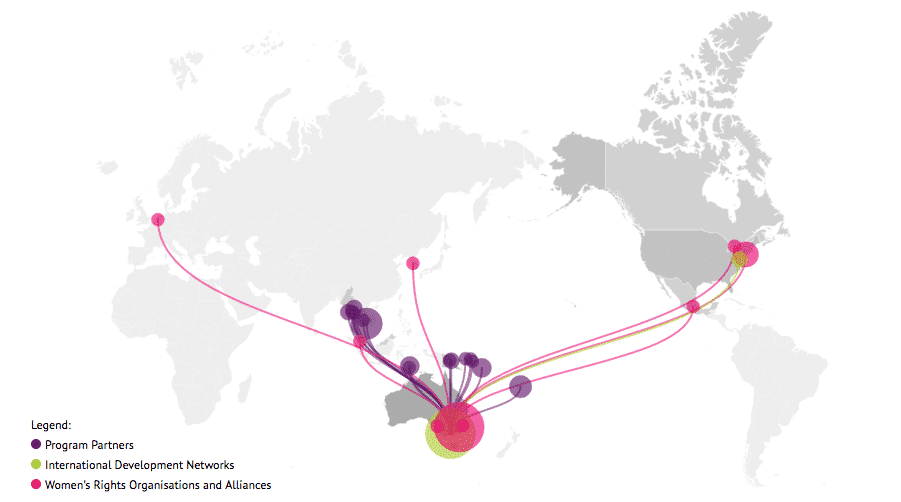
Case study: International Women’s Development Agency Map
Looking for what data visualization can do for your website? Check out this live example of an interactive map developed for International Women’s Development Agency.
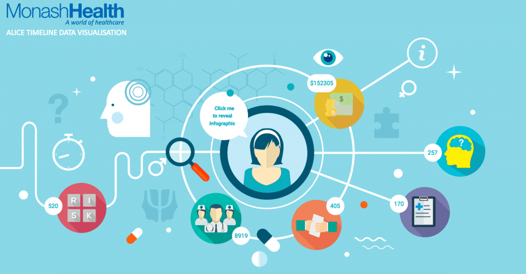
Case Study: Monash Health Interactive Timeline Tool
Monash Heath wanted a time-based interactive data visualization to show the pathway of a patient’s journey through the healthcare system. We used Adobe Illustrator, Excel, HTML, JavaScript, and CSS to come up with this digital experience.
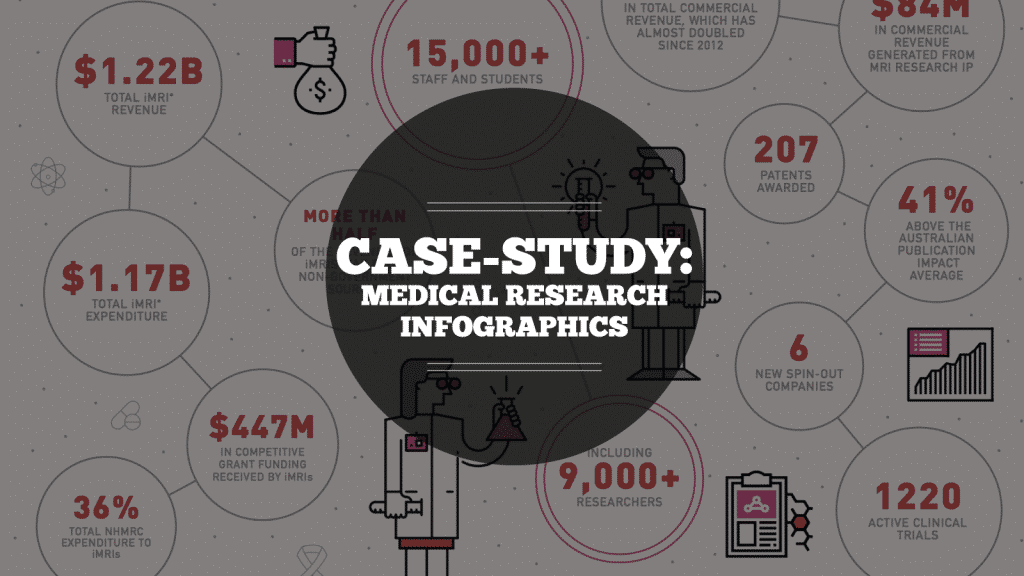
Case Study: Medical Research Infographic
Case Study: Medical Research Infographic Who: Association of Australian Medical Research Institutes What: Summary Report Infographic When: August 2016 Why: The team at the Association of Australian Medical Research Institutes
Infographic Case Study
A large Australian and New Zealand food manufacturer engaged Datalabs to visualize a set of survey results undertaken by their human resources department and an external consultancy. The result was this visually engaging infographic.

Case Study: IWDA Annual Report Microsite
Considering going digital with your annual report? Do it! Here’s an example of what interactivity and a non-profit organization’s ‘year in numbers’ looked like after they ditched paper and went digital.
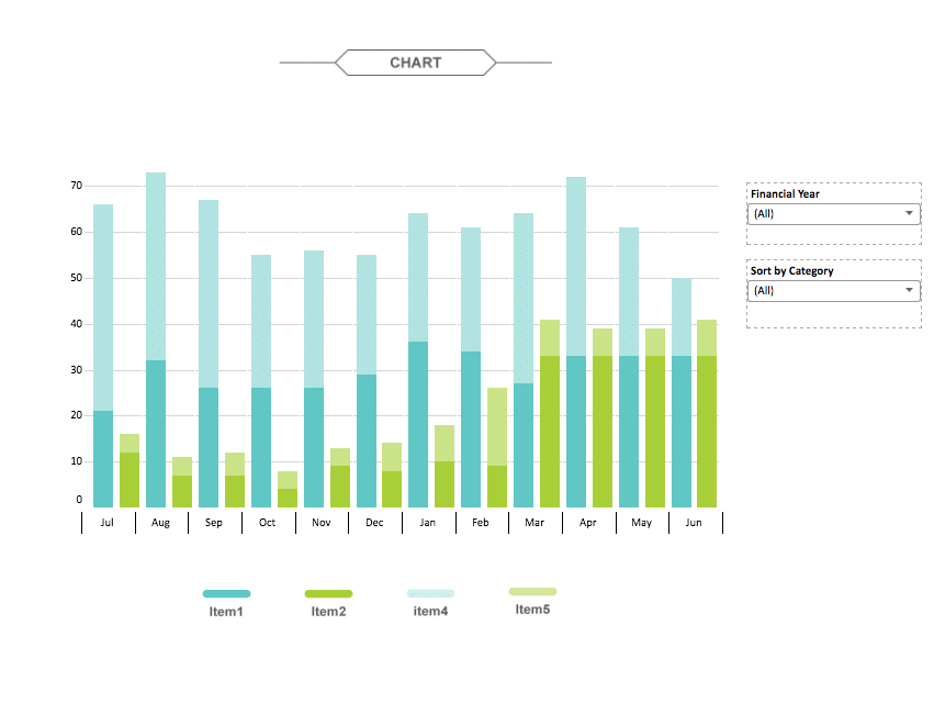
Pillar Superannuation Tableau Dashboard Report
The aim for this project was to create an interactive dashboard, utilizing Tableau, to convey the data that had been collected over the financial year. Check out this financial firm’s reporting suite.
- Data Visualization Training
- Brand Guidelines for Data
- Online Courses & Products
We noticed you're visiting from Australia. We've updated our prices to Australian dollar for your shopping convenience. Use United States (US) dollar instead. Dismiss

IMAGES
VIDEO
COMMENTS
This chapter explores some interesting case studies of data visualizations. Critiquing these case studies is a valuable exercise that helps both expand our knowledge of possible visual representations of data as well as develop the type of critical thinking that improves our own visualizations.
Visuals allow data scientists to summarize thousands of rows and columns of complex data and put it in an understandable and accessible format. By bringing data to life with insightful plots and charts, data visualization is vital in decision-making processes.
Effectively designed data visualizations allow viewers to use their powerful visual systems to understand patterns in data across science, education, health, and public policy. But ineffectively de...
Using data visualization, I designed 20+ charts, maps, and graphs to help readers unravel the information that GitHub data scientists collected. In this data visualization case study, I explain my design process, showcase the website I helped to create for GitHub’s Octoverse, and share key learnings from the project.
Data Visualization with Tableau: 4 Best Case Studies to Know. Discovering the commercial benefits with data visualization. DRL Team. AI R&D Center. 22 Apr 2021. 8 min read.
All the visualisation case studies below were developed by researchers at the DSI or DSI Academic and Affiliate Fellows. Visit how to book the DO to see some of the visualisations first hand!
See the potential that creative design and storytelling can bring to data. These data visualization case studies span Australia, the United States, Europe, the Middle East, and Asia.