

How to Craft an Outstanding Case Study for Your UX Portfolio

Writing case studies for your UX portfolio can feel opaque and overwhelming. There are so many examples out there, and often the ones that make the rounds are the stunning portfolios of top visual designers. It can be inspiring to see the most beautiful work, but don’t let that distract you from the straightforward format of a good UX case study.
At the core, a UX case study relies on excellent storytelling with a clear, understandable structure . This article breaks down the anatomy of a UX case study to help you tell a simple and effective story that shows off your skills. We’ll start with some general guidelines and structure, then break it down one piece at a time:
UX portfolio overview
What is a ux case study, general guidelines, how to structure a case study, how to fill in the details, defining the problem, understanding your users, early or alternate ideation, final design solution, next steps and learnings.
- Final thoughts
1. Before we get started
Before we dive into all the art and science of the case study, here’s a quick refresher on what a job-winning UX portfolio looks like. In this video, pro designer Dee analyses various design portfolios to pick out what works—and what doesn’t:
Simply put, a case study is the story of a design project you’ve worked on. The goal, of course, is to showcase the skills you used on the project and help potential employers envision how you’d use those skills if you worked for them.
A case study is typically written like a highly visual article, with text walking readers through a curated set of images. Curated is an important word here, because it should be short and sweet. It’s a chance to share what you want potential employers to know about your work on this project.
With that in mind, case studies are really a UX designer’s secret weapon in two ways. First, they get you in the door by showing more about your work than a resume and a top UX cover letter ever could. Another benefit is that they’re really handy in job interviews. If someone asks about a past project, you can walk them through the case study you’ve already created (this is sometimes a requirement anyway).
I mentioned that UX case studies are about storytelling. I’d actually say they’re about stories-telling, since they need to tell two intertwined stories .
The first is the story of your project. This answers questions like what problem you solved, who your users were, what solutions you explored, and what impact they had.
The second story is about you as a designer and your process. This is more about which methods you chose to use and why, how you worked within constraints, and how you worked as a member of a team (or without one).
So what are the steps for an effective case study? Well, like most things in design (and life), it depends. Every case study will be different, depending on what stories you’re telling. The six-part outline below, though, should guide you through an effective format for any UX project story. Here’s the outline (we’ll dive into each component in just a minute):
- Defining the Problem
- Understanding your Users
- Final solution

It’s worth it to add a few general notes before we dive into each of the list items above. For each section, include 1-2 short paragraphs and an image of a deliverable that visually tells the story your paragraphs explain. A reader should be able to either just read or just look at the images and roughly get what this moment in the story is communicating.
When choosing images to include, focus on quality over quantity. Choose your best deliverables for each stage and briefly relate them back to the larger narrative. It can be tempting to overload the page with everything you created along the way, but these extra details should stay in your back pocket for interviews.
Lastly, make sure your case study is scannable . In the best of circumstances, people don’t read word for word on the web. Make sure your text is reasonably concise, use headers and strong visual hierarchy, and use bullet points and lists when possible. If you need a refresher on how to achieve this, check out our guide to the principles of visual hierarchy .
Ok, let’s take a look at each step in a bit more detail.
2. Anatomy of a UX case study

Like any story, the introduction sets the stage and gives much of the necessary context readers will need to understand your project. This is one section where people actually might take some extra time to read carefully as they try to discern what this case study is about. Make sure they have all the details they need.
Some key questions to answer are:
- What is your company and/or product?
- What user problem did you try to solve?
- What was your role?
- What tools and methods did you use?
- What are the major insights, impacts, or metrics related to the project
After introducing the project, dive more deeply into the problem you tackled. You touched upon this in the introduction, but this section is an opportunity to make a strong case for why this project exists. Did a competitor analysis or market research demand a new product? Was there past user research in your company that suggests a needed redesign of the product?
Remember that you’ll want to create a through line in the narrative, so try to lay out the problem in a way that frames your design work as a solution.
Deliverables that work really well for this section would be:
- Analytics or usage data
- Market research of internal business metrics
- Survey results or interview highlights
After explaining the problem, show how it impacts your users and their interaction with your product. If you did original user research or you’re seeking user research-oriented jobs, sharing interview scripts, affinity maps , and spreadsheets can be useful in showing your process.
However, this section shouldn’t be only about your process. A key goal of this section is articulating who your users are and what their needs are. These findings should set up your design work that follows, so try to set up that connection.
A few types of the deliverables you might share here are:
- User personas
- Mental models
- Journey maps or customer experience maps
Keep in mind you want to communicate users’ key motivations and challenges, as well as any more specific user groups you identified.

This section can really scale up or down depending on what you have to show. Research shows that hiring managers don’t just want the final product , so it’s clear that showing some of your process is helpful. Especially for students or designers without a fully built product to show, this can be a moment for you to shine.
Don’t worry about the low fidelity of these documents, but the rougher they are, the more you’ll need to guide readers through them. Everything you show here should teach the reader something new about your process and/or your users.
Artifacts you might include are:
- Pen and paper or low fidelity digital wireframes
If you did early testing or faced constraints that determined your future design work, be sure to include them here, too.
This section should include the most final work you did on the project (e.g. wireframe flows or color mockups) and any final product it led to (if you have it). Be clear, though, about which work is yours and which isn’t.
Explain any key decisions or constraints that changed the design from the earlier stages. If you incorporated findings from usability testing, that’s great. If not, try to call out some best practices to help you explain your decisions. Referring to Material Design, WCAG, or Human Interface Guidelines can show the why behind your design.
If you’re able to show the impact of your work, this can take a good case study and make it outstanding. If your project has already been built and made available to users, have a look at any analytics, satisfaction data, or other metrics. See what you could highlight in your case study to show how your design improved the user experience or achieved business goals. Ideally, you can refer back to your original problem statement and business goals from the introduction.
If you don’t have any way of showing the impact of your project, lay out how you would measure the impact. Showing you know how to measure success demonstrates you could do this on future projects.
Lastly, conclude your case study by sharing either your next design steps and/or some key insights you learned from the project. This isn’t just fluff! No project is perfect or final. Showing next steps is a great way to demonstrate your thinking iterative approach (without having to do the work!).
Also, many companies do (or should do) retrospectives after each project to identify challenges and improve future processes. Use this process and the insights you gain from it to inform your case study. Letting employers know you’re capable of reflection shows humility, self-awareness, and the value you can bring to a team.
3. Final thoughts
Since each case study is a unique story you’re telling about your project, it’s a little art and a little science. But starting with the structure laid out in this article will show who you are as a designer and how you solved a problem. And those are two stories companies want to hear!
If you’d like to learn more about how to craft a great UX portfolio, check out these articles:
- 5 Golden rules to build a job-winning UX portfolio
- The best UX design portfolio examples from around the web
- The best free UX/UI portfolio websites to use
- Salary negotiation for UX designers
The Complete Guide to UX Case Studies
Updated: October 23, 2023
Published: August 21, 2023
Writing a UX case study can be overwhelming with the proper guidance. Designing for the user experience and writing about it in a case study is much more than writing content for a webpage. You may ask, “If my design speaks for itself, should I include a UX case study in my portfolio?”

Yes, you should include UX case studies in your portfolio. And here’s why.

You need to make your portfolio stand out among the crowd. A UX case study is a great way to do that. Let’s take a minute to define what a UX case study is and look at some examples.
Table of Contents
What is a UX case study?
The benefits of ux case studies, examples of ux case studies, tips for creating a ux case study.
UX portfolios are essential to showcasing UX designer skills and abilities. Every UX designer knows better designs bring better results. Sometimes, it’s easy to let the design speak for itself — after all, it is meant to engage the audience.
But, in doing that, you, as the designer, leave many things unsaid. For example, the initial problem, the need for the design in the first place, and your process for arriving at the design you created.
This is why you need to include UX case studies in your portfolio.
UX case studies tell a curated story or journey of your design. It explains the “who, what, when, where, and how” of your design. The text should be short and sweet but also walk the reader through the thinking behind the design and the outcome of it.
[Video: Creating a UX Case Study: Right and Wrong Way to Approach It]
There are many benefits to including UX case studies in your portfolio. Think of your UX portfolio as a well-decorated cake. The designs are the cake, and UX case studies are the icing on the cake— they will catch your audience's eye and seal the deal.
Take a look at the benefits of adding UX case studies to your portfolio.

Don't forget to share this post!
Related articles.
![Website Navigation: The Ultimate Guide [Types & Top Examples]](https://blog.hubspot.com/hubfs/ft-nav-bar.webp "ux case study meaning")
Website Navigation: The Ultimate Guide [Types & Top Examples]
![What Is End-User Experience Monitoring? [+Tips For Implementing It]](https://blog.hubspot.com/hubfs/end-user-experience-monitoring.png "ux case study meaning")
What Is End-User Experience Monitoring? [+Tips For Implementing It]

What Is GUI? Graphical User Interfaces, Explained

Horizontal Scrolling in Web Design: How to Do It Well

UX Accessibility: Everything You Need to Know

Your Guide to Creating UX Problem Statements

UX Prototyping: Your Complete Guide

The Chrome UX Report: How to Use It to Improve Your Website UX

Building Your First-Time User Experience: How to Get It Right

Perfecting Your Digital UX Design — The Tips You Need to Know
3 templates for conducting user tests, summarizing UX research, and presenting findings.
CMS Hub is flexible for marketers, powerful for developers, and gives customers a personalized, secure experience
How To Write a UX Case Study in 5 Steps

The first day I sat down to write a UX case study, I had no idea what I was doing. I remember that I wanted to write about an app that I was using constantly, called MyFitnessPal. I had done a bit of research, but when I sat down, my mind went blank and I ended up writing a 900-word diatribe about the social aspects of the app.
To this day, I can’t believe I had the audacity to show anyone this case study. When I showed my friend, he just laughed at it.
“This is a Medium article,” he said, “not a case study.”
When you’re starting out as a UX designer , you know that you need case studies for your portfolio. However, there’s not a lot of concrete information out there on exactly what should be in a case study. People have different expectations for UX case studies, but I’ll give you the 5 basic elements they should all include.
{Resource}
A quick note—case study styles are like Thanksgiving turkey recipes: everyone has one and they all come out a little different, but in the end it won’t ruin the holiday meal. As long as your case study is all meat and bone with no wasted space, it’ll be fine.
Step 1: Define the Scope
Ideally, the first paragraph should tell the reader what you’re planning to talk about. You may want to highlight a problem, show off a stunning design, or highlight a change.
Step 2: Define the problem
Readers of your case study want to see the problem clearly defined. An issue that new UX designers have often is identifying that there is a problem but not identifying the problem itself. A common bad statement might be something like “this app is frustrating for users and they have a high bounce / uninstall rate.” A better statement is something like “users have trouble accessing and understanding their account overview, and navigation to and away from this page is buried in menus.” This outlines the problem clearly and sets you up to solve it concisely over the next few paragraphs. If you’re designing an app from scratch, this section should talk about what problem you are hoping to solve, and why your solution is the cleanest and most effective one.
Step 3: Define the Audience
Not every app is for everyone. An easy example is something like Blind, which is a forum app designed for tech professionals, particularly engineers, to discuss work life at their jobs. Being designed for tech professionals means that it doesn’t have to necessarily be awe-inspiringly beautiful with jaw-dropping animations. It can be austere, and even a bit spartan since the people using it are working in a heavily analytical industry. Even the job posting section of their website is just an Airtable.
Understanding your target audience for a product will make analyzing the success of that product much simpler, as design, copy, and architecture should all work together cohesively.
Step 4: Solve the problem
There are several ways to do this in a single section, but generally, this should be a paragraph or two outlining A) what your solution for the problem is, and B) how you arrived at the solution to this problem. Both are vital to include. An easy way to start is to write something like “I decided to solve this problem by taking these actions,” before outlining the actions you recommend.
Step 5: Show your work
I’m an ignoramus, so algebra never came easy to me. I especially hated when I would arrive at the right answer and be asked to show my work. What does it matter how I got there? I got the correct answer, didn’t I? Let me be the Algebra II Top Gun of this school and leave me alone.
Unfortunately, in design case studies showing your work is necessary, and this is where you get a chance to show your UX design process . How did you arrive at this solution? What steps did you take to ensure that you were being circumspect in your reasoning? You can’t be the Diogenes of UX, hanging out in the middle of the agora shouting dichotomies and hoping someone listens. You have to walk the reader through each step of your thought process.
This is where you get to show off your screens, your prototyped animations, your Tableau repositories, your Typeform and Google Sheets research, your pivot tables, Miro flowcharts, Hotjar heat maps, and beautifully animated PyViz scatter charts. This is where you get to blow your reader’s mind.
Take a look at the case study example in Derrick's profile , one of the Verified Designers on Uxcel.
A quick tip: Head over to Coolors or Adobe Color and pick out a nice cohesive palette to put all your research in. This is an easy way to ensure that it doesn’t confuse the reader (wait, red is good now?) and looks clean and consistent.
Writing a UX case study is incredibly important to your career path, especially when first starting out. However, by ensuring that you have every necessary step in your case studies, you can create beautiful qualitative and quantitative research and design that blows your readers’ minds and lands you your dream job. Happy hunting!
Frequently Asked Questions
Become a UX Design professional with our interactive, self-paced career path and break into a booming industry.
Upskill your design team effectively
Equip your design team with the best-in-class design training that sticks.
Do you know your design team skill level? Send them this quick test & see where their skills stand among 300K+ designers worldwide.
Level up your design career
Get step-by-step guide how to build or advance your UX design career.
Do you know your design skills level? Take a quick test & see where you stand among 300K+ designers worldwide.
Continue reading
12 best ux portfolio websites & builders to use in 2024, 8 tips for onboarding your new ux designer, 11 inspiring ux design portfolio examples & why they work, cookie settings 🍪.
- Interactive UX learning for all levels
- 20+ UX courses and career paths
- Personalized learning & practice
Design-first companies are training their design teams. Are you?
- Measure & identify team skill gaps
- Tailor learning for your team’s needs
- Unlock extensive learning library
- Visualize team growth over time
- Retain your designers
Boost sales on your landing page with Crazy Conversions
Inspiration
How to Write a UX Case Study: A Simple Step-by-Step Guide
Learn the step-by-step process of writing a compelling UX case study that will elevate your online portfolio

As a digital product designer, one of the most effective ways to showcase your skills and expertise is by creating a compelling UX case study for your online portfolio.
A well-crafted case study not only demonstrates your design process but also highlights your problem-solving abilities and the value you bring to the table.
In this blog post, we'll briefly touch on what a UX case study is, we'll then walk you through the essential steps how to write a UX case study that will impress potential clients and employers.
Let's get started!
What is a UX case study?

A UX case study is like a story that designers tell to explain how they solved a design problem.
It's a way to show others how they researched , planned, and created a digital product or experience that is user-friendly and effective.
It includes details about the project's goals , the people they designed for, the steps they took, and the final design they came up with.
A UX case study helps designers demonstrate their skills and expertise in making things easy to use and enjoyable for users.
It's a friendly and simple way for them to share their design journey and showcase their problem-solving abilities.
Video on how to write a UX case study:
8 simple steps to creating a ux case study:, 1. choose the right project:.

Selecting the right project for your case study is crucial. Aim for a project that best represents your skills and aligns with the type of work you want to attract. It should be a project where you had a significant impact and can showcase your problem-solving abilities and design thinking process effectively.
2. Define the Problem:

Start your case study by clearly defining the problem you were trying to solve. Explain the context, the pain points, and the goals of the project. Highlight the challenges you faced, as well as any research or data that supported your problem identification process.
3. Describe the Research and Discovery Phase:

In this section, describe your research methodologies, including user interviews, surveys , and competitive analysis. Share insights you gained from your research and how they influenced your design decisions. This demonstrates your ability to empathize with users and make informed design choices based on their needs.
4. Outline the Design Process:

Present your design process in a structured and coherent manner. Include wireframes , prototypes, and iterations that show the evolution of your design. Explain the rationale behind your design decisions and how they addressed the identified problem. Be sure to highlight any user testing or feedback loops that helped refine your solution.
5. Showcase the Visual Design:

This section is an opportunity to showcase your visual design skills. Include high-fidelity mockups or screenshots that highlight the aesthetics, typography, color schemes, and overall visual appeal of your design. Explain the reasoning behind your design choices and how they enhance the user experience .
6. Present the Final Solution:

Describe the final solution you arrived at and how it effectively addresses the initial problem. Include metrics or key performance indicators (KPIs) to demonstrate the success of your solution. Whenever possible, provide real-world results , such as increased user engagement, improved conversion rates , or positive user feedback.
7. Reflect and Share Learnings:

Take a moment to reflect on the project and share any lessons or insights gained during the design process . Discuss what worked well, what challenges you encountered, and how you overcame them. This demonstrates your ability to learn and grow as a designer.
8. Present the Case Study Effectively:

Pay attention to the presentation and formatting of your case study. Use clear headings, subheadings, and bullet points to make it easy to read and skim. Include relevant visuals, such as images , diagrams , and charts, to enhance the visual appeal. Make sure your case study is concise, engaging, and aligned with your personal brand.
Frequently asked questions on how to write a UX case study:

Why are UX case studies important?
UX case studies are important for several reasons. They provide insights into the design process , showcase a designer's skills and abilities, and demonstrate how user-centered design principles were applied to solve a specific problem. They are also useful for sharing knowledge, building credibility, and securing job opportunities.
How long should a UX case study be?
The length of a UX case study can vary depending on the complexity of the project and the information you want to convey. However, it's generally recommended to keep it concise and focused, aiming for a length of 800 to 1,500 words. Including visual elements like images , diagrams, or prototypes is also encouraged to enhance understanding and engagement.
What are some tips for creating an effective UX case study?
Here are a few tips to create an effective UX case study:
Clearly define the problem: Start by clearly articulating the problem statement and why it is important to address.
Show the design process: Walk through the design process, highlighting key decisions, iterations, and insights gained along the way.
Include visuals: Incorporate visual elements like wireframes , prototypes, and user interface designs to provide a visual context and make the case study more engaging.
Share the impact: Demonstrate the impact of your design solution by including user feedback, success metrics, or before-and-after comparisons.
Be concise and organized: Keep the case study concise and well-structured, making it easy for the reader to follow your thought process and understand the project's evolution.
Tailor it to the audience: Adapt your case study to the audience you're targeting, focusing on aspects that are most relevant and impactful to them.
Can I include confidential or proprietary information in a UX case study?
It's generally advised to avoid including confidential or proprietary information in a public UX case study. If you need to showcase sensitive information, consider anonymizing or obfuscating the data to protect the privacy and confidentiality of the individuals or organizations involved. Always respect any non-disclosure agreements or intellectual property rights you may have signed.
Should I include negative feedback or challenges faced in a UX case study?
Yes, it's important to be transparent about the challenges and obstacles encountered during a UX project. Including negative feedback or hurdles you faced demonstrates your ability to navigate difficulties and adapt your approach. Highlighting how you addressed and overcame challenges can also provide valuable insights into your problem-solving skills and resilience as a designer .
Can I use visuals created by others in my UX case study?
If you use visuals created by others, such as stock photos , icons , or illustrations , make sure you have the necessary permissions and licenses to use them in your case study. It's important to respect copyright laws and intellectual property rights. When in doubt, it's best to create your own visuals or use resources that are explicitly licensed for free or commercial use.
How should I present my UX case study?
UX case studies can be presented in various formats, depending on the context and requirements. Common formats include a written document, a slide deck presentation, or a web page . Consider the needs of your audience and the platform where you plan to showcase your case study. Ensure it is well-organized, visually appealing, and easy to navigate , allowing the viewer to understand your design process and the outcomes clearly.
Writing a compelling UX case study is an essential skill for any digital product designer.
It allows you to showcase your problem-solving abilities, design process, and the impact you have made on real-world projects.
By carefully selecting the right project, highlighting your research and design decisions, and presenting your case study effectively, you can create a captivating narrative that will impress potential clients and employers.
Remember, a well-crafted case study is not just a reflection of your design skills, but also an opportunity to tell a compelling story about your expertise and approach to UX design.

Boost sales in 30 days or your money back
Introducing Crazy Conversions, the powerful playbook helping founders unlock sales on their landing page
Boost my sales now $29

5/5 stars on Gumroad
You may also like

The Anatomy of High Converting Landing Pages

User Interface Design: The Ultimate Guide for Beginners

Optimize Conversion Rates Like a Pro: 20 Expert Tips

Product designers
Get inspiration, resources and knowledge sent to your inbox.
One email per week
Easy unsubscribe
Inspiration, resources and knowledge for digital product designers
Bookmark CursorUp: ⌘ + D
Design Folio Firestarter
Crazy Conversions
Suggest inspiring site
Suggest a resource
Advertising
- Portfolio Tips
- Career Tips
- Portfolio Examples
- Get UXfolio!
The Ultimate UX Case Study Template

Having a template to follow is the biggest help in UX case study writing. Even more so, if you’re a junior who doesn’t have much experience with portfolios. A template can help you plan, organize your thoughts while showing you the light at the end of the tunnel.
The UXfolio team reads hundreds of case studies every month. What we’ve found is that successful UX case studies have a similar structure. In this article, we’ve distilled this formula into a flexible UX case study template and some practical tips that you can use to polish your case studies!
About UX case studies in general:
Before you get to work, we need to clarify a few important details. Doing so will help you understand the expectations and the purpose of UX case studies:
What are UX case studies?
UX case studies are a form of professional content that mixes text and visuals to present the design process of products or product features. They make up UX portfolios, alongside optional pages such as ‘About Me’ or ‘Contact’.
How are they different from UX portfolios?
UX portfolios are made of UX case studies. Think of your portfolio as a folder that holds together your case studies. Back in the day, these used to be printed, book-like documents. Nowadays the industry prefers websites and other digital formats .
How are they different from resumés?
Your resumé lists your skills and work experience. Meanwhile, your portfolio uses case studies to showcase how you apply those skills and experience . Ultimately, you’ll need both to land a job.
How many case studies should be in a portfolio?
If you’re a junior UX designer , you should include 2-3 case studies in your portfolio. These could describe UX bootcamp assignments, re-design concepts, UX challenges , internship projects , or even fictional products. If you’re a medior or senior UX designer, write up 4-5 of your most impressive projects into case studies. Your goal should be to feature as many of your skills as possible. And remember: quality over quantity.
What to feature in your UX case studies?
Since your career depends on your UX portfolio, there’s a lot of pressure that comes with putting one together. Usually, it’s this pressure that numbs designers and leads to procrastination. But just setting straight what lays ahead will help ease your mind:
The story of your design
Design decisions, visuals with explanations.
This might sound very esoteric, but it’s really not. For every design, there was at least one problem that required a solution. You were the person who explored the problem and found the solution/solutions. There might have been moments when the whole thing went off-rails, or when you needed to go back to the drawing board. Those are all part of your design story.
Now, imagine that a friend, peer, or colleague asks you about a project. How would you talk about it? That’s almost exactly what you should put in your case studies. Just polish it a bit, leave out the curse words, add visuals and you have a case study.
Throughout the design process, you keep making decisions. Choosing a UX method to apply is a decision too, and there’s a reason why you chose it. Your UX case studies need to highlight these decisions and their contribution to the design.
The biggest mistake in UX case studie s is when UXers go on defining instead of explaining:
- Definition ➡️ “I proceeded to do an in-depth competitive analysis to find out more about competing apps in the same category.”
- Explanation ➡️ “I proceeded to do an in-depth competitive analysis to make a list of features that were missing from our products, check out how others solved the XY flow, and find out how could we improve on it in our solution.”
Then you’ll move on to explain what you’ve found and as your case study progresses, you reference those findings.
You need to be heavy-handed with your visuals when you’re creating UX case studies. Using images alongside your text will help your readers’ comprehension. So, as a first step, collect everything you can: photos, sketches, whiteboard grabs, graphs, personas, screenshots, wireframes, user flows, prototypes, mood boards, notes, and so on.
We’ve seen some creative UXers use screenshots of calls (with blurred-out faces), group photos, and prototypes of all fidelity. Such visuals help us understand what we’re reading about. But they also build an image in our heads of the designer behind the screen, which can be very powerful and memorable.
Some designers are already in the habit of keeping every scrap of paper with a scribble on it because they know that when it comes to writing a case study, you can’t have enough visuals. Follow their example to make your easier – your future self will thank you.
But it’s not enough to just throw some images into a case study. Here’s how you can make them impactful:
- Always give context ➡️ if you put that stunning photo of the wall with post-its into your case study, make sure that you place it in a section where you explain what’s happening on it (see design decisions) or give it a caption that explains it. The important thing is that visuals will only work if they are strategically placed or they come with an explanation.
- Strive for visual consistency ➡️ even if it requires some extra work, you should make sure that your visuals match each other. Yes, a persona and the user flow might not be close to each other on your layout, but they’re still in the same document so they need to have consistent styling. Believe me, this is a common criticism from design leads and HR folk as well.

How long should be a case study?
If you check a site like Behance, you’ll find that most UX projects there are rather short. Usually, they focus on the visual aspects of design, aka UI. That is a fantastic starting point for a case study. But for UX design, you will need to add some content for context.
The good news is that you don’t need to write essays for case studies. All it takes is around 500 words and some well-optimized visuals. You should never stretch your words because it’ll reflect poorly on your presentation skills.
Also, treat this number with flexibility: If the project at hand justifies it, feel free to go above or below that. Usually, when a case study is very long, it’s because the project itself was more complicated.
What’s the point of UX case studies?
1. applied designer skills.
It’s one thing to learn a skill and it’s another to use it in a way that can help drive numbers for a business. A great UX case study will prove that you are capable of applying your skills and delivering a solution even with all the distractions and obstacles that come with real-life scenarios.
2. Presentation skills
Many UXers forget about the skills that are required beyond UX. Just read a few UX designer job descriptions , and you’ll find that advocating for design best practices is one of the most common requirements.
As a designer, you’ll have many stakeholder meetings and you’ll need to present your or your team’s ideas. And the fate of those ideas might depend on the way they’re presented. Therefore, the way you articulate your thoughts is important. A great UX case study will show that you are great at structuring your thoughts and articulating complex concepts.
3. The impact of your design
You can see in our UX case study template that there’s a separate section for showcasing your impact. If you can prove that your design can drive numbers, you’re set. This is the single most powerful tool that you can use in a case study: before-and-after analytics, such as an increase in checkouts, increase in finished flows, better CTRs, user feedback, etc. Use whatever number you have to show that your design contributed to the business. It’ll convince even the UX-doubters.
Obviously, as an aspiring/junior designer , this might be impossible, so you need to be a bit more creative. We advise you to show what impact the project had on you: what you’ve learned and how you’ve improved as a designer.
4. Navigating in a team
Almost every product is a collaborative effort between professionals from various disciplines: researchers, designers, developers, marketers, etc. Therefore, navigating in a collaborative environment is an important trait. A case study should show how the team influenced the design, how you’ve collaborated with other designers, the sacrifices that had to be made, and so on.
You don’t need an elaborate plan for this. First and foremost, make sure that you introduce the team in your case study. Second, ask for quotes/recommendations and include them in a neat quotes section. Yes, tooting your own horn can be a bit uncomfortable, but unfortunately, it’s part of the game.
5. Showcase of your taste
Yes, it’s UX, but the reality is that most people don’t care: if what you present doesn’t appeal to them, it’s unlikely that you’ll get the job. Make sure that your UX case studies are visually consistent. If you want to cast a wider net, strive for sleek, minimalist solutions and harmonizing colors.

A simple yet effective UX case study template
This is a tried-and-true UX case study template that can provide a structure to your thoughts. There are 6 chapters that are standard for almost any UX case study. However, the content of these chapters is highly dependent on the project you’re writing about. But don’t worry, this doesn’t mean that we’ll leave you on your own: for each chapter, we’ll give you various options and ideas to help you get going.
UX case study template/skeleton:
- Hero section
- Project overview
- Exploration/Discovery
- UX design process
- Final design
1. Hero section
All case studies should begin with a title & subtitle. You can use various formulas for your title, but we’ve found that this is the one that works the best:
- App name + project scope + project/case study = Netflix Checkout Redesign Project
Your subtitle can provide a glimpse into the project, for which you have various options:
- What’s the product about? (An app that helps you keep your plants alive.)
- What was the project about? (6-week UX design and research project)
If you want to include something visual in your hero section go hard or go home: use spoilers, aka show screens of the final design. You don’t have to fit everything there, just the parts you’re most proud of as an appetizer. Later in the case study, you’ll have enough space to showcase everything you’ve worked on.
- 2 sentences (titles), and
- 1 optional cover image.
2. Project overview
Make sure that your readers are prepared for what’s to come. Remember: they know nothing about this project, so you need to cover the bases:
- Product description,
- Team members,
- Project length,
- Methods used, and
- 3-4 sentences for the overview, and
- 4-5 bulletpoints for the small details.

3. Exploration/discovery
Now that we have all the background information, we can move on to how you’ve approached the issue you were presented with. This part usually includes:
- Competitive analysis,
- Interviews, and
Make sure that for everything you mention you answer at least these three questions:
- Why did you choose to do it?
- What did you find out?
- How did that influence your next move?
You can end this chapter with a wrap-up to create a smooth transition to the next chapter.
- At least 3-4 sentences for each method you’ve used,
- Visualize as much information as you can.

4. UX design process
Now that we understand the scope of the project, we’re eager to see how you went on to design a solution. You can achieve a great structure here if you start from more abstract ideas and move towards the final design:
- Wireframes,
- Prototypes,
- Iteration, and
- Validation.
Again, you need to answer a few questions for every step you made:
- What did you want to achieve by doing this?
- How did this step contribute to the final design?
- At least 3-5 sentences for every method you mention.
5. Final design
Probably the most exciting part of every UX case study is the reveal of the final design. In this section, you should explain
- Why did you choose this solution?
- What other solutions were in the run?
- Before-and-after screenshots (if relevant to the project).
There are two great options to present your final designs. The first is to use galleries. You can go with a nice carousel or a grid that follows a logical order. The second is to embed your Figma prototype. This has the added benefit of making your case study interactive, which makes for a more memorable experience. (Or you can combine the two for an even better showing.)
- 2-3 short paragraphs.

If you have numbers or analytics that show how your design contributed to business goals, you need to showcase them. This will make your case study even more impactful. You don’t need graphs and piecharts (unless you have the time to create some); it’s enough to make a list with the quantifiable data. If you don’t have access to such data , you can also include testimonials and user quotes to underline impact. If you can include both, that’s a winning combination.
- At least 1 sentence for each achievement.
- In a bulleted list or short paragraph.
6. Learnings
There’s something to learn even from the most boring project you’ve ever done. At least, you should strive to find something positive that can contribute to your growth as a designer. This can be a soft skill, a new tool, a new method, or a different way of cooperation. Try to think of things that were new to you in this project and share the takeaways with your readers. Alternative closures include:
- What would I do differently?
- Jobs to be done
- This chapter can be as long as you please, but
- At least 3-4 sentences.
Alternate UX case study templates
We’ve provided a classic UX case study template that has been proven to be working. Now, we’ll show you how you can alter this template for different flows:
UI focused case study template
If you’re strong in UI, you should not wait to reveal your final design until the end of your case study. You needn’t worry about spoiling the surprise as a case study is not a fiction novel or Netflix show. A beautiful design will pull in your readers. What’s more, if the company doesn’t really know the difference between UI and UX, this approach will make your case study even more impactful as it’ll start with the ‘beautiful stuff’.
Here’s how that template would go:
- Project Overview
- Transition to the next section by letting your reader know that you’ll explain how you’ve arrived at this solution.
- Exploration/discovery
- (Optional: Showcase even more of your final designs)
Impact driven case study template
Every product has a business behind it. And what you can do for that business is what matters to stakeholders. We can all conclude that a screen is pretty, but if it doesn’t contribute to business goals or KPIs, it’s just that, a pretty screen. So, if you have some numbers to share, don’t be afraid to put them right after your intro section. Then go on and showcase how you’ve achieved it:
- Share numbers then follow up by showcasing the design which contributed them:
Build your UX case studies with UXfolio!
UXfolio is a portfolio and case study builder made with UX designers in mind. It offers stunning, customizable templates as well as a case study generator with text and image ideas. What’s more, UXfolio comes with built-in device mockups, easy prototype embedding, and password protection on the portfolio or the case study level. Ready to work on your portfolio? Try UXfolio for free!
A rapid desktop prototyping tool

Mockplus - Design Faster. Collaborate Better.
Prototype, design, collaborate, and design systems all in Mockplus

Top 22 Stunning UX Case Studies You Should Know in 2022
An immersive yet well-structured UX case study helps UX professionals show off their design talents in portfolio websites, and let them communicate better with employers, designers and others easily.
However, as a UX designer , how can you write a perfect UX case study to easily get hired or communicate with others better?
Mockplus has handpicked 22 of the best UX design case study examples in 2022 to help you get inspiration, improve your portfolios and make your own things with ease. A step-by-step guideline about how to create a UX case study is also followed.
What is a UX case study?
A UX case study tells the story of how you create a great website or app and, in particular, what you do to improve the UX of the site. UX designers—newbies and experts alike—will often share a case study on a portfolio website as a great way to get hired. Just like sending a resumé.
So, it is a lot more than just a copy of everything you've done while designing the project. To really showcase your design talent and the breadth of your abilities, you need to make sure the following are all included:
- A full description of your role in the project;
- The biggest challenges you've faced;
- The solutions you've chosen, how you chose them and why;
- How you communicate and collaborate with others; and
- The outcomes and the lessons you’ve learned.
To this, you should feel free to add any further information that you think would help you stand out from the crowd.

It is also worth remembering that UX case studies are a good resource for UX design beginners to learn more practical design skills and to gain from the real experience of others in dealing deal with difficult or urgent problems.
22 Best UX case study examp le s you should learn
Whatever stage you’re at and whatever you are writing your case study for, these 22 top examples are bound to inspire you.
1. Perfect Recipe -UX design for cooking and shopping

Designer s : Marina Yalanska and Vlad Taran
Case Study : Perfect Recipe
This is a mobile application that enables users to search for food recipes and to buy what they need to cook different dishes.
Why d id we choose this one?
This case study illustrates the entire UX design process is very simple, plain language. Many aspects of the process are included, along with some really inspirational ideas, such as product personalization, challenges and solutions, animated interactions, and other interface details.
Extra tips :
This example is from the Tubikstudio blog, which is very popular among designers. It regularly shares different branding, UI, and UX case studies. We would strongly recommend that you follow this blog to keep yourself up to date with the latest and most creative case studies.
View details
2. GnO Well Being - Branding, Web Desing & UX

Designer : Marina Yalanska and Olga Zakharyan
Case Study : GnO Well Being
This is a creative illustration website that presents and sells a weighted designer blanket that helps you get a good night’s sleep, the first step to good health and a better life.
Why d id we choose this ?
This example is so much more than a great UX case study. In addition to the UX design , it gives you insight into many more key design issues, such as the logo, custom graphics, website pages, interactions and so on. There are many ideas here that you could copy for your own projects.
3. Splitwiser - UI/UX case redesign

Designer : Chethan KVS (a Product designer at Unacademy)
Case Study : Splitwise
This is a concept mobile app that enables users to track and split expenses with friends. The designer has also given it another name, "Splitwise."
Why do we choose this ?
This case study shares the designer's insights into key design decisions, such as why he chose this product, why he decided to redesign the logo, how to improve the onboarding and other pages, how to optimize the user flow, how to balance all pages and functions, how to enhance UX through bottom bars, interactions, gestures, view modes, and more.
Everything is explained using intuitive images, earning it thousands of “likes”. This is a great example that is bound to help you write a stunning case study on redesigning UX.
This comes from a popular media channel called "UX Planet" that regularly posts examples of the best and latest UX case studies from around the world. Another great place to keep you up to speed with the latest UX designs.
4. Deeplyapp.com - UX & visual improvements

Designer : Sladana Kozar
Case Study : Deeplyapp
This is a health and self-care website app that helps users maintain mental well-being with meditations and exercises. This case study talks you through the design process of creating a user-friendly mobile app.
This case study focuses on improvements to the UX and visual features of this mobile app. Many aspects are included to help you understand it better, such as the design background, what to build, UI flow diagram, discoverability design, visual balance, and much more. A full set of app interfaces are presented for you to study as well.
You can also check out its Part 1 post for more details.
5. Talent Envoy - improving the recruitment process

Designer : Enes Aktaş (Experienced UX designer)
Case Study : Talent Envoy
Talent Envoy is an intelligent job assistant that helps users find their ideal job and get to all the way to signing a contract faster and more easily.
This case study firstly points out the biggest challenges and problems faced by job-seekers—the shortage of US recruitment markets. It then talks to you through the detail of how the designers optimized the recruitment process. You will also find information on the user research process, the UI flowchart design, the related wireframe and Sketch designs, the main page design, and more.
All the details have clear explanations and they offer a great example of how to use user research to solve problems and improve UI interfaces.
This one comes from another hot media channel called "Muzli" which shares the latest ideas, designs, and interactions about websites or website apps from all over the world. Don’t miss out on this site if you want to stay ahead of the curve.
6. My Car Parking - UI/UX case study

Designer : Johny Vino (Experienced UX and interaction designer)
Case Study : My Car Parking
This is a mobile app that can help people get parking slots easily even when they travel beyond their normal routes.
This is a masterclass in how to write a case study that is simple, well-structured, and easy to understand. Many intuitive lists and images are used to explain the design ideas and processes.
It has received “claps” from over seven and a half thousand people and is a perfect example of how to write a well-structured and easy-to-understand case study.
7. Parking Finder App - UI/UX case study

Designer : Soumitro Sobuj
Case Study : Parking Finder App
This is another concept mobile app that makes it easy for users to find parking slots even in big or overcrowded cities.
This case study is beautifully presented and gives a good presentation of the whole design process. It covers nearly all the issues that a textbook UX case study should have, such as problems and solutions, user-centered design, design strategy, user flow, information architecture , interface wireframes and visual designs, and much more besides.
It is one of the best examples we have found of a case study that really teaches you how to write the perfect UX case study.
8. Pasion Del Cielo - coffee ordering experience

Designer : Jonathan Montalvo (Senior Designer, Branding, UXUI )
Case Study : Pasión del Cielo
This is a concept project about a real local coffee shop in Miami.
This case study demonstrates effective ways to engage users with the Pasión brand and how a site can make it as easy as possible to turn page views into coffee sales.
There is a lot of analysis included to explain the entire design process, such as analyzing the competition, feature analysis, brand and interface improvements, and much more. Most important of all, many user personas have been created to evaluate and enhance the UX.
This is a good example to check for anyone looking to improve their own UX case study. Above all, it shows what can be done with rich images, bright colors, clear layouts, and well-crafted personas.
9. Workaway App - UX redesign

Designer : Rocket Pix (UXUI, web designer )
Case Study : Workaway App
This is a mobile app that provides international hospitality services; it helps users to contact each other to organize homestays and cultural exchanges.
This UX design case study explains how the designer redesigned the Workaway App to make it easier for users. Many intuitive charts (pie charts, flow charts, line charts), cards, and images are used to illustrate the ideas.
It is simple and easy to follow, and also a good example of how to create an intuitive case study with charts and cards.
10. Receipe App - UI/UX design process

Designer : Dorothea Niederee (UX, UI designer )
Case Study : Recipe App
This is a food app design offering inspirational recipes for anyone who wants to eat healthier.
This case study gives a clear demonstration of the entire UI/UX design process. Three user personas are defined to present different users' needs. Some colors, typography, and UI elements are also shared.
This is a good example of how to define a detailed user persona in your UX case study.
11. Hobbfyy - a social and discovery app UX design

Designer : Mustafa Aljaburi (UX, UI designer )
Case Study : Hobbfyy
This is a social and discovery app that makes it quick and easy to get everything you need for your hobbies.
This case study aims to show how to develop a site that will provide its users with solutions, in this case to get what they need for their hobbies. Beautiful images, a storytelling style, and special layouts are used to explain everything.
12. Bee Better - habit tracker app UX case study

Designer : Anastasiia Mysliuk (UX, UI designer )
Case Study : Bee Better
This is a habit tracker app that makes it easy for you to develop new useful habits.
This case study aims to solve problems associated with how we form and develop habits. It helps users find solutions and make habit formation more interesting; it motivates them to maintain their useful new habits. Many aspects of design, such as problems, solutions, the design process, discovery and research, user journey map, prototypes, and much more are illustrated and explained in simple language.
This would be a good example to follow if you are looking to create an easy-to-understand UX case study.
13.Sit My Pet - pet sitting app UX case study

Designer : Aiman Fakia (UX, UI, visual designer )
Case Study : Sit My Pet
This is a pet-setting app that provides pet owners with a digital service that helps them connect with pet sitters.
This UX case study describes a site that aims to make pet sitting more easily accessible for pet owners. It analyzes both its users and its competitors very well. The way solutions are evaluated, the user stories, and other related aspects are followed in detail to give you a better understanding of the project as a whole.
This is a good example of how to develop a UX design based on user needs.
14. Groad - food ordering system UX case study

Designer : Phap (UI designer )
Case Study : Groad
This is a food ordering app offering food delivery services from stores, restaurants, cafés, fast food bars, and others.
This UX case study uses beautiful illustrations and colors to explain the entire design process. As well as the usual parts of the design process—UI flow chart, UI showcasing—the related logo and icon designs, typography, and other aspects are included. This is a good example if you are looking to learn how to create an immersive case study with beautiful illustrations and colors.
15. iOS VS Android UI/UX Case Study

Designer : Johanna Rüthers
Case Study : Econsy
Here is another concept app that helps people live more sustainably by using a scanning process to give them information about the ecological and social impact of products they are thinking of buying.
This case study explains the differences in the mobile app’s appearance when it is applied on the Human Interface Guidelines (IOS) and Material Design Guidelines (Android). This will help you to create an app that works well on both Mac and Android devices.
More UI/UX case studies & designs:
16.Timo Bank - UI/UX Case Study

Timo Bank is a mobile banking app project produced by Leo Nguyen, a freelance designer and creative director. This case study aims to provide more intuitive transfer, payment, and money management solutions for mobile users.
This is a great example to consider if you are hoping to create a better banking app.
17. Endoberry Health App Design

Endoberry Health App Design provides useful solutions for women suffering from endometriosis. In turn, this gives doctors a better understanding of individual cases. The design challenges, solutions, and UI details are displayed and explained to illustrate the design project.
18. Job Portal App

Job Portal App has been specially made for designers and freelancers. This case study uses cute illustrations, simple words, and clear storytelling to explain how the designer worked out the ideal job hunting solutions for users.
19. Cafe Website - UI/UX Case Study

Café Website gives its users a great experience by making it quick and easy to order a coffee online. Many elegant page details are displayed.
20. Ping - the matchmaker app case study

Ping is a dating app that offers users a unique and effective way to find their perfect match. As you can see, its mascot is really cute and this case study will show you how a cute mascot can enhance the UX.
21. Hubba Mobile App - UI/UX Case Study

Hubba Mobile App is a B2B online marketplace where retailers can find and purchase unique products for their stores or shops. This case study aims to explain the process of creating a special mobile app for this online marketplace. It offers a beautiful and clear presentation of the entire UI/UX design process.
22. Music App - music for children

Music App shares the fancy UI and colors from a music app made for children. It is a good example that is sure to inspire you to create a distinctive children's app.
How do you create a UX case study?
If you are still not entirely sure how to go about creating a distinctive UX case study, here are a few simple steps to walk you through the entire process from start to finish:
Step 1. Figure out your purpose
The final outcome will depend on what it is you are trying to achieve. So, before you start writing a UX design case, you should first figure out in detail what its purpose is. Ask yourself some basic questions:
- Is it for a job interview?
- Is it for improving your personal portfolio?
- Is it designed to show off your design talents on social media?
- Is it just created to practice your design skills?
- Is it made to share design experiences with other designers?
In short, figuring out your purpose and setting a goal can make the entire design process so much easier.
Step 2. Plan or outline your case study
Whatever you want to do, it is always a good idea to start with a plan. When it comes to writing a UX case study, you should also outline your entire UX case study and decide on what sections you want to include.
For example, nowadays, a good UX design case study often covers:
- Overview : Start with a short paragraph that introduces your project.
- Challenges and goals : Explain the project background and point out the biggest challenges or problems you've encountered. Explain the goals you want to achieve and how you will overcome the challenges you have identified.
- Roles and responsibilities : Tell readers what role you play in the project and the specific features of your role that will help create a better product.
- Design process : Introduce the entire design process in detail so that readers can see clearly what you have done to make life easier for users. Many employers check this part very carefully to see whether you have the basic skills and abilities they are looking for. So, never underestimate the importance of this section.
- Solutions and outcomes : No matter what problems you have faced, the solutions and the final outcomes achieved are what really matters. So, always use this section to showcase your skills and achievements.
You might also want to add further sections:
- User research : Some full-stack designers also include this to give a more comprehensive view of their design skills.
- UI designs : Some experienced designers also display their relevant UIs, and UI flow, along with low- and high-fidelity prototypes to enrich the content.
Of course, if you are a newbie, and you still have questions, why not go online and search for UX case study templates that you can study and follow.
Step 3. Explain the design process clearly
As we've explained above, the design process is always one of the most important parts of a good UX case study. You should always introduce clearly as many of the relevant parts of the process as possible. For example: show how you and your team communicate and collaborate effectively; demonstrate how you have developed ideas to address user problems; explain how you and your team have dealt with emergencies or mishaps.

You can also introduce the UX design tools that you have chosen to simplify the entire design process. Mockplus, is an online product design platform, enabled us to adapt quickly and effectively to working from home during the recent Coronavirus lockdown. Prototyping our designs, sharing ideas, working together in an effective team, taking the process from design to handoff, it all works smoothly with this single tool.
Step 4. Improve readability and visual appeal
The content should be the main focus of your case study—but not the only focus. To make the case study as good as possible, you also need to think about its readability and visual appeal. Here are some suggestions to follow:
- Explain everything as clearly as possible.
- Add images, illustrations, charts, cards, icons, and other visuals.
- Create a clear storytelling structure or layout.
- Choose an immersive color scheme.
- Add eye-catching animations and interactions.
- Use vivid video, audio, and other multimedia resources.
The final visual effect can be make-or-break for whether your UX case study is going to stand out from the crowd. You should always take it seriously.
Step 5. Summarize
Every UX case study can be a good chance to practice and improve your design skills. So, in your conclusion, don’t forget to analyze the entire process and summarize the outcomes. Always take a minute to figure out what lessons you should take away from the process, what tips should be remembered, what should be improved, and—most important—what your next steps are going to be.
UX case studies are one of the most essential parts of a UX designer's portfolio. The ability to write a well-structured UX case study is also one of the basic skills that a competent UX professional should have. So, UX case studies play a very important role in UX designer's life.
We hope our picks of the best UX design case studies along with our step-by-step guide will help you create a stunning UX case study.
In- house content editor, specialize in SEO content writing. She is a fruit lover and visionary person.

Uploads design files from Sketch, Figma, Axure, Photoshop, and Adobe XD into our design handoff tool.

A free online prototyping tool that can create wireframes or highly interactive prototypes in just minutes.

A vector-based UI design tool enables you design in the way you want to.

Your single source of truth to build, maintain and evolve design assets in one place.

Related Content

Design Faster. Collaborate Better.
Designing the best user experience. Mockplus does it all!

Interactive prototyping

Unified collaboration

Scalable design systems
© 2014-2023 Mockplus Technology Co., Ltd. All rights reserved.
- Reviews / Why join our community?
- For companies
- Frequently asked questions
UX Research
What is ux research.
UX (user experience) research is the systematic study of target users and their requirements, to add realistic contexts and insights to design processes. UX researchers adopt various methods to uncover problems and design opportunities. Doing so, they reveal valuable information which can be fed into the design process.
See why UX research is a critical part of the UX design process.
- Transcript loading…
UX Research is about Finding Insights to Guide Successful Designs
When you do UX research, you’ll be better able to give users the best solutions—because you can discover exactly what they need. You can apply UX research at any stage of the design process. UX researchers often begin with qualitative measures, to determine users’ motivations and needs . Later, they might use quantitative measures to test their results . To do UX research well, you must take a structured approach when you gather data from your users. It’s vital to use methods that 1) are right for the purpose of your research and 2) will give you the clearest information. Then, you can interpret your findings so you can build valuable insights into your design .
“I get very uncomfortable when someone makes a design decision without customer contact.” – Dan Ritzenthaler, Senior Product Designer at HubSpot
We can divide UX research into two subsets:
Qualitative research – Using methods such as interviews and ethnographic field studies, you work to get an in-depth understanding of why users do what they do (e.g., why they missed a call to action, why they feel how they do about a website). For example, you can do user interviews with a small number of users and ask open-ended questions to get personal insights into their exercise habits. Another aspect of qualitative research is usability testing , to monitor (e.g.) users’ stress responses. You should do qualitative research carefully. As it involves collecting non-numerical data (e.g., opinions, motivations), there’s a risk that your personal opinions will influence findings.
Quantitative research – Using more-structured methods (e.g., surveys, analytics), you gather measurable data about what users do and test assumptions you drew from qualitative research. For example, you can give users an online survey to answer questions about their exercise habits (e.g., “How many hours do you work out per week?”). With this data, you can discover patterns among a large user group. If you have a large enough sample of representative test users, you’ll have a more statistically reliable way of assessing the population of target users. Whatever the method, with careful research design you can gather objective data that’s unbiased by your presence, personality or assumptions. However, quantitative data alone can’t reveal deeper human insights.
We can additionally divide UX research into two approaches:
Attitudinal – you listen to what users say—e.g., in interviews.
Behavioral – you see what users do through observational studies.
When you use a mix of both quantitative and qualitative research as well as a mix of attitudinal and behavioral approaches, you can usually get the clearest view of a design problem.

© Interaction Design Foundation, CC BY-SA 4.0
Use UX Research Methods throughout Development
The Nielsen Norman Group—an industry-leading UX consulting organization—identifies appropriate UX research methods which you can use during a project’s four stages . Key methods are:
Discover – Determine what is relevant for users.
Contextual inquiries – Interview suitable users in their own environment to see how they perform the task/s in question.
Diary studies – Have users record their daily interactions with a design or log their performance of activities.
Explore – Examine how to address all users’ needs.
Card sorting – Write words and phrases on cards; then let participants organize them in the most meaningful way and label categories to ensure that your design is structured in a logical way.
Customer journey maps – Create user journeys to expose potential pitfalls and crucial moments.
Test – Evaluate your designs.
Usability testing – Ensure your design is easy to use.
Accessibility evaluations – Test your design to ensure it’s accessible to everyone.
Listen – Put issues in perspective, find any new problems and notice trends.
Surveys/Questionnaires – Use these to track how users’ feel about your product.
Analytics – Collect analytics/metrics to chart (e.g.) website traffic and build reports.
- Copyright holder: Unsplash. Copyright terms and license: CCO Public Domain. Link: https://pixabay.com/en/clay-hands-sculpting-art-69...
- Copyright holder: Unsplash. Copyright terms and license: CCO Public Domain. Link: https://www.pexels.com/photo/man-in-black-shirt-an...
- Copyright holder: Indecent Proposer. Copyright terms and license: CC BY-NC 2.0 Link: https://www.flickr.com/photos/indecent_proposal/14...
- Copyright holder: Anna Langova. Copyright terms and license: CC0 1.0 Link: http://www.publicdomainpictures.net/view-image.php...
- Copyright holder: Conmongt. Copyright terms and license: CC0 Public Domain Link: https://pixabay.com/en/hourglass-time-time-lapse-clock-1623517/
Whichever UX research method you choose, you need to consider the pros and cons of the different techniques . For instance, card sorting is cheap and easy, but you may find it time-consuming when it comes to analysis. Also, it might not give you in-depth contextual meaning. Another constraint is your available resources , which will dictate when, how much and which type of UX research you can do. So, decide carefully on the most relevant method/s for your research . Moreover, involve stakeholders from your organization early on . They can reveal valuable UX insights and help keep your research in line with business goals. Remember, a design team values UX research as a way to validate its assumptions about users in the field , slash the cost of the best deliverables and keep products in high demand —ahead of competitors’.

User research methods have different pros and cons,and vary from observations of users in context to controlled experiments in lab settings.
Learn More about UX Research
For a thorough grasp of UX research, take our course here: User Research – Methods and Best Practices
Read an extensive range of UX research considerations, discussed in Smashing Magazine: A Comprehensive Guide To UX Research
See the Nielsen Norman Group’s list of UX research tips: UX Research Cheat Sheet
Here’s a handy, example-rich catalog of UX research tools: 43 UX research tools for optimizing your product
Questions related to UX Research
UX research is a good career for those who enjoy working with a team and have strong communication skills. As a researcher, you play a crucial role in helping your team understand users and deliver valuable and delightful experiences. You will find a UX research career appealing if you enjoy scientific and creative pursuits.
Start exploring this career option; see the User Researcher Learning Path .
Studies suggest that companies are also willing to pay well for research roles. The average salary for a UX researcher ranges from $92,000 to $146,000 per year.
In smaller companies, user research may be one of the responsibilities of a generalist UX designer. How much can your salary vary based on your region? Find out in UI & UX Designer Salaries: How Much Can I Earn .
Research is one part of the overall UX design process. UX research helps inform the design strategy and decisions made at every step of the design process. In smaller teams, a generalist designer may end up conducting research.
A UX researcher aims to understand users and their needs. A UX designer seeks to create a product that meets those needs.
A UX researcher gathers information. A UX designer uses that information to create a user-friendly and visually appealing product.
Learn more about the relationship between UX research and UX design in the course:
User Experience: The Beginner’s Guide
If we consider a very broad definition of UX, then all user research is UX research.
However, in practice, there is a subtle difference between user research and UX research. While both involve understanding people, user research can involve users in any kind of research question, and some questions may not be that directly connected to user experience.
For example, you might do user research relating to a customer’s experience in relation to pricing, delivery or the experience across multiple channels.
Common UX research methods are usability testing, A/B testing, surveys, card sorting, user interviews, usage analytics and ethnographic research. Each method has its pros and cons and is useful in different scenarios. Hence, you must select the appropriate research method for the research question and target audience. Learn more about these methods in 7 Great, Tried and Tested UX Research Techniques .
Get started with user research. Download the User Research template bundle .

For a deep dive into usability testing—the most common research method, take the course Conducting Usability Testing .
Having a degree in a related field can give you an advantage. However, you don’t need a specific degree to become a UX researcher. A combination of relevant education, practical experience, and continuous learning can help you pursue a career in UX research. Many UX researchers come from diverse educational backgrounds, including psychology, statistics, human-computer interaction, information systems, design and anthropology.
Some employers may prefer candidates with at least a bachelor’s degree. However, it does not have to be in a UX-related field. There are relatively fewer degrees that focus solely on user research.
Data-Driven Design: Quantitative Research for UX
User Research – Methods and Best Practices
Every research project will vary. However, there are some common steps in conducting research, no matter which method or tool you decide to use:
Define the research question
Select the appropriate research method
Recruit participants
Conduct the research
Analyze the data
Present the findings
You can choose from various UX research tools . Your choice depends on your research question, how you're researching, the size of your organization, and your project. For instance:
Survey tools such as Typeform and Google Forms.
Card sorting tools such as Maze and UXtweak.
Heatmap tools such as HotJar and CrazyEgg
Usability testing (through first-click testing and tree-testing) tools such as Optimal Workshop and Loop 11
Diagramming applications such as Miro and Whimsical to analyze qualitative data through affinity diagramming.
Spreadsheet tools such as Google Sheets and Microsoft Excel for quantitative data analysis
Interface design and prototyping tools like Figma, Adobe XD, Sketch and Marvel to conduct usability testing.
Presentation tools such as Keynote, Google Slides and Microsoft PowerPoint.
Many of these tools offer additional features you can leverage for multiple purposes. To understand how you can make the most of these tools, we recommend these courses:
There are relatively fewer degrees that focus solely on user research.
While there are no universal research case study formats, here’s one suggested outline:
An overview of the project: Include the problem statement, goals and objectives.
The research methods and methodology: For example, surveys, interviews, or usability testing).
Research findings
The design process: How the research findings led to design decisions.
Impact of design decisions on users and the business: Include metrics such as conversion and error rates to demonstrate the impact.
Optionally, include notes on what you learned and how you can improve the process in the future.
Learn how to showcase your portfolio to wow your future employer/client in the How to Create a UX Portfolio course.
While AI can help automate tasks and help UX researchers, it will not completely replace them. AI lacks the creativity and empathy that human designers bring to the table.
Human researchers are better at understanding the nuances of human behavior and emotions. They can also think outside the box and develop creative solutions that AI cannot. So, AI can help researchers be more efficient and effective through data analysis, smart suggestions and automation. But it cannot replace them.
Watch AI-Powered UX Design: How to Elevate Your UX Career to learn how you can work with AI.
Agile teams often struggle to incorporate user research in their workflows due to the time pressure of short sprints. However, that doesn’t mean agile teams can’t conduct research. Instead of seeing research as one big project, teams can break it into bite-sized chunks. Researchers regularly conduct research and share their findings in every sprint.
Researchers can involve engineers and other stakeholders in decision-making to give everyone the context they need to make better decisions. When engineers participate in the decision-making process, they can ensure that the design will be technically feasible. There will also be lower chances of errors when the team actually builds the feature. Here’s more on how to make research a team effort .
For more on bite-sized research, see this Master Class: Continuous Product Discovery: The What and Why
For more practical tips and methods to work in an agile environment, take our Agile Methods for UX Design course.
User research is very important in designing products people will want and use. It helps us avoid designing based on what we think instead of what users actually want.
UX research helps designers understand their users’ needs, behaviors, attitudes and how they interact with a product or service. Research helps identify usability problems, gather feedback on design concepts, and validate design decisions. This ultimately benefits businesses by improving the product, brand reputation and loyalty. A good user experience provides a competitive edge and reduces the risk of product failure.
Learn more about the importance of user research in the design process in these courses:
Design Thinking: The Ultimate Guide
Answer a Short Quiz to Earn a Gift
What is the primary purpose of UX research in design processes?
- To ensure the product is visually appealing.
- To reduce the cost of marketing the product.
- To understand user needs and enhance design decisions.
Which type of UX research do designers use to collect non-numerical data such as opinions and motivations?
- Behavioral research
- Qualitative research
- Quantitative research
Which UX research method involves users sorting terms into categories to help structure design logically?
- Card sorting
- Information architecture
- Usability testing
What is a potential drawback of using card sorting in UX research?
- It can be expensive and requires special software.
- It may not provide deep contextual insights.
- It only works for digital products.
How does UX research primarily benefit a design team in a business context?
- It focuses exclusively on the aesthetic aspects of product design.
- It reduces dependency on technology.
- It validates design assumptions and keeps products competitive.
Better luck next time!
Do you want to improve your UX / UI Design skills? Join us now
Congratulations! You did amazing
You earned your gift with a perfect score! Let us send it to you.
Check Your Inbox
We’ve emailed your gift to [email protected] .
Literature on UX Research
Here’s the entire UX literature on UX Research by the Interaction Design Foundation, collated in one place:
Learn more about UX Research
Take a deep dive into UX Research with our course User Research – Methods and Best Practices .
How do you plan to design a product or service that your users will love , if you don't know what they want in the first place? As a user experience designer, you shouldn't leave it to chance to design something outstanding; you should make the effort to understand your users and build on that knowledge from the outset. User research is the way to do this, and it can therefore be thought of as the largest part of user experience design .
In fact, user research is often the first step of a UX design process—after all, you cannot begin to design a product or service without first understanding what your users want! As you gain the skills required, and learn about the best practices in user research, you’ll get first-hand knowledge of your users and be able to design the optimal product—one that’s truly relevant for your users and, subsequently, outperforms your competitors’ .
This course will give you insights into the most essential qualitative research methods around and will teach you how to put them into practice in your design work. You’ll also have the opportunity to embark on three practical projects where you can apply what you’ve learned to carry out user research in the real world . You’ll learn details about how to plan user research projects and fit them into your own work processes in a way that maximizes the impact your research can have on your designs. On top of that, you’ll gain practice with different methods that will help you analyze the results of your research and communicate your findings to your clients and stakeholders—workshops, user journeys and personas, just to name a few!
By the end of the course, you’ll have not only a Course Certificate but also three case studies to add to your portfolio. And remember, a portfolio with engaging case studies is invaluable if you are looking to break into a career in UX design or user research!
We believe you should learn from the best, so we’ve gathered a team of experts to help teach this course alongside our own course instructors. That means you’ll meet a new instructor in each of the lessons on research methods who is an expert in their field—we hope you enjoy what they have in store for you!
All open-source articles on UX Research
7 great, tried and tested ux research techniques.

- 1.2k shares
- 3 years ago
The Ultimate Guide to Understanding UX Roles and Which One You Should Go For

Shadowing in User Research - Do You See What They See?

Contextual Interviews and How to Handle Them

15 Guiding Principles for UX Researchers

Ethnography

Porter’s 5 Forces Model - Design in Context, Understand the Market

- 7 years ago
Ideas for Conducting UX Research with Children

Laddering Questions Drilling Down Deep and Moving Sideways in UX Research

Action Research
4 common pitfalls in usability testing and how to avoid them to get more honest feedback.

- 2 years ago
Confirmation Bias – It’s Not What We Think We Know That Counts

User Research Methods for Mobile UX

- 11 mths ago
The Top UX Design Books You Need to Read in 2024: Beginner to Expert

6 Tips for Better International UX Research

Collaborating with Your Team for Research

Adding Quality to Your Design Research with an SSQS Checklist

- 8 years ago
Common UX Research Interview Questions

- 10 mths ago
How to Fit Quantitative Research into the Project Lifecycle

The Best Free UX Design Courses in 2024

Open Access—Link to us!
We believe in Open Access and the democratization of knowledge . Unfortunately, world-class educational materials such as this page are normally hidden behind paywalls or in expensive textbooks.
If you want this to change , cite this page , link to us, or join us to help us democratize design knowledge !
Privacy Settings
Our digital services use necessary tracking technologies, including third-party cookies, for security, functionality, and to uphold user rights. Optional cookies offer enhanced features, and analytics.
Experience the full potential of our site that remembers your preferences and supports secure sign-in.
Governs the storage of data necessary for maintaining website security, user authentication, and fraud prevention mechanisms.
Enhanced Functionality
Saves your settings and preferences, like your location, for a more personalized experience.
Referral Program
We use cookies to enable our referral program, giving you and your friends discounts.
Error Reporting
We share user ID with Bugsnag and NewRelic to help us track errors and fix issues.
Optimize your experience by allowing us to monitor site usage. You’ll enjoy a smoother, more personalized journey without compromising your privacy.
Analytics Storage
Collects anonymous data on how you navigate and interact, helping us make informed improvements.
Differentiates real visitors from automated bots, ensuring accurate usage data and improving your website experience.
Lets us tailor your digital ads to match your interests, making them more relevant and useful to you.
Advertising Storage
Stores information for better-targeted advertising, enhancing your online ad experience.
Personalization Storage
Permits storing data to personalize content and ads across Google services based on user behavior, enhancing overall user experience.
Advertising Personalization
Allows for content and ad personalization across Google services based on user behavior. This consent enhances user experiences.
Enables personalizing ads based on user data and interactions, allowing for more relevant advertising experiences across Google services.
Receive more relevant advertisements by sharing your interests and behavior with our trusted advertising partners.
Enables better ad targeting and measurement on Meta platforms, making ads you see more relevant.
Allows for improved ad effectiveness and measurement through Meta’s Conversions API, ensuring privacy-compliant data sharing.
LinkedIn Insights
Tracks conversions, retargeting, and web analytics for LinkedIn ad campaigns, enhancing ad relevance and performance.
LinkedIn CAPI
Enhances LinkedIn advertising through server-side event tracking, offering more accurate measurement and personalization.
Google Ads Tag
Tracks ad performance and user engagement, helping deliver ads that are most useful to you.
Share Knowledge, Get Respect!
or copy link
Cite according to academic standards
Simply copy and paste the text below into your bibliographic reference list, onto your blog, or anywhere else. You can also just hyperlink to this page.
New to UX Design? We’re Giving You a Free ebook!

Download our free ebook The Basics of User Experience Design to learn about core concepts of UX design.
In 9 chapters, we’ll cover: conducting user interviews, design thinking, interaction design, mobile UX design, usability, UX research, and many more!
Learn / Blog / Article
Back to blog
Lean UX: definition, process, and a detailed case study
Scott Adams, the creator of the Dilbert comic strip, has spent the past 30 years making fun of inefficiency in business—including our efforts to reduce inefficiency.

Last updated
Reading time.
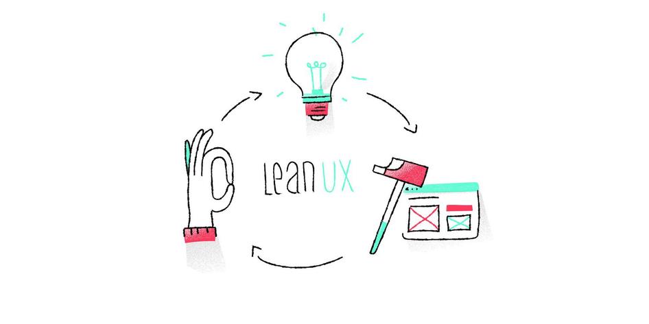
The truth is, it’s hard to get everyone on the same page in any organization, big or small. That’s why Doodle , a Software as a Service (SaaS) company with just over 50 employees and 250 million active users, turned to Lean UX to improve its products in an efficient, evidence-based, customer-centric way. In other words, Lean UX principles help Doodle’s product teams make the changes their customers want in a smart, efficient way, so they can grow faster and boost their bottom line .
I recently sat down with Jack Berglund, Chief Product Officer at Doodle , to talk about his product development strategy. He was very transparent, so if you’re looking for a real-life example of how to use Lean UX for digital product design, you’ve come to the right place.
Table of contents
Lean ux case study: what is doodle and who is jack berglund, what is lean ux, 3 phases of lean ux: think, make, check, lean ux development process at doodle, lean ux: a simple roadmap to get started.
Doodle is an online tool that helps people schedule meetings more efficiently. It syncs with all the major calendaring systems (Google, Outlook, Apple’s iCal, etc.), and it lets users poll meeting invitees to find a time that works for everyone.
Founded in 2007, Doodle is headquartered in Zurich with offices in Berlin, Tel Aviv, Israel, and Belgrade. Today, more than 250 million people use Doodle each year, and it’s available in more than 25 languages.
As Doodle’s Chief Product Officer, Jack Berglund uses Lean UX to guide agile, cross-functional teams to develop products that customers love.
Does that sound a little too jargon-heavy? Don’t worry, I’ll unpack it all for you… and I promise it won’t sound so much like a Dilbert cartoon by the time we’re done.
Lean User Experience (UX) Design is a user-centered design process that embraces Lean and Agile development methodology to reduce waste and build products centered around the users. Lean user experience design relies on a collaborative approach and rapid experimentation/prototyping, to get user feedback by exposing a minimum viable product (MVP) to users as early as possible.
The Lean UX process grew out of earlier process management systems like Lean Manufacturing , which has been used by major companies (such as Intel, Nike, Toyota, and Ford) to eliminate waste in production. Lean UX took principles that were originally designed for physical products and adapted them for software development.

LEAN UX TAKES ITS ROOTS IN LEAN MANUFACTURING, WHICH IS USED BY MAJOR COMPANIES ACROSS THE WORLD.
What makes software production different? For one thing, you don’t have to follow the old “measure twice, cut once” idea. Instead, your Agile product teams (which are composed of experts from different departments) can come up with ideas, test them out quickly, and revise them based on customer responses and usability.
As Jeff Gothelf puts it in Lean UX: Designing Great Products with Agile Teams , “You can measure once, cut once, measure once, cut once, measure once, cut once, forever.” That’s the luxury that SaaS and e-commerce product design teams have. Since they work in a virtual space, they just don’t have the same physical restrictions to user experience design as Toyota or Nike.
How so? If you’re Toyota, you can’t try out five different steering wheels in one month to see which one improves the customer experience . But if you’re Doodle, you can add a new checkbox to the 'Make a Poll' product, see if it gets any use, and tweak it accordingly.
Lean UX in action: Doodle saw a 54% increase in the number of free trial signups by changing the language on their homepage to focus on business use-cases, which was a greater increase than expected.
In the Lean UX model, product teams are usually made up of members from different departments (e.g., engineers, product managers, UX designers). Each team works to improve a specific product by focusing on improving processes that cycle through three phases: Think, Make, and Check.
THE LEAN UX MODEL FOLLOWS A THREE-PHASE CYCLE: THINK, MAKE, AND CHECK.
Teams brainstorm possible areas for improvement based on customer feedback , customer research, competitor comparisons, and observing their product in use. They develop a problem statement, then decide which areas they want to improve.
Designers and developers build a new feature that will (hopefully) solve a problem and/or improve the product.
Product teams test the new feature, using tools like UX surveys and A/B testing , to figure out whether their hypothesis was correct. If customers respond well to the new feature, it becomes part of the new design. If it doesn’t improve the customer experience, they return to the Think phase and try something new.
The Doodle team uses Lean UX to anticipate their users’ needs. This design-thinking approach allows them to build cutting-edge products their customers will gladly pay for, and keeps them one step ahead of the competition.
They have five product teams, and each team is usually composed of at least one product manager , one product designer, and a collection of engineers—possibly including data scientists or data engineers, as needed.
A TYPICAL PRODUCT TEAM AT DOODLE INCLUDES A PRODUCT MANAGER, A PRODUCT DESIGNER, A DATA SCIENTIST, AND MULTIPLE ENGINEERS.
The idea is to create a cross-functional team (meaning, teams from different departments) who come together to work on specific product improvements (such as Doodle’s 'MeetMe' product, Polls, etc.). Each team has a slightly different makeup depending on the product they manage.
Lean UX in action: Doodle tested out a new calendar invite feature that put the agreed-upon meeting time in all attendees’ calendars, and 40% of their customers used the first version of this feature. This demonstrated how strong the demand was for the feature, and gave the team a clear sense of where to go next because there was already plenty of room for improvement on that initial version.
What does the lean UX process begin with? Here’s how Doodle approaches their Think, Make, Check phases:
Step 1: the thinking phase at Doodle
Doodle uses Airtable to maintain their 'idea bank,' which is a collection of all ideas submitted for improvement and, at the time we talked, contained 175 ideas.
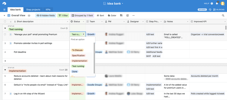
DOODLE USES AIRTABLE TO COLLECT IDEAS AND PRIORITIZE THEM.

“We use the idea bank to capture all ideas, wherever they come from. Even if we think they're terrible ideas, we still write them down, and that serves two purposes. One, we want the person who made the suggestion to know that it's been captured and it's up for consideration. Two, we do this because what might not be a great idea now, for whatever reason, might become a great idea in the future.”
Of course, ideas don’t come out of thin air! The product teams at Doodle use the following tools to gather qualitative research from their customers and capture ideas for product improvement.
3 lean UX tools Doodle uses to find areas for improvement
Google Analytics : “Google Analytics is a good source for us in terms of user behavior within the product,” says Jack. Doodle uses Google Analytics for cohort analysis , which is all about breaking users down into groups (cohorts) and studying the behavior of each group. For example, Doodle can tell whether a user who connected through their Calendar Connect product is retained better than those who have not. They have their own data warehouse to complement this information.
Desk.com: Desk.com , a Salesforce product, allows Customer Success (CS) to tag different types of issues that arise. “For obvious bugs,” Jack says, “it’s a bit easier: if something isn’t working the way it’s supposed to, it’s pretty obvious that you need to fix it. Where it becomes more complicated is when you receive input, either from research or CS, that speaks to something that isn’t so black and white, like a feature we could add down the line. At that point, it goes from an engineering/problem-solving matter to a question of prioritizing and using your judgment,” he says. In the next section, I’ll talk about how Doodle prioritizes projects like these.
Hotjar : Doodle uses Hotjar Feedback to have users rate their level of satisfaction and describe their experience using website feedback . If the customers provide an email address, someone responds. “However,” Jack says, “even the anonymous feedback can be helpful.”
Doodle collects feedback from different types of users, segmenting the data according to each group. In particular, they want to know which product the respondents are using (e.g., MeetMe, Polls), whether they are the ones who created the poll or simply participated in it, and whether they’re using the paid version of the product.
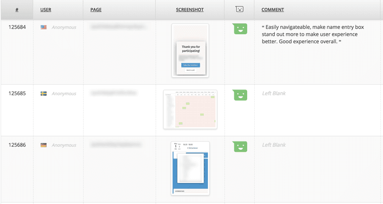
DOODLE USES HOTJAR FEEDBACK TO COLLECT FEEDBACK FROM USERS AT SCALE AND IN CONTEXT.
Product managers and product designers read the replies and look for patterns, but at the moment they don’t have a formal system in place to review this data.
Where Doodle did take a more organized approach to Voice-of-the-Customer feedback was when they redesigned their website in 2017. This was a complete redesign, going from a late-90s style to something much more modern, and they used Hotjar Feedback to figure out what their users liked, disliked, and needed.
Categorizing projects according to goals
Once they submit ideas, Doodle’s project teams categorize each one based on the goals they want to achieve, and those goals are grouped into Objectives and Key Results (OKRs). OKRs, in short, describe big-picture objectives, such as “convert more users after the trial ends.” To learn more about organizing by OKRs, take a look at this article by Jeff Gothelf (the author of Lean UX , mentioned above).
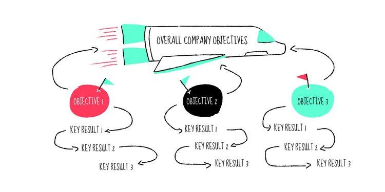
DOODLE USES OBJECTIVES AND KEY RESULTS (OKRS) TO MEASURE THEIR PROJECTS.
Doodle uses OKRs to identify their larger goals. Then they break their OKRs down by Objectives and Key Results, which identify the smaller goals that will hopefully help them achieve their Objectives. For example, the “convert more users after the trial period ends” Objective might be achieved by encouraging users to create more polls since Doodle’s research shows that users who create polls are more likely to convert.
Therefore, “get users to create a poll during the trial period” could become a Key Result, and that KR would fall under the “convert more users” Objective.
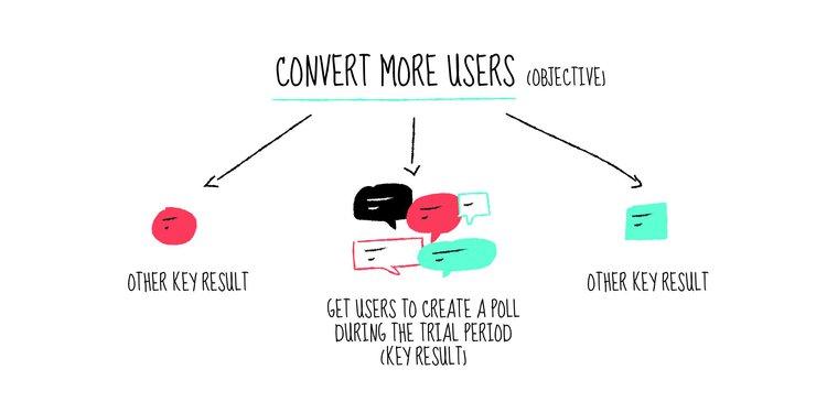
AN EXAMPLE OF AN OBJECTIVE (CONVERT MORE USERS) AND KEY RESULTS ATTACHED TO IT.
As the team captures more ideas, they tag them according to the appropriate OKR. Then, when they discuss plans for reaching those goals, they can use Airtable to filter the results, only showing those that relate to certain Objectives and Key Results.
Idea generation and problem-solving: a tale of two meetings
In the beginning, the product teams would brainstorm new ideas and discuss the progress they’d made on current projects at one meeting, but that got confusing.
These days, they have two separate meetings: one for brainstorming and generating new ideas (monthly), and the other. for discussing their progress on current projects (weekly).
“To get a balance there, we have two different versions of the same meeting. One is weekly, where we go through the stuff we're working on, making sure that it's progressing. And then there’s a separate meeting where we generate ideas and talk about what we want to do next.”
Step 2: the make phase at Doodle
In the make phase, a team of designers and developers builds a new feature to address previously highlighted problems and/or improve the product. But when ideas abound, as is likely to be the case, a crucial step is choosing what to build first.
How Doodle prioritizes projects
During the monthly meetings, whoever owns or champions an idea gives a 60-second talk about the idea, the data related to it, and how they might approach it as an improvement project. After the team reviews all new ideas they take a vote, pick the two or three most promising ideas, set deliverables, and really dive into them. The best ideas get added to the list of active projects.
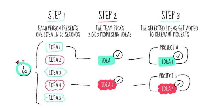
The ICE framework
Doodle uses a system called ICE, designed by Sean Ellis. ICE stands for Impact, Certainty, and Effort, and potential projects are evaluated on these qualities. Here’s what the ideal project would look like in the ICE model:
Impact (on User Experience) : High
Certainty (whether it will work) : High
Effort (what it would take to make the change and test it) : Low
Of course, most projects aren’t so straightforward. Jack says, “There are ones where you say, ‘Look, the effort is significant. We think the impact is high, but we're not completely sure.’ In that case, before we spend that full effort, we see if there’s something simpler we can work on.”
Jack stressed that they don’t take anything for granted when they assess certainty. If the idea’s champion thinks it’s a great project to work on, that counts for .01 on a certainty scale of 0 to 10. If the stakeholders love the idea and think it’s brilliant, that might bump you up another 0.1, but you’re still a long way from a 1, much less a 10.
THE DOODLE TEAM PRIORITIZES IDEAS USING THE ICE FRAMEWORK.
“What I really like about this approach,” he concludes, “is that it pushes us to do the necessary things to validate our ideas.” Whether it’s asking very specific questions to customers, bringing out specific data, or doing more A/B tests (see below), this framework allows Jack and his teams to save a lot of time down the line and make sure that all the work they are doing counts. That said, the ICE model isn’t a rigid scoring system. It’s a simple tool that gives you a rough idea of what to prioritize.
Curious to see how Hotjar prioritizes projects? Check out Mastering the art of prioritization: how Hotjar decides what to work on next .
Step 3: the check phase at Doodle
Lean UX doesn’t rely on gut feel to decide whether a change has been successful, and neither does Jack Berglund. The teams at Doodle test their changes to see how users respond and later refine their approach accordingly.
If you have a lot of traffic to your website, A/B tests (or split tests) are a great way to validate your hypotheses scientifically and determine if the changes you made are working. Once you’ve got that result, you can go ahead and implement the changes confidently.
“We have a good amount of traffic, so we can do a lot of A/B testing. And if we're smart about the tests we run, we can save ourselves a lot of time by not implementing things that are basically low confidence,” says Jack.
Example #1: An 800% increase in the use of a feature
Sometimes the results can be surprising—like, “an eight-fold increase in feature use” surprising. When users create a poll, which they send to meeting invitees to determine which date works best for everyone, they can add a “Yes, if need be” option. This allows invitees to select their preferred date (the green checkmark) along with any dates that are less-than-ideal but would still work (the yellow checkmark).
Originally, this was an advanced option, meaning that it didn’t pop up in the 'Make a Poll' wizard that the average user sees. The product team assumed most users wouldn’t be interested in that feature, but they questioned their assumptions and tested it out by adding it to the wizard as a checkbox.
The result? They saw an 800% increase in the use of that feature. Who knew?
Example #2: The fake door that got them nowhere
Jack shared this with me as a cautionary tale—the story of a time they set out to study a problem with A/B testing but ended up studying the wrong thing. They didn’t get the information they needed to move to the next steps, but they learned a valuable lesson.
Doodle wanted to see whether having a 'Poll Deadline' button, which allowed poll creators to set a deadline for respondents to reply, would get any traction. They set up a fake door , which is a button that offers a feature that isn’t actually available, so the UX team can see whether people will use it before spending the time and money to develop it. When users click on a fake door, they receive a message telling them: “Sorry! This feature is not yet available.”
Doodle showed the fake door to a portion of their users, and people clicked, but the team soon realized they had no way of knowing how useful the feature would be to their clients. Sure, they got plenty of clicks… but was the button valuable enough to influence buying behavior? Would it increase conversions? They couldn't tell from this A/B test.
To answer that question, Doodle went back to the drawing board. They’re currently planning to run a test that measures how likely this feature is to influence a user’s decision to start a free trial, which is a more complicated and business-focused question than whether or not a user will click.
“The core lesson is that we need to measure behavior change that demonstrates real value to the user.”
By designing smart, strategic A/B tests that answer basic questions about buying behavior, the teams at Doodle can prioritize their tasks and focus on those that offer a greater return.
Starbucks tests
It’s not always practical to do A/B testing, even when you have a ton of traffic, because sometimes you need to move quickly to see if an idea is worth looking into at all. You can always do more structured testing later if an idea shows promise after ‘guerilla testing’ it (an idea that Jeff Gothelf introduces in Lean UX ).
Guerilla tests are ‘quick and dirty’ user tests that give you a sense of how your ideal users might respond. Much like focus groups, which advertising agencies have been using for more than 70 years, guerilla testing gives you quick feedback when you need it.
Since Doodle has 250 million users (that’s the population of Indonesia, by the way), and since many of these users are similar to people the Doodle team members rub shoulders with at their local Starbucks, they like to use Starbucks for guerilla testing new features. They go down to the Starbucks near their office and offer people a voucher for a free cup of coffee to test out new features.
“If you ever want to try to get a Starbucks voucher for a free cup of coffee, just hang out at the Starbucks near the Doodle office in Zurich. You never know!”
Starbucks testing is just one form of anecdotal feedback they use. Doodle also goes to customers, employees (including marketers), and product management stakeholders to get their input.
The guerrilla testing approach of Lean UX works better for SaaS and eCommerce than it does for companies that build physical products because, again, you can make changes quickly and reverse them if they don’t work. And in many ways, that points to the basic difference between Lean Manufacturing and Lean UX.
Lean UX is all about agility, experimentation, testing, and reassessing in a continuous cycle. It has allowed companies like Doodle to scale to 250 million active users—and it’s helped them thrive in a competitive market.
Lean UX in Action: Doodle had the 'Settings' page automatically appear as the third step in their poll creation wizard, which increased the number of free trial signups by 25%, boosted the use of their 'Ask Attendees for Contact Information' option by 300%, and increased the use of the 'Hidden Polls' feature (which allows the creator to keep poll results hidden) by 400%.
If you were inspired by Jack's story or simply want to give Lean UX a try in your own business, here is a simple 3-step roadmap to get started:
Step 1: think phase
Gather customer feedback using tools like Feedback from Hotjar and reviewing insights from your Customer Success or sales team.
Process this info in an idea bank using a simple spreadsheet or a tool like Airtable.
Step 2: make phase
3. Set up a meeting to prioritize projects according to their Impact, Certainty, and Effort (keeping in mind that certainty is determined by facts, not stakeholder opinions).
Step 3: check phase
4. Use guerilla testing to get quick feedback where appropriate.
5. Use A/B testing , if your traffic is large enough, to get scientifically valid results.
FAQs about lean UX
What is agile and lean ux.
Agile and lean UX involves applying the principles of these methodologies to the sphere of UX. Agile and lean both focus on creating quick iterations of products and features, testing them with users, and creating a tight feedback loop between users and product teams as they iterate in the future.
What are the benefits of lean UX?
Applying the lean methodology to UX creates a user-centered approach that forces product teams to rapidly generate and test ideas in the real-world to find what works. This prototyping model speeds up the UX design process, minimizes waste, and grounds it in the perspectives and experiences of real users.
What is an example of lean UX?
Online scheduling tool Doodle uses the lean UX approach to generate a backlog of ideas for new features or improvements. It then prioritizes the ideas that are estimated to have the most impact, and then conducts sprints where product & design teams create iterations that are A/B tested with users. During these prototyping tests, the product team observes how users interact with the new features and determines which ones they actually use and find helpful. They then repeat this process indefinitely to continuously improve the product.
Related articles

UX design and analysis
Design a homepage that delights your users in 9 easy steps (with tips and examples)
While product, UX, and marketing teams help shape a website or app’s homepage, a more powerful group holds the reins: the users. Their needs and preferences are key deciding factors in locking in an effective homepage design.

Shadz Loresco

The anatomy of a stellar website: the dos and don’ts of design
Over the past five years, buyers have largely shifted their shopping habits to be primarily online. For brands wishing to remain competitive in the digital marketplace, this means an accessible and attention-grabbing website has become more important than ever before.
Consumers agree: respondents to Hotjar’s Coming in Hot report told us that they have higher expectations for brands’ websites than they did five years ago.
Hotjar team

Coming in hot: the power of first impressions
Consumers have more than their fair share of vendors to choose from when shopping online. When attention is split between different brands and devices, ensuring your online presence stands out from the crowd hinges on first impressions.
But catering to the ever-changing habits and preferences of digital buyers is no small feat. That’s why Hotjar surveyed hundreds of US-based consumers—to reveal the insights you need to guarantee your website exceeds user expectations.
Get a free custom homepage design for your new website.
Design, UI, UX , Inspiration
15 excellent ux case studies every creative should read.
- By Sandra Boicheva
- October 21st, 2021
In a previous article, we talked about UX portfolios and how they carefully craft a story of how designers work. Interestingly enough, recruiters decide if a UX freelance designer or an agency is a good match within 5 minutes into the portfolio . In order to persuade these recruiters, the portfolio needs to present an appealing story that showcases the skill, the thought process, and the choices taken for key parts of the designs. With this in mind, today we’ll talk about UX case studies and give 15 excellent examples of case studies with compelling stories.
The Storytelling Approach in UX Case Studies
An essential part of the portfolio of a UX designer is the case studies that pack a showcase of the designer’s skills, way of thinking, insights in the form of compelling stories. These case studies are often the selling point as recruiters look for freelancers and agencies who can communicate their ideas through design and explain themselves in a clear and appealing way. So how does this work?
Photography by Alvaro Reyes
Just like with every other story, UX case studies also start with an introduction, have a middle, and end with a conclusion .
- Introduction: This UX case study example starts with a design brief and presents the main challenges and requirements. In short, the UX designer presents the problem, their solution, and their role.
- Middle: The actual story of the case study example explains the design process and the techniques used. This usually starts with obstacles, design thinking, research, and unexpected challenges. All these elements lead to the best part of the story: the action part. It is where the story unveils the designer’s insights, ideas, choices, testing, and decisions.
- Conclusion: The final reveal shows the results and gives space for reflection where the designer explains what they’ve learned, and what they’ve achieved.
Now as we gave you the introduction, let’s get to the main storyline and enjoy 15 UX case studies that tell a compelling story.
1. Car Dealer Website for Mercedes-Benz Ukraine by Fulcrum
This case study is a pure pleasure to read. It’s well-structured, easy to read, and still features all the relevant information one needs to understand the project. As the previous client’s website was based on the official Mercedes Benz template, Fulcrum had to develop an appealing and functional website that would require less time to maintain, be more user-friendly, and increase user trust.
- Intro: Starts with a summary of the task.
- Problem: Lists the reasons why the website needs a redesign.
- Project Goals: Lists the 4 main goals with quick summaries.
- Project: Showcases different elements of the website with desktop and mobile comparison.
- Functionality: Explains how the website functionality helps clients to find, and order spare parts within minutes.
- Admin Panel: Lists how the new admin panel helps the client customize without external help.
- Elements: Grid, fonts, colors.
- Tech Stack: Shows the tools used for the backend, mobile, admin panel, and cloud.
- Client review: The case study ends with a 5-star review by the marketing director of Mercedes Benz Ukraine, Olga Belova.
This case study is an example of a detailed but easy to scan and read story from top to bottom, featuring all relevant information and ending on the highest note: the client’s review.
Advertisement
2. Galaxy Z Flips 5G Website by DFY
This is a big project that covers every aspect of the website, including the UX strategy. The creative studio aimed to fully illustrate and demonstrate the significant upgrades over previous models and to enable two-way communication with the customers through an interactive experience.
- Intro: Summary of the project and roles.
- Interactive Experience: The main project goal.
- Demonstration: Explains the decision to feature 360-degree views and hands-on videos instead of technical terms.
- Screens: Includes high-quality screenshots of significant pages and features.
- Ecosystem: Highlight a page with easy navigation across different products as a marketing decision that makes cross-selling seamless.
- Essentials: Showcases a slider of all products with key features that provide ample information.
- Showroom: Interactive experience that helps the user “play around” with the product.
- Credits: As a conclusion, DFY features the stakeholders involved.
A strong presentation of a very ambitious project. It keeps the case study visual while still providing enough insight into the thought process and the most important decisions.
3. Jambb Social Platform by Finna Wang
Here we have a beautiful case study for a platform that aims to help creators grow their communities by recognizing and rewarding their base of supporters. It tackles a curious problem that 99% of fans who contribute in non-monetary ways don’t get the same content, access, and recognition they deserve. This means the creators need a way to identify their fans across all social platforms to grow their business and give recognition. To get a clear picture of what the design has to accomplish, Finna Wang conducted stakeholder interviews with the majority of the client’s team.
- Intro: Listing roles, dates, team, and used tools.
- Project Overview: The main concept and the reasons behind it.
- Exploration: What problem will the platform solve, preliminary research, and conclusions from the research. The section includes the project scope and problem statement.
- Design Process: A thorough explanation of the discoveries and the exact steps.
- User Flows: 3 user flows based on common tasks that the target user/fan would do on the site.
- Design Studio: Visualization process with wireframes, sitemap, prototypes.
- Design Iterations: The designer highlights the iterations they were primary behind.
- Style Guide: Typography, colors, visual elements breakdown.
- Usability Testing: Beta site vs Figma prototype; usertesting.com, revised problem statement.
- Prototype: Features an accessible high fidelity prototype in Figma you can view.
- Takeaways: Conclusions.
An extremely detailed professionally made and well-structured UX case study. It goes a step further by listing specific conclusions from the conducted research and featuring an accessible Figma prototype.
4. Memento Media by Masha Keyhani
This case study is dedicated to a very interesting project for saving family stories. It aims to help users capture and record memories from their past. To do so, the design team performed user research and competitive analysis. The entire project took a 6-week sprint.
- Overview: Introducing the client and the purpose of the app.
- My Role: Explaining the roles of the designer and their team.
- Design Process: A brief introduction of the design process and the design toolkit
- Home: The purpose of the Homepage and the thought process behind it.
- Question Selection: The decision behind this screen.
- Recording Process: Building the recording feature and the decisions behind it.
- User research: a thorough guide with the main focuses, strategies, and competitor analysts, including interviews.
- Research Objectives: The designer gives the intent of their research, the demographics, synthesis, and usability testing insights.
- Propositions: Challenges and solutions
- User Flow: Altering the user flow based on testing and feedback.
- Wireframes: Sketches, Lo-Fi wireframing.
- Design System: Typography, colors, iconography, design elements.
- The Prototype: It shows a preview of the final screens.
This UX study case is very valuable for the insights it presents. The design features a detailed explanation of the thinking process, the research phase, analysts, and testing which could help other creatives take some good advice from it for their future research.
5. Perfect Recipes App by Tubik
Here we have a UX case study for designing a simple mobile app for cooking, recipes, and food shopping. It aims to step away from traditional recipe apps by creating something more universal for users who love cooking with extended functionality. The best idea behind it is finding recipes based on what supplies the user currently has at home.
- Intro: Introducing the concept and the team behind it.
- Project: What they wanted to make and what features would make the app different than the competitors.
- UI design: The decisions behind the design.
- Personalization: Explaining how the app gives the user room for personalization and customizing the features according to their personal preferences.
- Recipe Cards and Engaging Photos: The decisions behind the visuals.
- Cook Now feature: Explaining the feature.
- Shopping List: Explaining the feature.
- Pantry feature: The idea to sync up the app with AmazonGo services. This case study section features a video.
- Bottom Line: What the team learned.
This UX case study is a good example of how to present your concept if you have your own idea for an app. You could also check the interactive preview of the app here .
6. SAM App by Mike Wilson
The client is the Seattle Art Museum while the challenge is to provide engaging multimedia content for users as well as self-guided tours. Mile Wilson has to create an experience that will encourage repeat visits and increase events and exhibition attendance.
- Intro: Listing time for the project, team members, and roles.
- The Client: A brief introduction of Seattle Art Museum
- The Challenge: What the app needs to accomplish.
- Research and Planning: Explaining the process for gathering insights, distributing surveys, interviews, and identifying specific ways to streamline the museum experience.
- Sloane: Creating the primary persona. This includes age, bio, goals, skills, and frustrations.
- Designing the Solution: Here the case study features the results of their research, information architecture, user flows, early sketching, paper prototypes, and wireframes.
- Conclusion: Explaining the outcome, what the team would have done differently, what’s next, and the key takeaways.
What we can take as a valuable insight aside from the detailed research analysis, is the structure of the conclusion. Usually, most case studies give the outcome and preview screens. However, here we have a showcase of what the designer has learned from the project, what they would do differently, and how they can improve from the experience.
7. Elmenus Case Study
This is a case study by UX designers Marwa Kamaleldin, Mario Maged, Nehal Nehad, and Abanoub Yacoub for redesigning a platform with over 6K restaurants. It aims to help users on the territory of Egypt to find delivery and dine-out restaurants.
- Overview: What is the platform, why the platform is getting redesigned, what is the target audience. This section also includes the 6 steps of the team’s design process.
- User Journey Map: A scheme of user scenarios and expectations with all phases and actions.
- Heuristic Evaluation: Principles, issues, recommendations, and severity of the issues of the old design.
- First Usability Testing: Goals, audience, and tasks with new user scenarios and actions based on the heuristic evaluation. It features a smaller section that lists the most severe issues from usability for the old design.
- Business Strategy: A comprehensive scheme that links problems, objectives, customer segment, measurements of success, and KPIs.
- Solutions: Ideas to solve all 4 issues.
- Wireframes: 4 directions of wireframes.
- Styleguide: Colors, fonts, typeface, components, iconography, spacing method.
- Design: Screens of the different screens and interactions.
- Second Usability Testing: Updated personas, scenarios, and goals. The section also features before-and-after screenshots.
- Outcome: Did the team solve the problem or not.
A highly visual and perfectly structured plan and process for redesigning a website. The case study shows how the team discovers the issues with the old design and what decisions they made to fix these issues.
8. LinkedIn Recruiter Tool by Evelynma
A fresh weekend project exploring the recruiting space of LinkedIn to find a way to help make it easier for recruiters to connect with ideal candidates.
- Background Info: What made the designer do the project.
- Problem and Solution: A good analysis of the problem followed by the designer’s solution.
- Process: This section includes an analysis of interviewing 7 passive candidates, 1 active candidate, 3 recruiters, and 1 hiring manager. The designer also includes their journey map of the recruiting experience, a sketch of creating personas, and the final 3 personas.
- Storyboard and User Flow Diagrams: The winning scenario for Laura’s persona and user flow diagram.
- Sketches and Paper Prototypes: Sticky notes for paper prototypes for the mobile experience.
- Visual Design: Web and mobile final design following the original LinkedIn pattern.
- Outcome: Explaining the opportunity.
This is an excellent UX case study when it comes to personal UX design projects. creating a solution to a client’s problem aside, personal project concepts is definitely something future recruiters would love to see as it showcases the creativity of the designers even further.
9. Turbofan Engine Diagnostics by Havana Nguyen
The UX designer and their team had to redesign some legacy diagnostics software to modernize the software, facilitate data transfers from new hardware, and improve usability. They built the desktop and mobile app for iOS and Android.
- Problem: The case study explain the main problem and what the team had to do to solve it.
- My Role: As a lead UX designer on a complicated 18-month project, Havana Nguyen had a lot of work to do, summarized in a list of 5 main tasks.
- Unique Challenges: This section includes 4 main challenges that made the project so complex. ( Btw, there’s a photo of sketched wireframes literally written on the wall.)
- My Process: The section includes a description of the UX design process highlighted into 5 comprehensive points.
- Final Thoughts: What the designer has learned for 18 months.
The most impressive thing about this case study is that it manages to summarize and explain well an extremely complex project. There are no prototypes and app screens since it’s an exclusive app for the clients to use.
10. Databox by FireArt
A very interesting project for Firearts’s team to solve the real AL & ML challenges across a variety of different industries. The Databox project is about building scalable data pipeline infrastructure & deploy machine learning and artificial intelligence models.
- Overview: The introduction of the case study narrows down the project goal, the great challenge ahead, and the solution.
- How We Start: The necessary phases of the design process to get an understanding of a product.
- User Flow: The entire scheme from the entry point through a set of steps towards the final action of the product.
- Wireframes: A small selection of wireframe previews after testing different scenarios.
- Styleguide: Typography, colors, components.
- Visual Design: Screenshots in light and dark mode.
A short visual case study that summarizes the huge amount of work into a few sections.
11. Travel and Training by Nikitin Team
Here’s another short and sweet case study for an app with a complete and up-to-date directory of fitness organizations in detailed maps of world cities.
- Overview: Explaining the project.
- Map Screen : Outlining the search feature by categories.
- Profiles: Profile customization section.
- Fitness Clubs: Explaining the feature.
- Icons: A preview of the icons for the app.
- App in Action: A video of the user experience.
This case study has fewer sections, however, it’s very easy to read and comprehend.
12. Carna by Ozmo
Ozmo provides a highly visual case study for a mobile application and passing various complexities of courses. The main goal for the UX designer is to develop a design and recognizable visual corporate identity with elaborate illustrations.
- Intro: A visual project preview with a brief description of the goal and role.
- Identity: Colors, fonts, and logo.
- Wireframes: The thinking process.
- Interactions: Showcase of the main interactions with animated visuals.
- Conclusion: Preview of the final screens.
The case study is short and highly visual, easy to scan and comprehend. Even without enough insight and text copy, we can clearly understand the thought process behind and what the designer was working to accomplish.
13. An Approach to Digitization in Education by Moritz Oesterlau
This case study is for an online platform for challenge-based learning. The designer’s role was to create an entire product design from research to conception, visualization, and testing. It’s a very in-depth UX case study extremely valuable for creatives in terms of how to structure the works in their portfolio.
- Intro: Introducing the client, project time, sector, and the designer’s role.
- Competitive Analysis: the case study starts off with the process of creating competitive profiles. It explains the opportunities and challenges of e-learning that were taken into consideration.
- Interviews and Surveys: Listing the goals of these surveys as well as the valuable insights they found.
- Building Empathy: The process and defining the three target profiles and how will the project cater to their needs. This section includes a PDF of the user personas.
- Structure of the Course Curriculum: Again with the attached PDF files, you can see the schemes of the task model and customer experience map.
- Information Architecture: The defined and evaluated sitemap for TINIA
- Wireframing, Prototyping, and Usability Testing : An exploration of the work process with paper and clickable prototypes.
- Visual Design: Styleguide preview and detailed PDF.
- A/B and Click Tests: Reviewing the usability assumptions.
- Conclusion: A detailed reflection about the importance of the project, what the designer learned, and what the outcome was.
This is a very important case study and there’s a lot to take from it. First, the project was too ambitious and the goal was too big and vague. Although the result is rather an approximation and, above all, at the conceptual level requires further work, the case study is incredibly insightful, informative, and insightful.
14. In-class Review Game by Elizabeth Lin
This project was never realized but the case study remains and it’s worth checking out. Elizabeth Lin takes on how to create an engaging in-class review game with a lot of research, brainstorming, and a well-structured detailed process.
- Intro: What makes the project special.
- Research: Explaining how they approached the research and what they’ve learned.
- Brainstorming: the process and narrowing all How Might We questions to one final question: How might we create an engaging in-class math review game.
- Game Loop and Storyboarding: Sketch of the core game loop and the general flow of the game.
- Prototyping: Outlining basic game mechanics and rounds in detail.
- Future Explorations: The case study goes further with explorations showing how the product could look if we expanded upon the idea even further.
- What Happened?: The outcome of the project.
This case study tells the story of the project in detail and expands on it with great ideas for future development.
15. Virtual Makeup Studio by Zara Dei
And for our last example, this is a case study that tells the story of an app-free shippable makeover experience integrated with the Covergirl website. The team has to find a way to improve conversion by supporting customers in their purchase decisions as well as to increase basket size by encouraging them to buy complementary products.
- Intro: Introducing the project and the main challenges.
- Discovery and Research: Using existing product information on the website to improve the experience.
- Onboarding and Perceived Performance: Avoiding compatibility issues and the barrier of a user having to download an app. The section explains the ideas for features that will keep users engaged, such as a camera with face scan animation.
- Fallback Experience and Error States: Providing clear error messaging along with troubleshooting instructions.
- Interactions: explaining the main interactions and the decisions behind them.
- Shared Design Language: Explaining the decision to provide links on each product page so users could be directed to their preferred retailer to place their order. Including recommended products to provide users with alternatives.
- Outcome and Learning: The good ending.
- Project Information: Listing all stakeholders, the UX designer’s role in a bullet list, and design tools.
In Conclusion
These were the 15 UX case studies we wanted to share with you as they all tell their story differently. If we can take something valuable about what are the best practices for making an outstanding case study, it will be something like this.
Just like with literature, storytelling isn’t a blueprint: you can write short stories, long in-depth analyses, or create a visual novel to show your story rather than tell. The detailed in-depth UX case studies with lots of insights aren’t superior to the shorter visual ones or vice versa. What’s important is for a case study to give a comprehensive view of the process, challenges, decisions, and design thinking behind the completed project .
In conclusion, a UX case study should always include a summary; the challenges; the personas; roles and responsibilities; the process; as well as the outcomes, and lessons learned.
Video Recap
Take a look at the special video we’ve made to visualize and discuss the most interesting and creative ideas implemented in the case studies.

In the meantime, why not browse through some more related insights on web development and web design?
- The 30 Best UX Books Every Creative Should Read in 2022
- Great UI Animation Examples to Make Your Jaw Drop [+Tips and Freebies]
- 60 Superb App Design Inspiration Examples
Popular Posts
- 20 UI/UX Design Trends that will Rock 2023 [Updated]
- Best 15 UI Color Palette & Scheme Generators for the Perfect Interface Design
- 10 Golden UI Design Principles and How To Use Them
- GET A QUICK QUOTE
Subscribe for our newsletter
We hate boring. Our newsletters are relevant and on point. Excited? Let’s do this!
Get Started Now
Think of a case study as a way to tell the story of your UX design or research project. In it, you’ll highlight the process you took to address a specific challenge you were solving for your users and customers as well as the resulting outcomes.
UX designers and researchers often rely on case studies to include in their portfolio to highlight their capabilities and accomplishments
Why it’s important to have case studies in your portfolio
Getting to a finished product is never one simple step. More often than not, researchers and designers need to constantly iterate while talking to customers, before they get the design just right. How each team goes aout this process gives potential employers crucial insight into how a designer or researcher thinks and can be a powerful tool for career advancement.
What do you include in a case study?
Every case study is different, but most contain a few key components:
- Problem statement
- Description of key audiences, customers, or users
- Team description and responsibilities
- Project scope and objectives
- Detailed process
- Results and lessons learned
Tips for a great case study
While every case study will be different, there are a few components you should be sure to include to ensure you’re telling a compelling story.
Sketches, wireframes, and workflow diagrams
Showing all your notes is a great way to highlight your thought process throughout your project. Whether you’re including high fidelity or low fidelity prototypes or wireframes, or just a few diagrams and sketches, using visuals will help tell your story.
Customer videos and quotes
Talking to customers is an important component of every case study, so be sure to highlight interesting insights whenever you can. Some of the most interesting insights come from watching users get frustrated—or delighted with your product or process. Hearing the inflection in their voices and watching their body language as they try to achieve a goal is valuable insight into what’s working and what needs improvement.
Human understanding. Human experiences.
Get the latest news on events, research, and product launches
Oh no! We're unable to display this form.
Please check that you’re not running an adblocker and if you are please whitelist usertesting.com.
If you’re still having problems please drop us an email .
By submitting the form, I agree to the Privacy Policy and Terms of Use .
New Case Study
One simple way Apple could improve your sleep habits

Case studies

Apple sleep notification

How to avoid (and repair) these 3 critical design blunders
Design Blunders

Social Proof: Why people's behaviors affect our actions
Social Proof

Adobe: The growing issue with “Free” trials UX
Adobe Trial UX

Letterboxd: How to nail product market fit with clear Jobs‑To‑Be‑Done
Jobs-To-Be-Done

Spotify Wrapped: 6 psychology principles that make it go viral every year
Spotify Wrapped

The psychology of Temu’s casino‑like shopping UX
Temu Onboarding

GoDaddy: How to improve checkout flows ethically
GoDaddy Checkout UX

Framing Effect: Why context affects decisions
Framing effect

The psychology behind highly effective landing pages
Landing page conversion

Apple vs Meta Threads: The Illusion of Privacy
Apple privacy policy

Beehiiv subscription: 5 small UX mistakes that make a BIG difference
Newsletter subscription

The Search War: Bing AI Chat vs. Google

The Psychology Behind Loom's Explosive Growth
Loom onboarding

Episode 1: Can Bing's new AI search challenge Google?
Bing onboarding

Typeform: How to offboard users the right way
Typeform offboarding

How to increase signup confirmation rates with Sniper Links
Email confirmation UX

Labor Perception Bias: Why faster isn't always better
Labor perception bias

Tech ethics: If cookie consent prompts were honest…
Cookie consent

Amber Alert Redesign: 5 UX Improvements That Could Save Lives
Amber alerts UX

Google: How to increase feature adoption the right way
Google feature adoption

How Linkedin Increased Notification Opt-in Rates by 500%
Linkedin notifications

The Psychology of Advertising: Why this ad made me stop scrolling
Advertising psychology

The Ugly Truth About Net Promoter Score Surveys
Net promoter surveys

The Psychology Behind Amazon's Purchase Experience
Amazon purchase UX

One Simple Psychology Framework To Improve Your Onboarding
Blinkist onboarding

How Blinkist Increased Trial Conversions by 23% (Ethically)
Trial paywall optimization

YouTube’s Attempt To Solve The Paradox of Choice
Youtube retention

Adobe: The Psychology of User Offboarding
Adobe offboarding

Signal: How To Ethically Boost Your Revenues
Signal monetization

Chrome vs Brave: How To Use Ethical Design To Win Customers
Brave onboarding

The Psychology of Clubhouse’s User Retention (...and churn)
Clubhouse retention

The Scary Future Of Instagram
Instagram monetization

The Psychology of Misinformation on Facebook
Facebook misinformation

The Psychology Behind TikTok's Addictive Feed
Tiktok feed psychology

How To Properly Apply Jobs-To-Be-Done To User Onboarding
Headspace onboarding

How To Notify Users Without Being Spammy
Lifecycle emails

User Onboarding: Is HEY Email Worth It?
Hey onboarding

7 Product Team Pitfalls You Should Avoid
Product team pitfalls

How Tinder Converts 8% Of Singles Into Customers In Less Than 15min.
Tinder monetization

Coronavirus Dashboard UX: How Design Impacts Your Perception
COVID dashboard UX

How Morning Brew Grew To 1.5 Million Subs In 5 Years
Morning Brew retention

Uber Eats: How To Ethically Use Scarcity To Increase Sales
Uber Eats retention

Airbnb: How To Reduce Churn With Personalization
Airbnb personalization

6 Ways Mario Kart Tour Triggers You Into Gambling Your Money
Mario Kart monetization

Strava: 7 Strategies To Convert More Freemium Users
Strava monetization

Tesla: How To Grow Through Word-of-Mouth
Tesla charging UX

How Hopper Perfectly Nails Permission Requests UX
Hopper onboarding

9 Ways To Boost SaaS Revenues With A Better Upgrade UX
Zapier monetization

Superhuman's Secret 1-on-1 Onboarding Revealed
Superhuman onboarding

Trello User Onboarding: 7 Tactics To Inspire You
Trello onboarding

5 Deadly Onboarding Mistakes You Should Avoid
Sleepzy onboarding

Duolingo's User Retention: 8 Tactics Tested On 300 Million Users
Duolingo retention

Calm Referral Strategy: Drive Viral Growth With Simple Rewards
Calm referrals

Spotify vs Apple: How Spotify is betting $230M on podcasts to win over Apple users (Ep. 2)
Spotify onboarding

Spotify vs Apple: How Spotify is betting $230M on podcasts to win over Apple users (Ep. 1)
Spotify vs Apple
Advisory boards aren’t only for executives. Join the LogRocket Content Advisory Board today →
- Product Management
- Solve User-Reported Issues
- Find Issues Faster
- Optimize Conversion and Adoption
Heuristic evaluation: Definition, case study, template

Imagine yourself faced with the challenge of assembling a tricky puzzle but not knowing where to start. Elements such as logical reasoning and meticulous attention to detail become essential, requiring an approach that goes beyond the surface level to achieve effectiveness. When evaluating the user experience of an interface, it is no different.

In this article, we will cover the fundamental concepts of heuristic evaluation, how to properly perform a heuristic evaluation, and the positive effects it can bring to your UX design process. Let’s learn how you can solve challenges with heuristic evaluation.
What is heuristic evaluation?
The heuristic evaluation principles, understanding nielsen’s 10 usability heuristics, essential steps in heuristic evaluation, prioritization criteria in the analysis of usability problems, communicating heuristic evaluation results effectively, dropbox’s heuristic evaluation approach, incorporating heuristic evaluation into the ux process.
The heuristic evaluation method’s main goal is to evaluate the usability quality of an interface based on a set of principles, based on UX best practices. From the identification of the problems, it is possible to provide practical recommendations and consequently improve the user experience.
So where did heuristic evaluation come from, and how do we use these principles? Read on.
Heuristic evaluation was created by Jakob Nielsen, recognized worldwide for his significant contributions to the field of UX. The method created by Nielsen is based on a set of heuristics from human-computer interaction (HCI) and psychology to inspect the usability of user interfaces.
Therefore, Nielsen’s 10 usability heuristics make up the principles of heuristic evaluation by establishing carefully established foundations. These foundations serve as a practical guide to cover the main usability problems of projects. These heuristics work as cognitive shortcuts used by the brain for efficient decision making, especially in redesign projects. Heuristics also help to complement the UX process when understanding user problems and supporting UX research and evaluation.
When you are getting ready to conduct a heuristic evaluation, the first step is to set clear goals. Then, during the evaluation, you should make notes on what you find considering usability issues, always based on the criteria. Once this is done, you can prepare a report that might include information on which issues to tackle first, which makes the evaluation even better. All these steps matter because they help make sure interfaces match what users want and expect, leading to better interactions overall.
Preparation for the heuristic evaluation: Defining usability objectives and criteria
As with the puzzle example in the intro, fully understanding the problem is critical to applying heuristic evaluation effectively. Thus, during the preparation phase, you need to establish the evaluation criteria, also defining how these criteria will be evaluated.
Select evaluators based on their experience. By involving a diverse set of evaluators, you can obtain different perspectives on the same challenge. Although an expert is able to point out most of the problems in a heuristic evaluation, collaboration is essential to generate more comprehensive recommendations.
Although it follows a set of heuristics, the evaluation is less formal and less expensive than a user test, making it faster and easier to conduct. Therefore, heuristic evaluation can be performed in the early stages of design and development when making changes is more cost effective.
Nielsen’s usability heuristics are like a tactical set for methodically making things work, providing valuable clues that designers and creators follow to piece together the usability puzzle. These heuristics act as master guides, helping us intelligently fit each piece of the puzzle together so that everything makes sense and is easy to understand to create amazing experiences in the products and websites we use.

Over 200k developers and product managers use LogRocket to create better digital experiences
Here are Nielsen’s 10 usability heuristics, each with its own relevance and purpose:
1. System status visibility
Continuously inform the user about what is happening.
2. Correspondence between the system and the real world
Use words and concepts familiar to the user.

3. User control and freedom
Allow users to undo actions and explore the system without fear of making mistakes.

4. Consistency and standards
Maintain a consistent design throughout the system, so users can apply what they learned in one part to the rest.

5. Error prevention
Design in a manner that prevents users from committing mistakes or provides means to easily correct wrong decisions.

6. Recognition instead of memorization
Provide contextual hints and tips to help users accomplish tasks without needing to remember specific information.

7. Flexibility and efficiency of use
Allow users to customize keyboard shortcuts or create custom profiles to streamline their interactions.

8. Aesthetics and minimalist design
Keep the design clean and simple, focusing on the most relevant information to avoid overwhelming users using proper spacing, colors, and typography.

9. Help and documentation
Provide helpful and accessible support in case users need extra guidance.

10. User feedback
Give immediate feedback to users when they take an action.

Together, these pieces of the usability heuristics puzzle help us build a complete picture of digital experiences. Thus, by following these guidelines, evaluators can identify problems and prioritize them for correction at the evaluation stage.
In the evaluation phase, evaluators should look at the product or system interface and document any usability issues based on heuristics. By using heuristics consistently across different parts of the interface, it is still possible to balance conflicting heuristics to find optimal design solutions.
There may be challenges during the evaluation phase, which is why it is important that evaluators suggest strategies to overcome them from the definition of priorities. Evaluators should therefore, in consensus, discuss how these heuristics can be applied to identify and address usability problems.
One of the interesting ways to do heuristic evaluation is through real-time collaboration tools like Miro. On the template below, you will be able to collaborate in real-time to conduct heuristic evaluations of your project with your team, evaluating the problems by criteria and dividing them by colors, based on the level of complexity to be solved.

You can download the Miro Heuristic Evaluation template for free .
After performing a heuristic assessment, evaluators should analyze the findings and prioritize usability issues, trying to identify the underlying causes of usability issues rather than just addressing surface symptoms.
Usability issues discovered during the assessment can be given severity ratings to prioritize fixes.
Below is an example of categorization by severity according to the challenge presented:
- High severity : Prevents the user from performing one or more tasks
- Medium severity : Requires user effort and affects performance
- Low severity : May be noticeable to the user but does not impede execution or performance
The classification will help the team to have greater clarity regarding what is most relevant to be faced considering the impact on the user experience. By prioritizing the most critical issues based on their impact on the user experience, it will be easier to effectively allocate them throughout the project.
Finally, during the reporting phase, evaluators should present their findings and recommendations to stakeholders and facilitate discussions on identified issues.
Evaluators typically conduct multiple iterations of the assessment to uncover different issues in subsequent rounds based on the need for the project and the issues identified.
Heuristic evaluation provides qualitative data, making it important to interpret the results with a deeper understanding of user behavior. When reporting and communicating the results of a heuristic assessment, assessors should follow best practices by presenting findings in visual representations that are easy to read and understand, and that highlight key findings, whether using interactive boards, tables or other visuals.
Problem descriptions should be clear and concise so they can be actionable. Instead of generating generic problems, for example, break the problems into distinct parts to be easier to deal with. If necessary, try to analyze the interface component and its details, thinking not only analytically in an abstract way but also understanding that that problem will be solved by a UX Designer, considering all its elements. In this scenario, a well-applied context makes all the difference.
It is also important to involve stakeholders and facilitate discussions around identified issues. As a popular saying goes: a problem communicated is a problem half solved.
The Dropbox team really nails it when it comes to giving users a smooth and user friendly experience. Let’s dive into a few ways they have put these heuristic evaluation principles to work in their platform:
Dropbox keeps things clear by using concise labels to show the status of your uploaded files. They also incorporate a convenient progress bar that provides a time estimate for the completion of the upload. This real-time feedback keeps you informed about the ongoing status of your uploads on the platform:

The ease of moving, deleting, and renaming files between different folders and sharing with other people means that Dropbox offers users control over fundamental actions, allowing them to work in a personalized way, increasing their sense of ownership:
Making it a breeze for users to navigate no matter if they’re on a computer or a mobile device, Dropbox keeps things consistent in both: website and mobile app design:

To prevent errors from happening, Dropbox has implemented an interesting feature. If a user attempts to upload a file that’s too large, Dropbox triggers an error message. This message is quite helpful, as it guides the user to select a smaller file and clearly explains the issue. It’s a nifty feature that ensures users know exactly which steps to take next:

Dropbox cleverly employs affordances to ensure that users can easily figure out how to navigate the app. Take, for instance, the blue button located at the top of the screen — it’s your go-to for creating new files and folders. This is a familiar and intuitive pattern that users can quickly grasp:

Consider now flexibility and efficiency. On Dropbox, the user can access their files from any gadget, and they can keep working even when they are offline without worrying about losing anything. It makes staying productive a breeze, no matter where the users finds themselves:

Dropbox has a clean and minimalist design that’s a breeze to use and get around in. Plus, it’s available in different languages, ensuring accessibility for people all around the world:

Dropbox goes the extra mile by using additional methods alongside heuristic evaluation, demonstrating a high positive impact on their services. All this dedication to applying the best heuristics on their products has made Dropbox one of the most popular storage services globally.
Heuristic evaluation fits into the broader UX design process and can be conducted iteratively throughout the design lifecycle, despite being commonly used early in the design process.
It provides valuable insights to inform design decisions and improvements and enables UX designers to effectively identify and address usability issues.
Conclusion and key takeaways
In this article, we have seen that heuristic evaluation is a systematic and valuable approach to identifying usability problems in systems and products. Through the use of general usability guidelines, it is possible to highlight gaps in the user experience, addressing areas such as clarity, consistency and control. This evaluation is conducted by a multidisciplinary team, and the problems identified are recorded in detail, allowing for further prioritization and refinement.
Much like a complex puzzle, improving usability and user experience requires identifying patterns and providing instructive feedback when working collaboratively.
Checking interfaces using heuristic evaluation can uncover many issues, but it’s not a replacement for what you learn from watching actual users. Think of it as an extra tool to understand users better.
Remember that heuristic evaluation not only reveals challenges but also empowers you as a UX professional to create more intuitive and impactful solutions.
When you mix in heuristic evaluation while making your designs, you can end up with products and systems that are more helpful and user-friendly without spending too much. This helps make your products or services even better by following good user experience tips.
So don’t hesitate: make the most of the potential of heuristic evaluation to push usability to the next level in your UX project.
LogRocket : Analytics that give you UX insights without the need for interviews
LogRocket lets you replay users' product experiences to visualize struggle, see issues affecting adoption, and combine qualitative and quantitative data so you can create amazing digital experiences.
See how design choices, interactions, and issues affect your users — get a demo of LogRocket today .
Share this:
- Click to share on Twitter (Opens in new window)
- Click to share on Reddit (Opens in new window)
- Click to share on LinkedIn (Opens in new window)
- Click to share on Facebook (Opens in new window)
- #ux research

Stop guessing about your digital experience with LogRocket
Recent posts:.

Making a dropdown menu in Figma
Here’s a look at the elements of a dropdown menu, its different variations, and the steps to design a dropdown menu in Figma.

Holding a design kickoff meeting that sets the tone
A design kickoff is the starting point. It’s about bringing people together, clarifying questions, aligning objectives, and more.

Creating a global design system: How a universal design system can revolutionize design
What if we all used one global design system? Would this benefit users and developers equally? Let’s explore this concept in depth.

Best no-code website builders for designers
With drag-and-drop interfaces, no-code website builders allow designers to focus on creativity rather than technical implementation.

Leave a Reply Cancel reply
COMMENTS
UX case studies are examples of design work which designers include in their portfolio. To give recruiters vital insights, designers tell compelling stories in text and images to show how they handled problems. Such narratives showcase designers' skills and ways of thinking and maximize their appeal as potential hires.
Make sure your text is reasonably concise, use headers and strong visual hierarchy, and use bullet points and lists when possible. If you need a refresher on how to achieve this, check out our guide to the principles of visual hierarchy. Ok, let's take a look at each step in a bit more detail. 2. Anatomy of a UX case study.
You can use a UX case study to engage your readers in your thought process through each design stage. As a result, your readers will gain a solid understanding of the "how" of your UX designs and hopefully understand how working with you or your company benefits them. 3. Highlight (solved) user issues.
A UX case study is a sort of detailed overview of a designer's work. They are often part of a UX designer's portfolio and showcase the designer's skill in managing tasks and problems. ... The prototype is successful in testing, but problem factors are not identified with research-based statistics, meaning key factors could have been ignored. 9 ...
A case study is like a roadmap of each project, detailing the highs, lows, failures, and successes. This information allows you to identify areas for improvement, learn from mistakes, and refine your approach in subsequent projects. Now that you know why a stand-out case study is so important, let's look at 21 examples to help you get creative.
In this article, we'll guide you through the process of creating an effective UX/UI case study that leaves a lasting impression. 1. Choose a Project. The first step in creating a compelling UX/UI case study is to select the right project. Choose a project that not only showcases your design skills but also aligns with your interests and passions.
A UX case study has to tell a story about you. Like all good stories, case studies benefit greatly from a solid structure that guides the reader through your thinking and experience. Here, we will explore how to craft the perfect structure for your UX case studies. Let's begin with a few quotes about case studies and interviews, from UX ...
Define the Problem: Use your research to define the problem in clear, concise terms. Be specific and avoid using jargon or buzzwords that your audience might not understand. ... Writing a UX case study is a great way to showcase your design work and demonstrate the impact of your designs. By following these tips and advice, you'll be able to ...
Most UX case studies follow this similar formula, with a walkthrough of your design process, and can be broken down into 5 sections: Overview. Define the scope. Give your audience a high-level project overview and context of the project. The first paragraph should tell the reader what you're planning to talk about.
Step 2: Define the problem. Readers of your case study want to see the problem clearly defined. An issue that new UX designers have often is identifying that there is a problem but not identifying the problem itself. A common bad statement might be something like "this app is frustrating for users and they have a high bounce / uninstall rate.".
8 Simple steps to creating a UX case study: 1. Choose the Right Project: Selecting the right project for your case study is crucial. Aim for a project that best represents your skills and aligns with the type of work you want to attract. It should be a project where you had a significant impact and can showcase your problem-solving abilities ...
Definition ️ "I proceeded to do an in-depth competitive analysis to find out more about competing apps in the same category. ... Build your UX case studies with UXfolio! UXfolio is a portfolio and case study builder made with UX designers in mind. It offers stunning, customizable templates as well as a case study generator with text and ...
8 steps to write a Perfect UX case study. First thing first, there are three main parts to a UX case study structure which includes. Beginning - Title of Case study, Introduction/Overview. The ...
A case study should reflect a meaningful, learning or growth design experience where you worked with real stakeholders and created something of value for the customers. If you are creating case studies solely for the purpose of populating your portfolio, I guarantee those won't be competitive enough. So please don't think of a case study as ...
2. GnO Well Being - Branding, Web Desing & UX. Designer: Marina Yalanska and Olga Zakharyan. Case Study: GnO Well Being. This is a creative illustration website that presents and sells a weighted designer blanket that helps you get a good night's sleep, the first step to good health and a better life.
UX (user experience) research is the systematic study of target users and their requirements, to add realistic contexts and insights to design processes. UX researchers adopt various methods to uncover problems and design opportunities. Doing so, they reveal valuable information which can be fed into the design process.
3 phases of lean UX: think, make, check. In the Lean UX model, product teams are usually made up of members from different departments (e.g., engineers, product managers, UX designers). Each team works to improve a specific product by focusing on improving processes that cycle through three phases: Think, Make, and Check.
5. Perfect Recipes App by Tubik. Here we have a UX case study for designing a simple mobile app for cooking, recipes, and food shopping. It aims to step away from traditional recipe apps by creating something more universal for users who love cooking with extended functionality.
Case study. Think of a case study as a way to tell the story of your UX design or research project. In it, you'll highlight the process you took to address a specific challenge you were solving for your users and customers as well as the resulting outcomes. UX designers and researchers often rely on case studies to include in their portfolio ...
Cases studies from professionals and students who decide to share their process with the world. We believe designers are thinkers as much as they are makers. Curated stories on UX, Visual & Product Design. https://linktr.ee/uxc.
A test was taken by 54 students at MSU before and after 12 weeks of studying Spanish through Babbel. Surprisingly, the level of oral proficiency, grammar, and vocabulary correlated with how long students used the app. The more time spent on the app, the higher the scores. One downside to this study was that 36% of participants quit halfway.
Superhuman onboarding. Trello onboarding. Sleepzy onboarding. Duolingo retention. Calm referrals. Spotify onboarding. Spotify vs Apple. See exactly how companies like Tinder, Airbnb, Trello, Uber and Tesla design products that people love. One new user experience case study every month.
In this article, we have seen that heuristic evaluation is a systematic and valuable approach to identifying usability problems in systems and products. Through the use of general usability guidelines, it is possible to highlight gaps in the user experience, addressing areas such as clarity, consistency and control.